We’ve improved the functionality in dashboard charts! You can now:
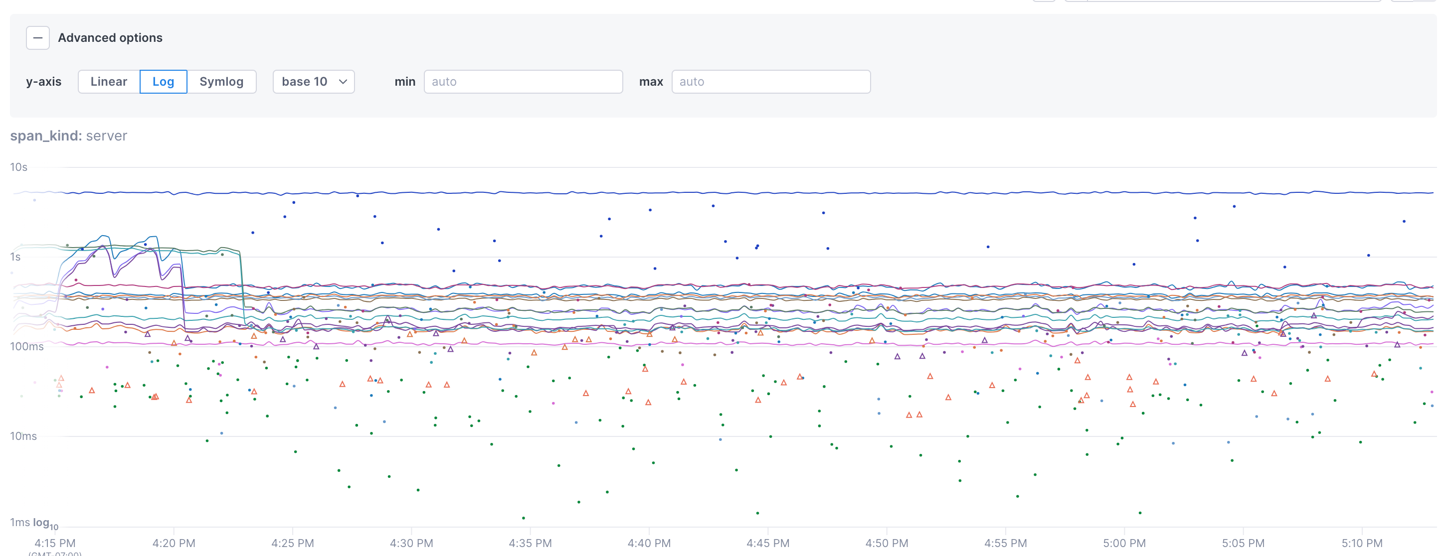
- Configure the y-axis to use either linear (defalut) log, or symlog scales. You can also set the base to use for the scale.
- Define a min and max value for the y-axis.
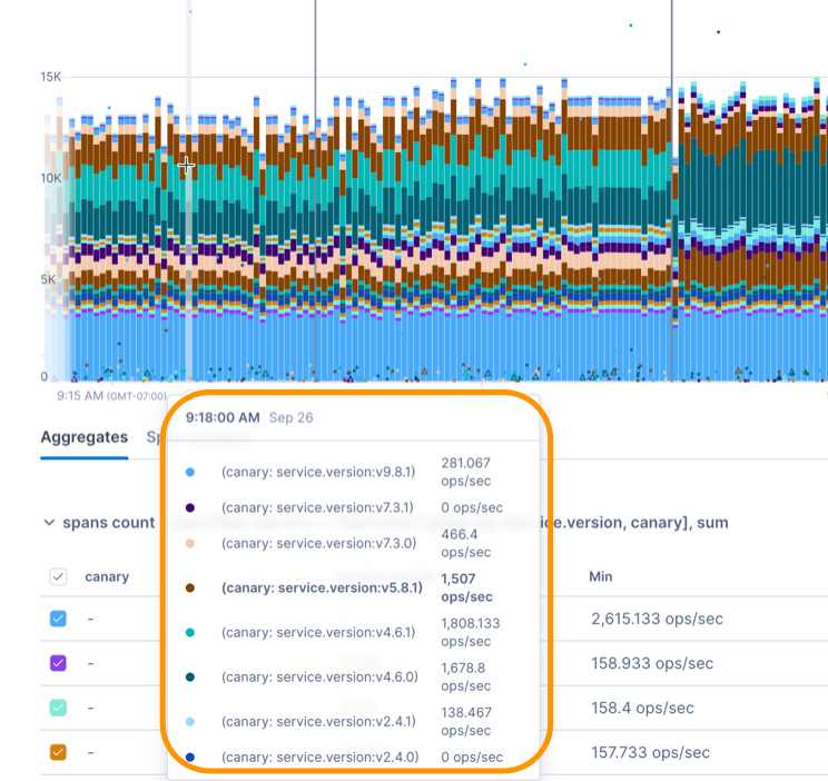
- View robust tooltips that display values for different the time series.
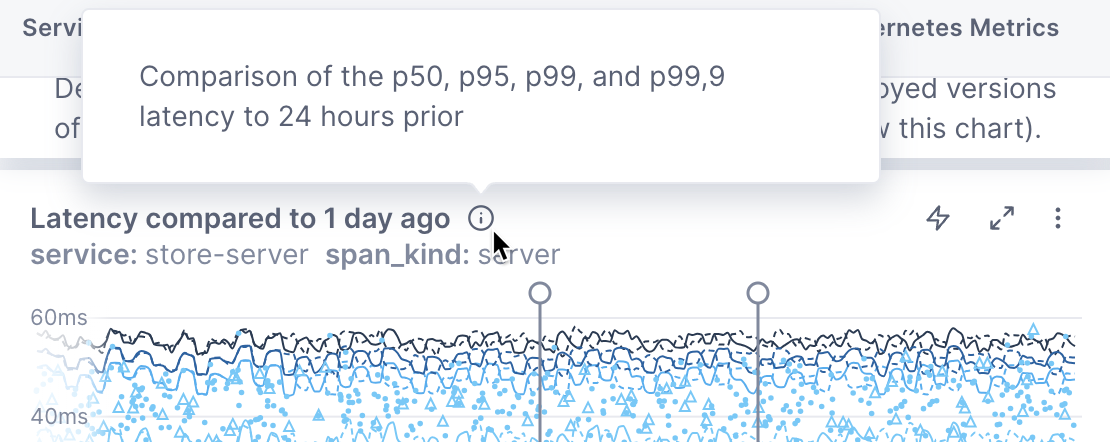
- Add markdown-supported descriptions to charts. You can view these descriptions from an info icon on the dashboard, providing context at the dashboard level.
Updated Sep 26, 2023