
The functionality in this topic is for unified dashboards and not dashboards for Streams.
You can monitor logs, metrics, and spans by adding panels to unified
dashboards based on queries to your telemetry data. Dashboards can contain any
number of panels based on data from logs, metrics, and traces. 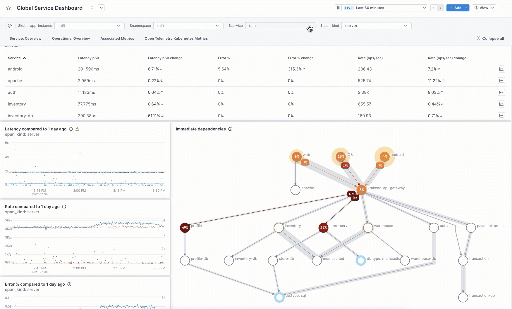
Pre-built dashboards
Cloud Observability offers several pre-built dashboards you can use without having to query your data. Start with one of these then customize it to fit your needs. You can edit the description, labels, and sections, add/delete visualizations, and change chart queries.
Service health dashboards
Cloud Observability provides two types of pre-built service dashboards. Both provide an overview of performance for a service, its operations, and if you’re ingesting Kubernetes metrics, the associated metrics that the service is emitting.
Seeing the transaction level information about your service (SLIs from spans) and infrastructure health (metrics) in the same dashboard provides a powerful view into the overall health of your system.
-
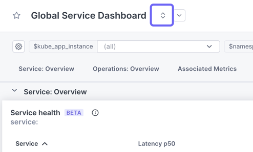
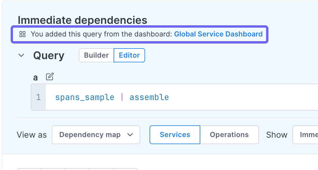
Global service dashboard: A single dashboard that uses a template variable for the service, allowing you to view all your services from one dashboard. Change the
servicevariable value to view specific services. -
Individual service dashboard: Available for every service reporting to Cloud Observability. This dashboard provides the same information but because it’s scoped to a single service, it also provides an additional section about the performance of the individual operations on that service.
Both types of service dashboards use the span_kind variable to determine the data to display. You can choose from the following values:
server(default): Shows data from spans providing functionality asked for by other services. Use this value for back-end services whose performance may affect other services in the request stream.client: Shows data from spans requesting something from another service. Use this value when other services rely on these requests, such as the entry point to your system.internal: Shows data from spans that are completely internal to the service.all: Shows data from all spans from the service.
Metric dashboards
You can create pre-built dashboards for many of the metrics received from AWS CloudWatch Metric Streams and Azure or from a metric integration that uses the OTel Collector.
Using Terraform? You can use the Cloud Observability Terraform provider to create and manage your dashboards and panels. You can also export existing dashboards into the Terraform format.
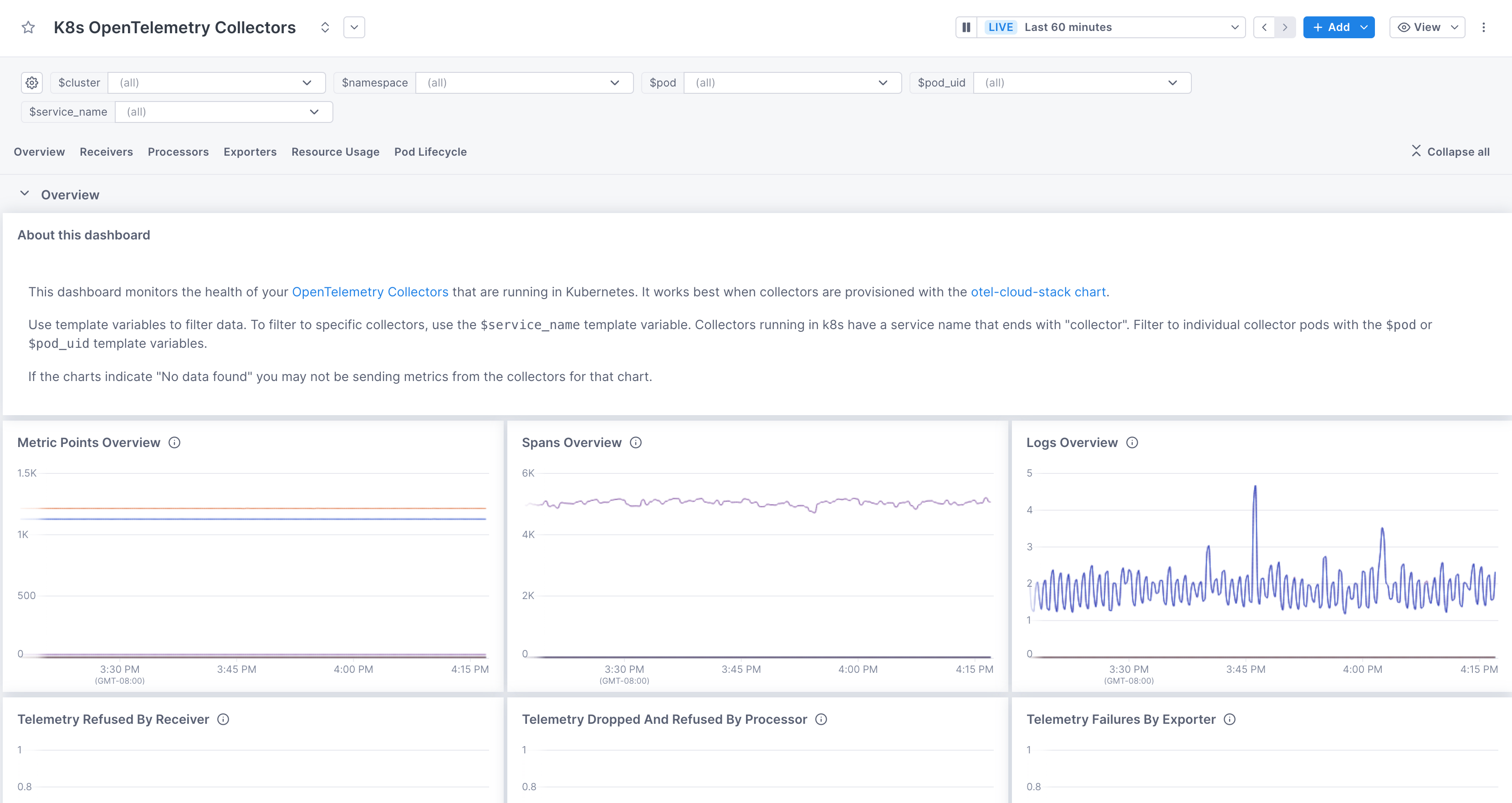
Collector health dashboard
If you’re using OpenTelemetry Collectors running in Kubernetes to ingest data into Cloud Observability, you can use the pre-built K8s OpenTelemetry Collectors dashboard to monitor the health of all your Collectors.
This dashboard works best if you’ve followed our Quickstart to install and run Collectors in Kubernetes.
Use pre-built dashboards
-
From the navigation bar, click Dashboards.
-
Click Create a pre-built dashboard and choose a dashboard.
Pre-built dashboards are not available for all integrations.
The dashboard displays several pre-built panels. You can edit the dashboards and add or edit the panels as needed.
Update a pre-built dashboard
When we release a new version of a pre-built dashboard you’re using, Cloud Observability displays a banner to let you know a newer version is available. 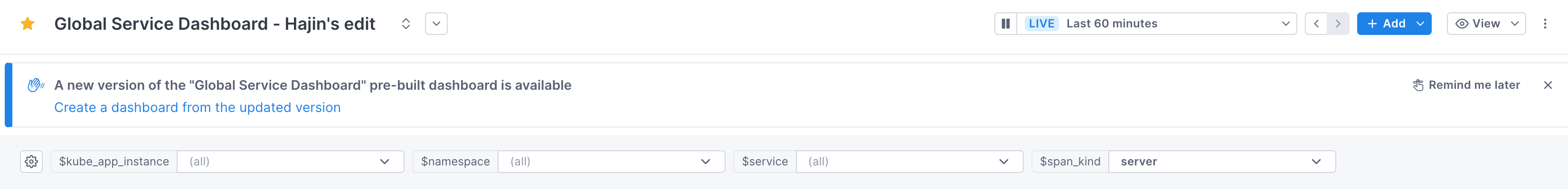
Follow these steps to update your dashboards:
-
Rename your dashboard so that it’s easy to find.
The newly updated dashboard will use the same name, so it’s good practice to rename the original.
For example, if the name is “Global Service Dashboard” you might rename it to “OLD Global Service Dashboard.
-
Click the link in the banner to create a new dashboard that uses the new version. Any modifications that you made will not be copied over. You’ll need to clone those changes to the new dashboard.
-
In a new tab or window, reopen the original dashboard and view the version history.
-
Reimplement changes made in the original dashboard by cloning the changed charts from the original dashboard to the new one.
Manually create a dashboard
You create a dashboard from the Dashboard list view.
-
From the navigation bar, click Dashboards.
-
Click Create a custom dashboard to access a new, blank dashboard.
-
Click Details and in the Details panel, rename the dashboard and optionally add a description and labels.
The description appears on the dashboard and Dashboard List view. The description can be up to 256 characters, and it supports Markdown. Here’s an example:
1
2
3
4
5
6
7
8
 Use this dashboard to monitor and identify issues with Cloud Observability's customer experience.
 Have questions?
 Ask in [#customer-experience](https://lightstep.com/).

 Docs:

 - [Runbooks](https://lightstep.com/)
 - [Troubleshooting](https://lightstep.com/)
If your description needs more than one line, consider adding a text panel instead.
You’re now ready to add panels to the dashboard.
You can also add a chart to the dashboard from the Service Directory view.
Edit a dashboard
Once you create a dashboard, you can edit it by adding more panels, creating sections, and adding text blocks. You can change the display of the panels by setting time periods and using template variables.
Be careful when opening the same dashboard in more than one tab or window. Edits may not carry over to multiple instances.
Add panels
Add a panel by clicking Add and then follow these instructions.
Add sections
You can organize your dashboard by adding named sections. When you add a section, the section name appears at the top of the dashboard and is a link to that section. You can expand and collapse all sections. 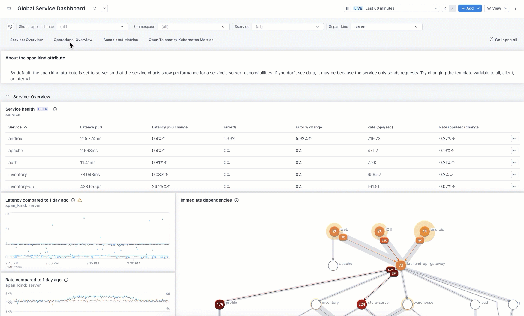
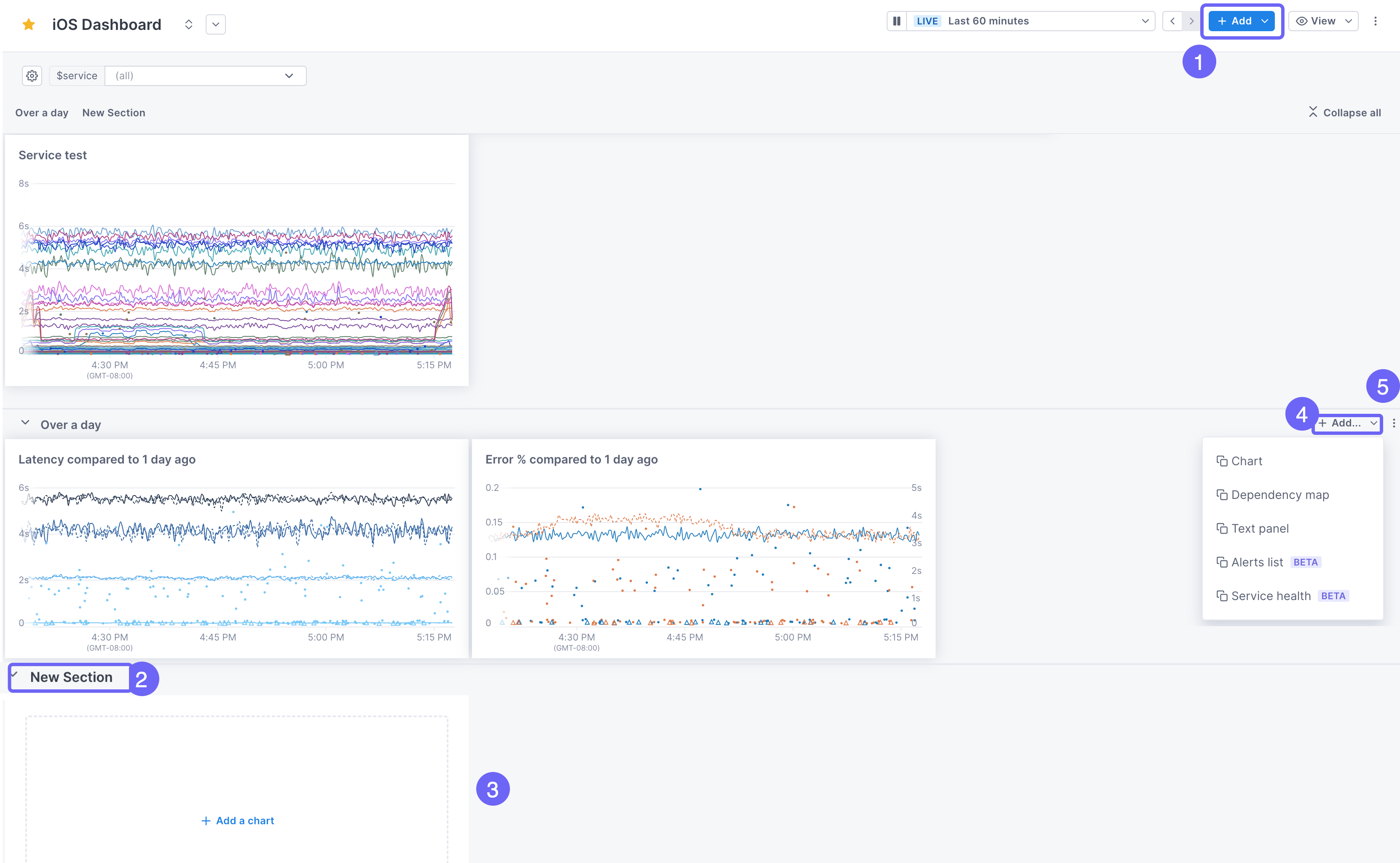
This image shows how to add a section. The steps below describe the procedure in more detail.
-
At the top of the page, click Add > Section. The new section is placed at the bottom of the dashboard.
-
By default, the section is named New Section. Click into the title to rename it.
-
The first blank panel is added for you. Click on it to create your query and configure your panel.
-
To add more panels, click Add, or click the title of an existing panel to drag and drop it into the section.
-
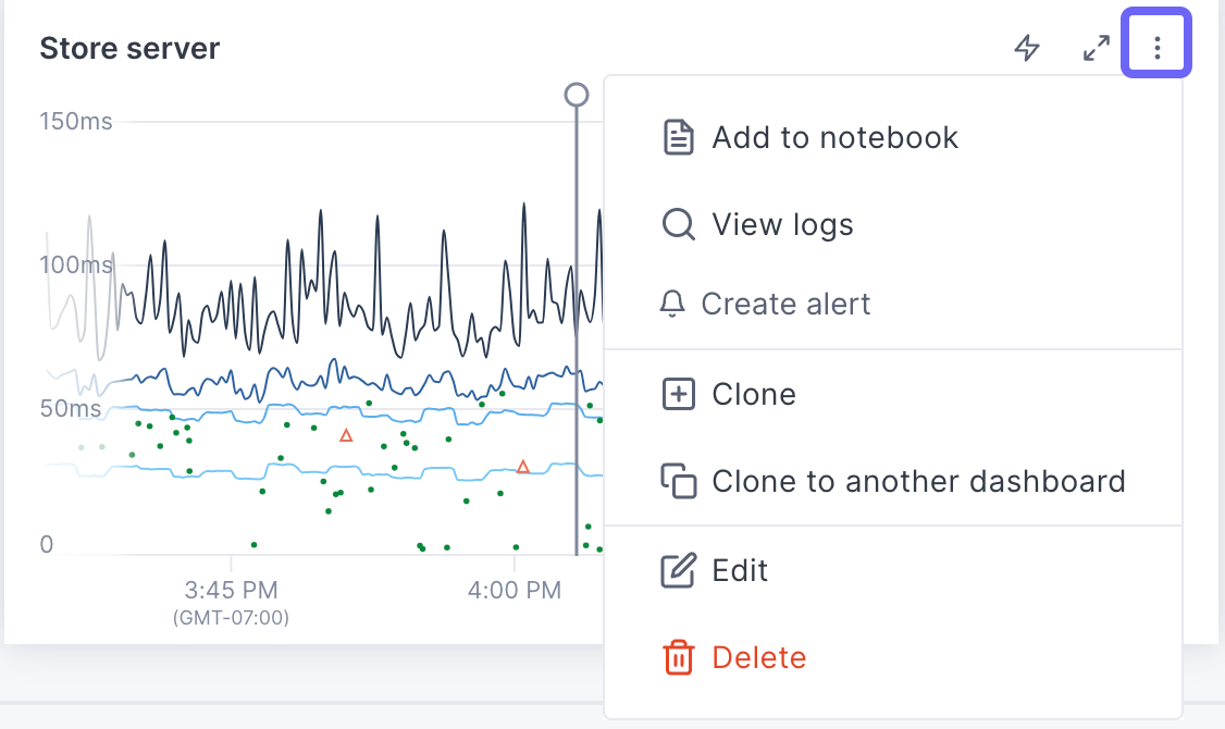
Use the panel’s More ( ⋮ ) icon to:
- Move it up or down the dashboard.
- Expand and collapse sections.
- Copy the link to a section.
- Clone the section to another dashboard.
If the panels in the section use template variables, those variables are copied over to the destination dashboard. If that dashboard doesn’t use those variables, you need to edit the queries in the destination to replace those variables.
-
When you delete a section, you can choose to delete just the section (the panels remain in the same place in the dashboard), or you can remove the section and its panels.
Rearrange and resize panels
You can move panels added to a dashboard by dragging and dropping them. Hover over a panel title. When the cursor turns into a hand, drag and drop the panel into its desired location.
You can resize a panel by hovering over the lower right-hand corner and dragging it to the size you need.
Add labels
You can add labels (like team:android or service:myservice) to a dashboard.
Learn how to add labels.
View dashboard details
You can view metadata about a dashboard from the details panel, accessed from the More ( ⋮ ) icon. You can also edit the name, description, and labels from here.
You can also view and edit a dashboard’s description by clicking the expand/collapse icon next to the dashboard’s title.
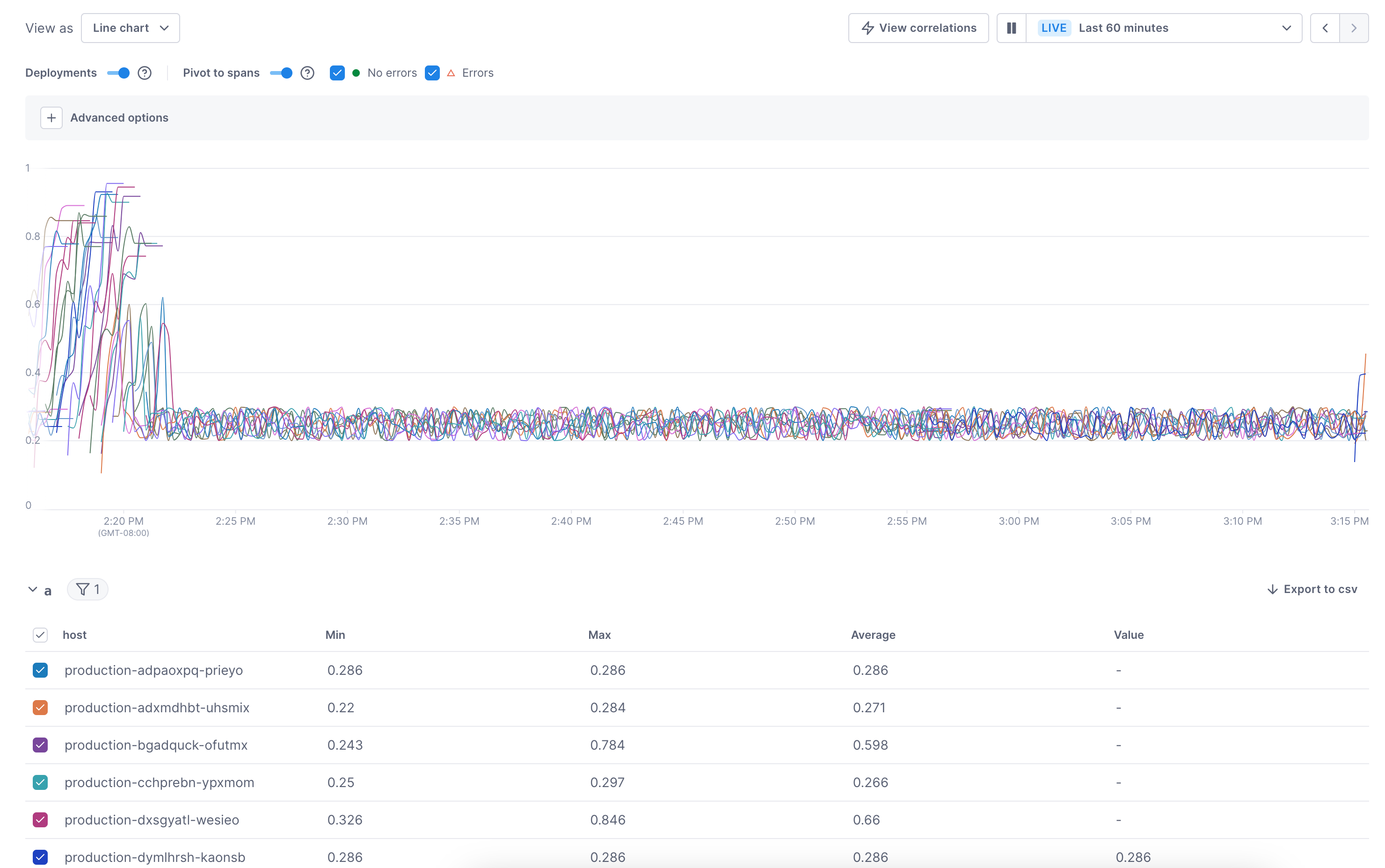
View deployment markers
When you implement an attribute to display versions of your service, a deployment marker displays at the time the deployment occurred. Hover over the top of the marker to display information about the deployment. 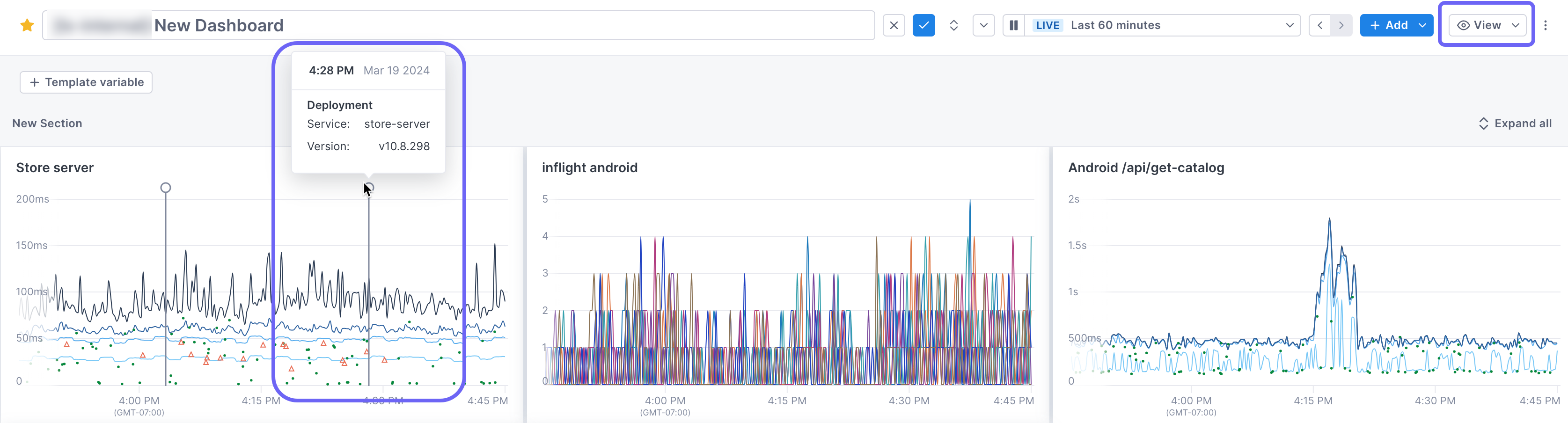
Control the display of deployment markers by clicking View > Deployments.
View span samples
By default, panels on the dashboard display span samples (span charts only). With span samples displayed, when you hover over a point, you can see the values for each group at the point. Spans with errors are triangles. Click on the point to view the span in the Trace view. Use the View button at the top of the dashboard to control the view of samples.
Use template variables
Template variables allow you to dynamically filter panels in a dashboard based on attribute values returned by the data. Instead of creating a panel for each value, you create one panel and then filter the dashboard to specific values.
For example, say you want to view the health of your services. Instead of creating a separate dashboard for each service, you create one dashboard that uses service as a template variable. On initial load, the panels show data using the default value of the variable (usually all, so in this case, from all services). You use the variable dropdown to select only the services you’re interested in.
Template variables provide greater functionality and are more predictable than Global filters. You can choose to use either one at the top of the dashboard.
To learn more, see Use template variables.
Add dashboard workflow links
You can add dashboard workflow links to a dashboard or panel that allow you to navigate to another app or another place in Cloud Observability keeping some context of the dashboard with you, for example the value of an attribute currently used in the query or the current value(s) of a template variable.
See Use dashboard workflow links for more information.
Apply global filters
If you want to quickly view data filtered to an attribute and don’t need to persist that ability, you can change the data reported on the dashboard using global filters.
Global filters only affect your view - they are not persisted.
To use global filters, click the More ( ⋮ ) icon and choose Switch to global filters!
When adding multiple filters, Cloud Observability narrows down your choices based on
attributes available after the previous filter. Multiple selections use AND to
join filters.
Global filters and span charts
When you add a global filter, you’re changing the query for each chart on the dashboard. If a chart is using a Stream to retain a span query and you apply a global filter, it’s considered a new query that is not retained (you will only see data currently in the retention window). If you add a chart with a Stream’s retained query to a dashboard that uses global filters, the query is retained as a Stream without those filters applied.
Change the reporting time range
By default, Cloud Observability shows data from the past 60 minutes. To change the time range, click the time-picker drop-down and:
- Set relative time ranges in minutes, hours, days, or weeks.
-
Enter custom time ranges in the From and To inputs.
The time picker saves custom time ranges and shows them under Recently used. You can also click < > next to the time picker drop-down to move back and forward in time.
To view live data for the last 60 minutes, click Play next to the time picker. When viewing live data, you can do the following:
- Use the time picker to set different live, relative time ranges in minutes, hours, days, or weeks.
- Hover over Live to see the refresh countdown.
To stop live viewing live data, click Pause. Cloud Observability stops refreshing the panel and sets a fixed, custom time window matching the last refresh.
Changing the time period only affects your view - the change isn’t persisted.
Data may not be available for the time range you select, based on the type of data and your data retention policy.
Clone a dashboard
There are two ways to clone an entire dashboard:
-
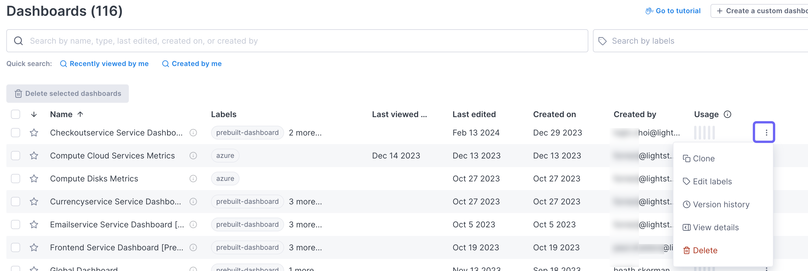
In the dashboard, click the More ( ⋮ ) icon and select Clone.
-
In the Dashboard List view, click the More ( ⋮ ) icon next to the relevant dashboard and select Clone.
Cloned dashboards copy over the template variables, but do not copy over the global filters. The time picker resets to the last 60 minutes.
Clone a panel
You can clone a panel to the same dashboard or to a different dashboard.
To clone a panel to the same dashboard dashboard:
- On the panel, click the More ( ⋮ ) icon and select Clone.
- In the dialog, update the panel name and click Clone.
The cloned panel appears at the bottom of your dashboard.
Panels cloned to the same dashboard use variables/global filters and the time period set for the dashboard.
To clone a panel to a different dashboard:
- On the panel, click the More ( ⋮ ) icon and select Clone to a different dashboard.
- In the dialog, select the destination dashboard.
The cloned panel appears at the bottom of that dashboard.
If the panel uses template variables, those variables are copied over to the destination dashboard. If that dashboard doesn’t use those variables, you need to edit the query in the destination to replace those variables.
If the panel uses global filters, those filters are not copied to the destination.
Delete a panel from a dashboard
Follow these steps to delete a panel:
- On the panel, click the More ( ⋮ ) icon and select Delete.
- In the dialog, click Yes, delete.
Deleting a panel from a dashboard deletes it from everyone’s view of the dashboard.
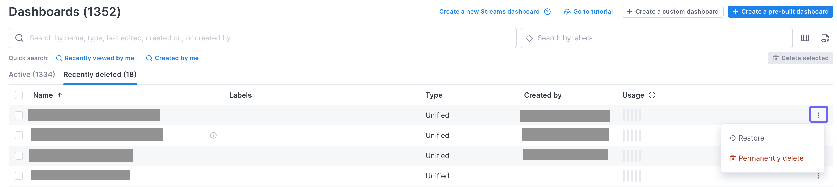
Delete and restore a dashboard
You can delete a dashboard from either the dashboard itself or from the Dashboard list. Deleting a dashboard also deletes all panels created for it.
Click the More ( ⋮ ) icon, select Delete, and click Yes, delete in the dialog.
Deleted dashboards are held in a soft-delete phase for 30 days so you can restore them if needed.
To restore a dashboard, on the Dashboard List view, select the Recently deleted tab and use the More icon to select Restore.
Share a dashboard
Cloud Observability creates a short link that you can use to share a dashboard. Any filters or time ranges applied to the dashboard are maintained when the other person visits the link.
To get the short link, click the More ( ⋮ ) icon and select Share. The link is copied to your clipboard.
View and edit details
You can view and edit a dashboards details (including the description, labels, and when it was last edited) by clicking the Details button at the top of the dashboard.
View other dashboards
You can jump to another dashboard using the dropdown next to the dashboard title. 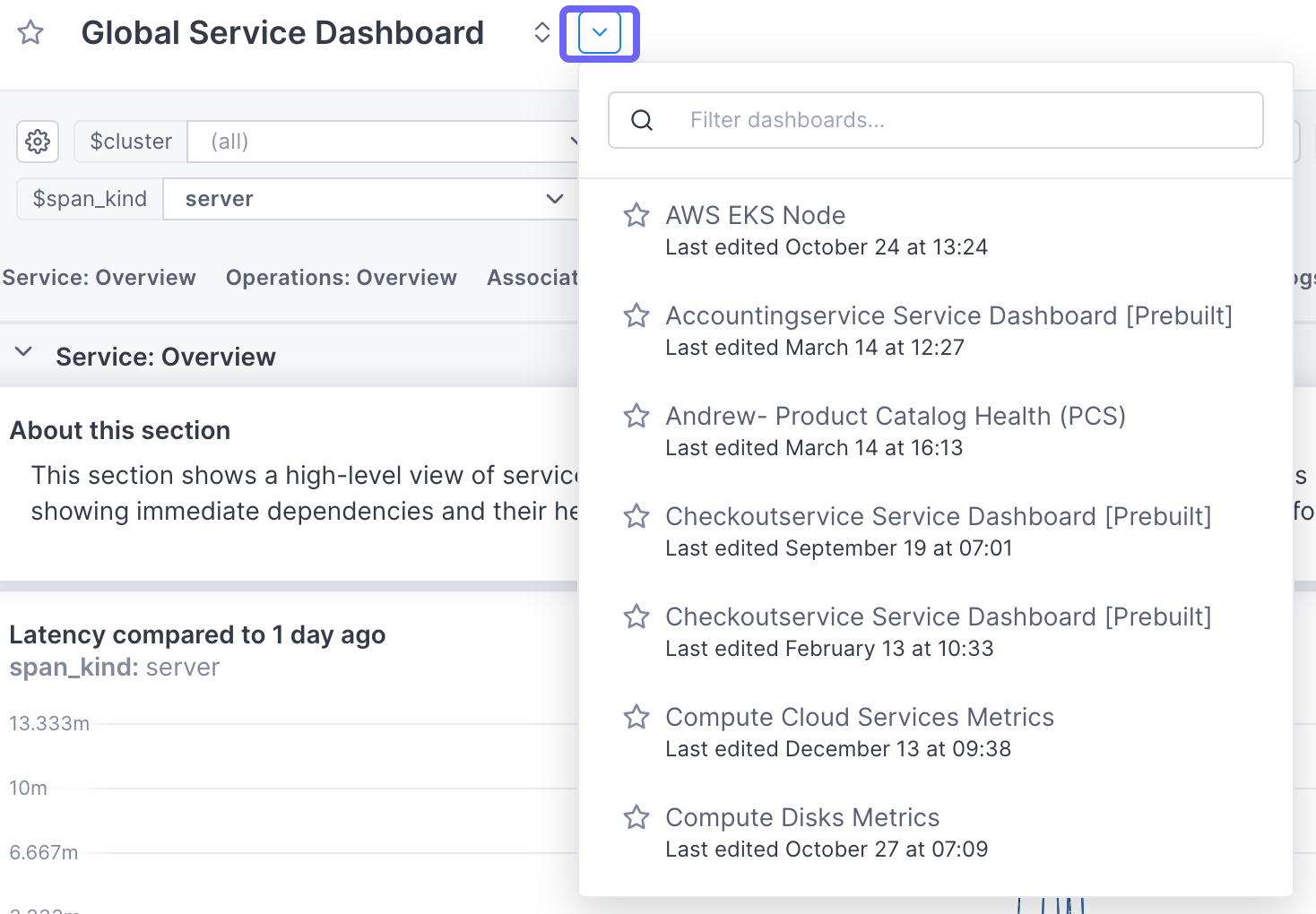
Export a dashboard to Terraform
If you use Terraform to manage your dashboards, a common use case is to create a “baseline” dashboard in the Cloud Observability UI and then export it to Terraform to create and manage new dashboards. Creating a dashboard in the UI is easier and more intuitive than working in a Terraform configuration file. When you export the dashboard to a Terraform file, you can then clone it and edit the file to create new dashboards, for example by changing the individual queries behind the panels.
To export a dashboard to Terraform, click the More ( ⋮ ) icon and
choose Export to Terraform. The tf config file can then be downloaded to
any local directory.
View a single panel (expand)
To get a better look at a panel on a dashboard, you can enlarge it. Hover over the panel and click the Expand panel icon (CTRL+v).
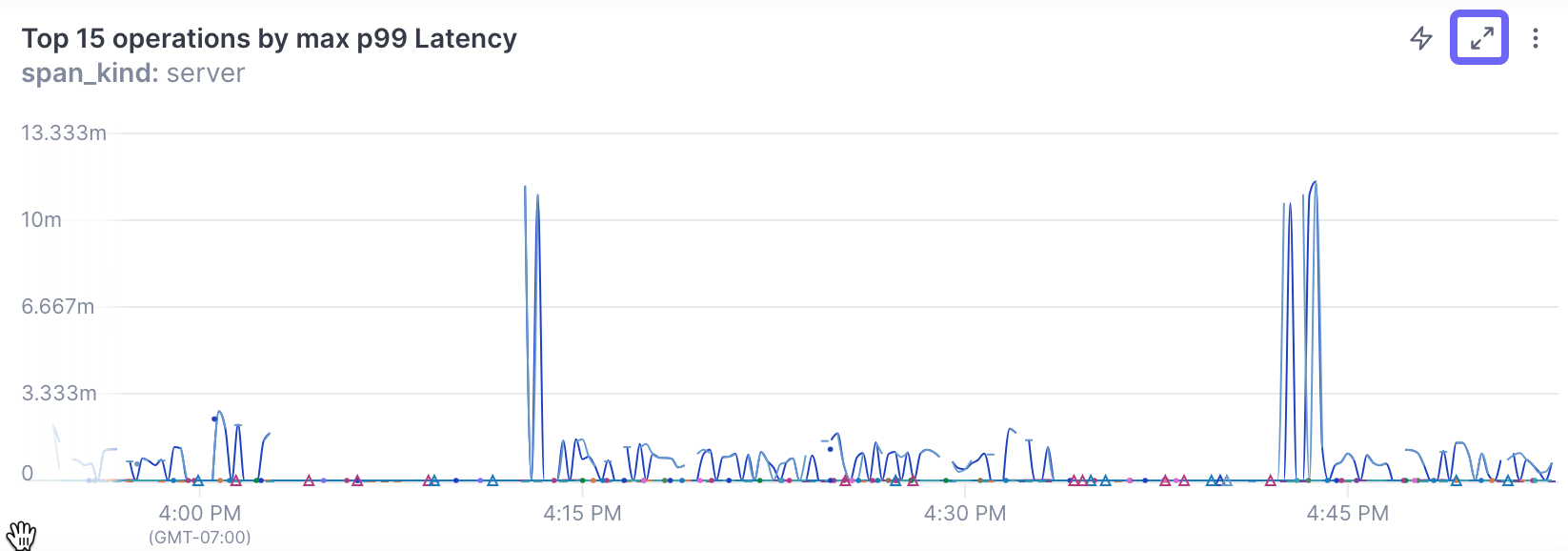
The panel opens in the editing view with the query builder collapsed. Click Query to open the builder and edit the query.
If a chart contains multiple queries or queries and a formula, you can toggle their display on and off below the chart.
Below a chart, a table displays the data for each line in the chart.
The toggle selection doesn’t persist to the dashboard.
Manage dashboards
You manage all your dashboards from the Dashboard view. 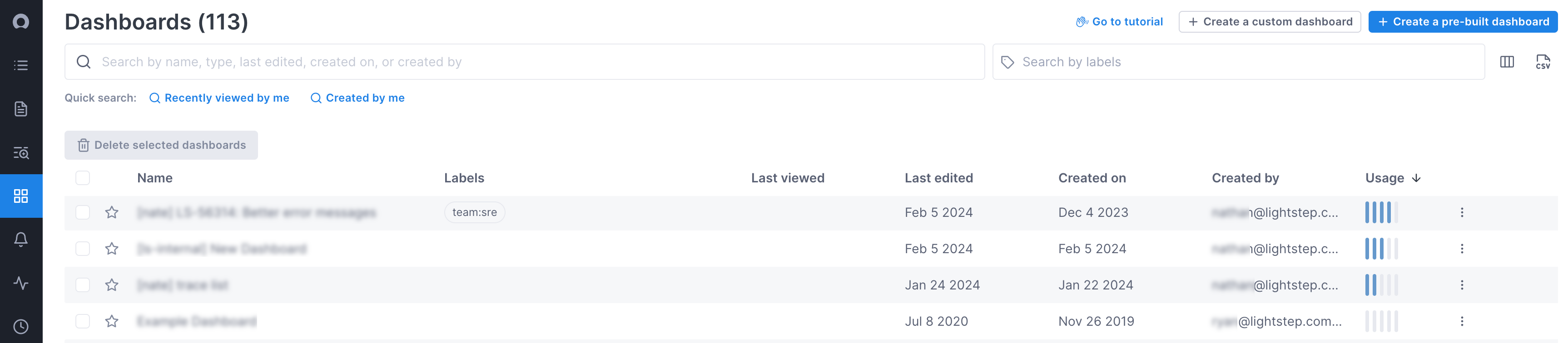 By default, dashboards are listed in
alphabetical order.
By default, dashboards are listed in
alphabetical order.
Sorting and dashboard favorites are saved only for a user. Other users will not see your sort or favorites.
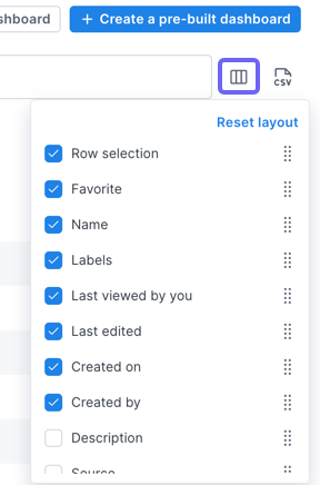
Manage columns in the dashboard list
You can choose which columns to hide/display and their order by clicking the columns icon at the top of the page. Columns can be resized by dragging the bar in the header.
Changing the column display only affects your view of the table.
Sort dashboards
You can sort the dashboards by any column.
Search for a dashboard
Use the Search by field to find a dashboard. You can search by name, date, type, or creator’s name.
To search by a label, use the Search by labels field.
View usage
You can see how often your dashboards are viewed and edited from the Usage column. This ranking can be helpful when many similar dashboards exist—knowing which are most used can help determine which dashboard to open.
Usage is determined by giving the dashboard(s) with the most views and edits a 5-bar rank. All other dashboards are then compared to that one and assigned a ranking. Rankings are updated every 30 days.
Favorite a dashboard
Click the star to favorite a dashboard. Favorited dashboards always appear at the top of the dashboard list.
Delete multiple dashboards
Select the dashboards to delete and click Delete selected.
Manage versions
Cloud Observability records each change made to a dashboard in the Version history panel. From here, you can restore the dashboard to a previous version, or clone a specific version to create a new dashboard.
To view version history from either the Dashboard List view or from the dashboard, click the More ( ⋮ ) icon for the dashboard and select Version history. The Version history panel displays a description of each change, along with a timestamp and the user who made the change. 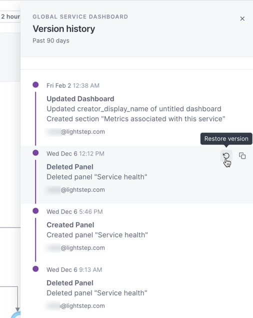
To restore the dashboard to a previous version, select that version and click the Restore version icon.
To create a new dashboard from a version, click the Clone dashboard icon.
Create an alert from a dashboard chart
You can create an alert from a chart, but because alerts require a specific structure, not all charts can be used to create one. If your query contains a group-by, you will not be able to create an alert (the option is disabled). For queries that don’t meet other requirements, you’ll be able to edit the query on the Alert Configuration page.
Creating an alert from a span query automatically creates a Stream.
Follow these steps to create an alert from a chart:
-
Hover over the chart in the dashboard, click the More ( ⋮ ) icon, and select Create an alert.
The Alert Configuration page opens in a new tab using the query from the original chart. A banner describes the edits needed to create a valid alert. Fields in violation are highlighted.
-
Fix the violations.
-
By default, the title is the same as the original chart. You can change it and you can add a description, if needed.
-
Continue creating the alert.
Add a panel to a notebook
You can add to a notebook for when, during an investigation, you want to be able to run ad hoc queries, take notes, and save your analysis for use in postmortems or runbooks. Notebooks let you view logs, metrics, and traces from different places in Cloud Observability together, in one place.
To add to a notebook, expand the panel and click Add to notebook and search to choose an existing notebook or create a new notebook.
When you add to a notebook, a panel is created using the same query. The annotation is a link back to the original, so you can quickly return to the origin of your investigation.
If you are adding a panel from a dashboard that uses template variables, the currently selected value replaces the variable in the query.
Learn more about notebooks.
Find correlations
When you notice issues on dashboards, use Cloud Observability’s correlation feature to investigate the deviation and find possible causes.
The correlation feature works with metrics and spans only. And you can’t use the correlation feature on big number charts.
To run the correlation feature, click View correlations or click directly in the chart and select View correlations. Cloud Observability opens a side panel where you can begin your investigation.
Visit Investigate deviations for more information.
See also
Updated Sep 4, 2024