
Use Cloud Observability’s correlation feature to investigate performance changes and find possible causes.
This page describes the correlation feature and how to use it on metrics and spans.
The correlation feature works with metrics and spans only. To investigate issues using logs, use the logs tab, notebooks, and the trace view.
About correlations
Cloud Observability’s correlation feature identifies attributes or operations that may have contributed to performance changes (deviations). Use the correlation feature with other Cloud Observability features – such as notebooks and the Trace view – to identify possible deviation causes.
You can access the correlation feature on charts in notebooks, dashboards, and alerts. The feature works on metrics and spans:
- For metrics, the correlation feature surfaces attributes from Key Operations on the metric’s service.
- For spans, the correlation feature surfaces attributes and operations from traces matching the chart’s query.
For both data types, the correlation feature calculates how much those attributes or operations correlate with the deviation, suggesting possible causes.
Using the correlation feature
Before you begin
Do the following to get the most value from the correlation feature:
-
Instrument services for distributed tracing.
The correlation feature uses attributes to relate deviations with spans in trace data.
- For metric data, register services with the
service.nameattribute. -
Filter charts to one service.
The correlation feature works best when it focuses on one service and its dependencies. For dashboard charts, use the global filter. For other charts, edit and save your query.
On metric data
Follow these steps to use the correlation feature on metric data in a dashboard:
- To open the feature from a dashboard chart, select Expand chart > View correlations.
-
In the panel, move the blue window to the relevant deviation and select View correlations. Cloud Observability displays results in the panel.
The chart shows the baseline (purple) and deviation (blue) windows used to compare performance. You can move and expand the windows – Cloud Observability automatically updates the results.
The table lists the service’s Key Operations, sorted by greatest change. The columns show:
- Attributes - Key-Operation attributes, sorted by greatest change.
- Service - The service where the attribute appears.
- Change - A visual of the attribute’s change between the baseline and deviation.
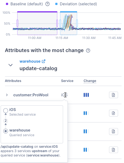
In the example below, the queried service is warehouse, the Key Operation is update-catalog, and the attribute with the most change is customer:ProWool. The customer:ProWool attribute appears on the iOS service.
Point to iOS to view the following:
- How the iOS service relates to the queried service (warehouse).
- Where the attribute appears – on the api/update-catalog operation on the iOS service.
You can also select the Add to notebook icon to add a p99-latency chart to a notebook.
-
Select an attribute to view three service level indicator (SLI) charts. The charts compare the baseline to the deviation for p99 latency, operation rate, and error percentage rate.
The charts have several options:
- Toggle Show comparison to also visualize spans without the attribute.
- Select Group by to group the data by the attribute key.
- Select Spans without errors or Spans with errors to show or hide specific spans.
- Select Add to notebook to add an SLI chart to a notebook.
- Select a span example to access the Trace view.
-
To investigate further, select the panel’s expand icon for the full correlation view.
The full view has more details, including several spark lines for Key Operations.
You’re all set with the basics for using the correlation feature on metric data. When using the correlation feature in practice, you may need to investigate several Key Operations to find root causes.
Next, learn more about using the correlation feature on span data and the full correlation view.
On span data
Follow these steps to use the correlation feature on span data in a dashboard:
- To open the feature from a dashboard chart, select Expand chart > View correlations.
-
In the panel, move the blue window to the relevant deviation and select View correlations. Cloud Observability displays results in the panel.
The chart shows the baseline (purple) and deviation (blue) windows used to compare performance. You can move and expand the windows – Cloud Observability automatically updates the results.
-
Select the filters to focus your investigation.
View changes in
Choose one of the following to compare in the baseline and deviation:
- Error - The error rate of traces with the attribute or operation.
- Latency - The latency of traces with the attribute or operation.
- Rate - The number of times an attribute or operation appears on traces.
on
Select to view either correlated attributes or correlated operations.
located
Select the drop-down to view correlations for one of the following:
- On queried spans - Spans returned by the original query.
- On queried service - Spans from the service in your query.
- From upstream - Spans upstream of the service you queried.
- From downstream - Spans downstream of the service you queried.
- On all spans - All spans in the corresponding traces.
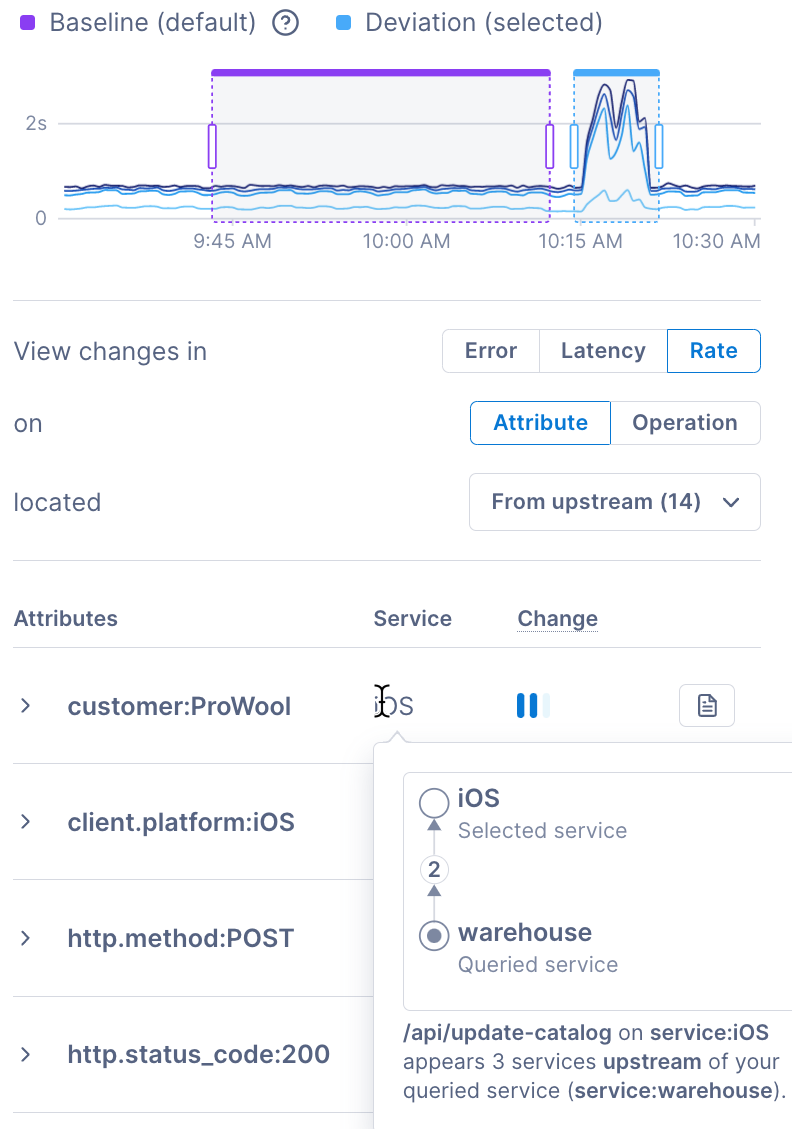
The table below shows the attributes with the greatest change. Change, in this example, is how often the attribute appears on traces in the baseline window versus the deviation window. The results only include spans upstream of the queried service.
The attribute with the greatest change is customer:ProWool from the iOS service. Point to iOS to view the following:
- How the iOS service relates to the queried service (warehouse).
- Where the attribute appears – on the api/update-catalog operation on the iOS service.
You can also select the Add to notebook icon to add a p99-latency chart to a notebook.
Once you choose filters, the table shows the attributes or operations from traces with performance differences in the deviation window. Cloud Observability sorts the results by greatest change, and the columns show:
- Attributes OR Operations - Attributes or operations from traces matching the chart’s query.
- Service - The service where the attribute or operation appears.
- Change - A visual of the attribute or operation’s change between the baseline and deviation.
-
Select an attribute or operation to view three service level indicator (SLI) charts. The charts compare the baseline to the deviation for p99 latency, operation rate, and error percentage rate.
The charts have several options:
- Toggle Show comparison to also visualize spans without the attribute.
- Select Group by to group the data by the attribute key.
- Select Spans without errors or Spans with errors to show or hide specific spans.
- Select Add to notebook to add an SLI chart to a notebook.
- Select a span example to access the Trace view.
-
To investigate further, select the panel’s expand icon for the full correlation view.
The full view has more details, including values for the baseline and deviation Error, Latency, or Rate. It also shows where the attribute or operation appears in the trace.
You’re all set with the basics for using the correlation feature on span data. Next, learn more about the full correlation view.
Working in the full correlation view
Use the full correlation view to get more investigation insights. To access the full view, select the expand icon in the correlation panel.
For both metrics and spans, the top of the full view displays several charts and these options:
- Select View query to see the chart’s original query in read-only format.
- Select the Display settings drop-down to view or hide the following:
- Deployment markers in all charts.
- Baseline and deviation windows in service level indicator (SLI) charts.
- Use the time picker to change the chart’s timeline.
- Select Expand chart to view the separate baseline and deviation charts.
- Select Share to get a link and share your results.
Visit the tabs below to learn about the full view for metric or span data:
-
The full correlation view for metrics shows the following for each Key Operation:
Performance changes
View spark lines for the average latency, operation rate, and error rate. Cloud Observability displays spark lines for the baseline (purple) and the deviation (blue) and sorts them by greatest change. The latency spark line shows the percentile with the largest change (either p99, p95, or p50).
Expand the spark lines to view larger chart versions. The latency chart shows all three latency percentiles (p99, p95, and p50).
Attributes with the most change
View a table with the following:
- Attributes - The attribute associated with the Key Operation, sorted by greatest change.
- Operation - The Key Operation associated with the attribute.
- Service - The service where the attribute appears.
- Baseline - For this service and Key Operation pair, the percentage of baseline traces with the attribute.
- Deviation - For this service and Key Operation pair, the percentage of deviation traces with the attribute.
- Change - The difference between the baseline and deviation values.
- Change impact - A visual of the attribute’s change between the baseline and deviation.
Select an attribute to view the same SLI charts and options as the correlation panel.
-
The full correlation view for spans shows several filters for focusing your investigation. The filters match the panel’s filters.
The table displays more details about the attribute or operation, including:
- Service - The service where the attribute appears.
- Baseline - The baseline’s error, latency, or rate.
- Deviation - The deviation’s error, latency, or rate.
- Change - The difference between the baseline and deviation values.
- Change impact - A visual of the attribute’s change between the baseline and deviation.
Select an attribute or operation to view the same SLI charts and options as the correlation panel.
See also
Updated Sep 12, 2023