
Cloud Observability’s Unified Query Builder (UQB) lets you query logs, metrics, and spans using one tool. You use the same UQB across notebooks, dashboards, and alerts to create charts that visualize your data. The UQB allows you to quickly and easily ask questions of your data and see the results in one place.
When you revisit your chart, the query name (or the UQL query, if you haven’t created a name) displays by default. Expand the section to return to the Unified Query Builder.
Query log data
The UQB supports two log query types:
- Basic log queries - Analyze individual logs matching certain conditions.
- Logs count queries - Analyze the number of logs matching certain conditions.
-
Follow the steps below to build a basic log query. The query returns up to 1000 logs containing
invalid prof, and it filters the results to logs with the attributecustomer = sweetpines.- In the UQB, click All telemetry > Logs.
-
Click the View as drop-down and select Logs list.
The table shows timestamps and
bodyvalues of up to 1000 logs. - In the Search for logs containing input, enter a word, phrase, or number.
For example,
invalid profmatchesinvalid profileandinvalid professor. It doesn’t matchinvalid prom. -
Click the Filter inputs to filter the results to logs with specific attributes. For example,
customer = sweetpines.When you click the inputs, the UQB shows the available keys and values. Cloud Observability shows the query results in the Logs list table.
-
Follow the steps below to build a logs count query. The query returns the number of logs containing
unable to con. It filters the results to logs with the attributeseverity = Warning Severity, and it groups the results byservice.name.-
In the UQB, click All telemetry > Logs.
The chart displays the total number of logs over time.
- In the Search for logs containing input, enter a word, phrase, or number.
For example,
unable to conmatchesunable to convertandtunable to contrabass. -
Click the Filter inputs to filter the results to logs with specific attributes. For example,
severity = Warning Severity.When you click the inputs, the UQB shows the available keys and values.
-
For the Group by input, enter an attribute key to group results by each of its values. For example,
service.name.Cloud Observability shows the query results in the chart.
Below the chart, the Aggregates table shows the minimum, maximum, and average number of logs grouped by
service.name. The Log events table displays up to 500 of the most recent log events, including the timestamp,body, andgroup byattributes.
-
To refine log queries:
- Add text searches to the Search for logs containing input. The UQB combines text searches with or.
- Click Add filter to add more filters. The UQB combines filters with and.
- Click Editor to view and edit the log query in UQL.
- [For
logs countqueries] Configure the aggregation methods in the Aggregate input. Log queries support delta and rate.
To further explore logs in the UQB, click a log in the Log events or Logs list table. The Log details panel shows the log’s attributes in tabular and JSON format. You can also use the panel to open linked traces and see logs in context.
Cloud Observability also offers the logs tab for exploring and filtering logs.
Query metric data
-
Search for a metric to plot:
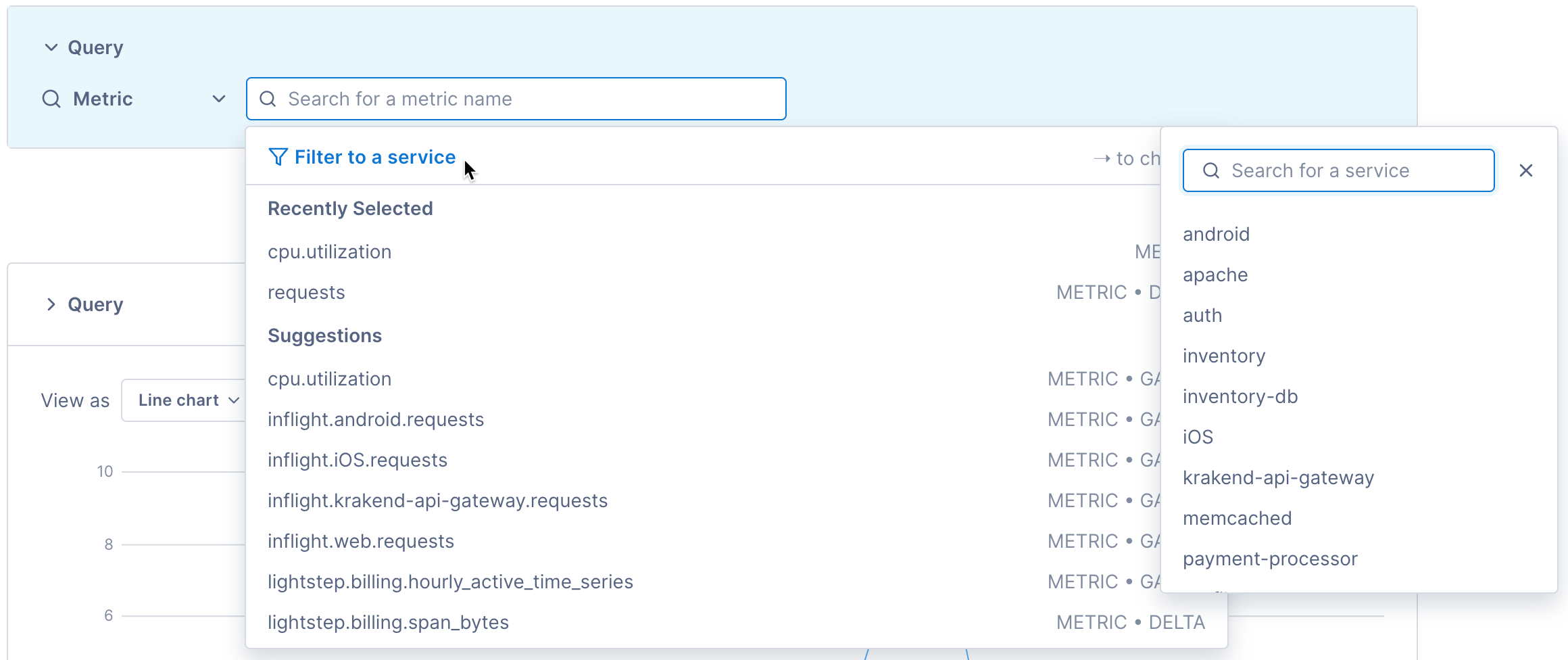
Click into the search field and begin typing the metric name.You can select Metric from the All telemetry dropdown to narrow your search to only metric data.
Cloud Observability’s correlation feature works best when it focuses on one service and its dependencies. To search metrics from one service, click Filter to service and select the service’s name.
When you select a metric, Cloud Observability expands the query builder and begins to chart the metric.
By default, queries are named alphabetically (a, b, c, etc). Click the Edit icon (
 ) to give your query a meaningful name.
-
Filter the data:
Unless you’ve already filtered by a service, all data for the metric is displayed. You can filter the data using metric attributes found on the data.Enter an attribute key, select an operator or enter a regular expression, and enter one or more values. Multiple values are joined by
OR.You can add more than one filter to the query where it makes sense (the query builder prunes the available list as you add attributes).
Multiple filters use
ANDto join filters.By default, Cloud Observability displays attributes that it’s seen in the last three days. But you can type in an attribute not in the dropdown and Cloud Observability will find it.
-
Align the data by choosing an aggregation method. Alignment is the process by which time series data points are aggregated temporally to produce regular, periodic outputs. By aligning your data before plotting it, you can tell a clearer story and more easily see anomalies. You can also set an explicit rolling input window that determines the data points that will be used when computing the aggregation.
If you use the latest aggregation, no input window is needed.
Whenever you make a query, Cloud Observability determines the number of output points to display that will make the chart detailed without making it feel crowded or hard to read. This optimal distance between points is called the output period. Cloud Observability adjusts the output period depending on the the amount of time being displayed on the chart. If you set the time picker to one week, the output period is 2 hours (meaning that the query produces a series of points which are all two hours apart). If you change the time picker to one hour, the output period is 30 seconds.
For example, say you are querying the requests metric and the data is coming from two sources. Using the delta aggregation, Cloud Observability combines the data from those sources to create individual time series points and then plots those on the chart, based on the output period. If you queried over the last 60 minutes, the output period (the space between each point on the graph) is 30 seconds.
The rolling input window is the duration of time that the data is pulled from before aggregating it. By default for charts on dashboards and notebooks, the input window is the same as the output period. That is, if the output period is 30 seconds, the data is aggregated over the last 30 seconds to produce the data point.
If your chart appears very noisy, or if you’re building a chart for an alert, it can be helpful to smooth the output data by using data from a wider rolling input window. For example, if you are querying on the requests metric and choose to aggregate using rate with a 10 minute input window, Cloud Observability computes the number of requests per second in 10 minute rolling time windows.
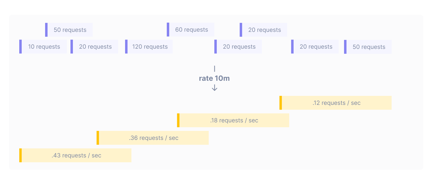
When querying for alerts, you must specifically set a rolling input window. Increasing the input window means increasing the time that it will take before a underlying change in the data will trigger an alert threshold. When it’s important to be notified immediately, use smaller input windows.
Choose one of the following temporal aggregation methods:
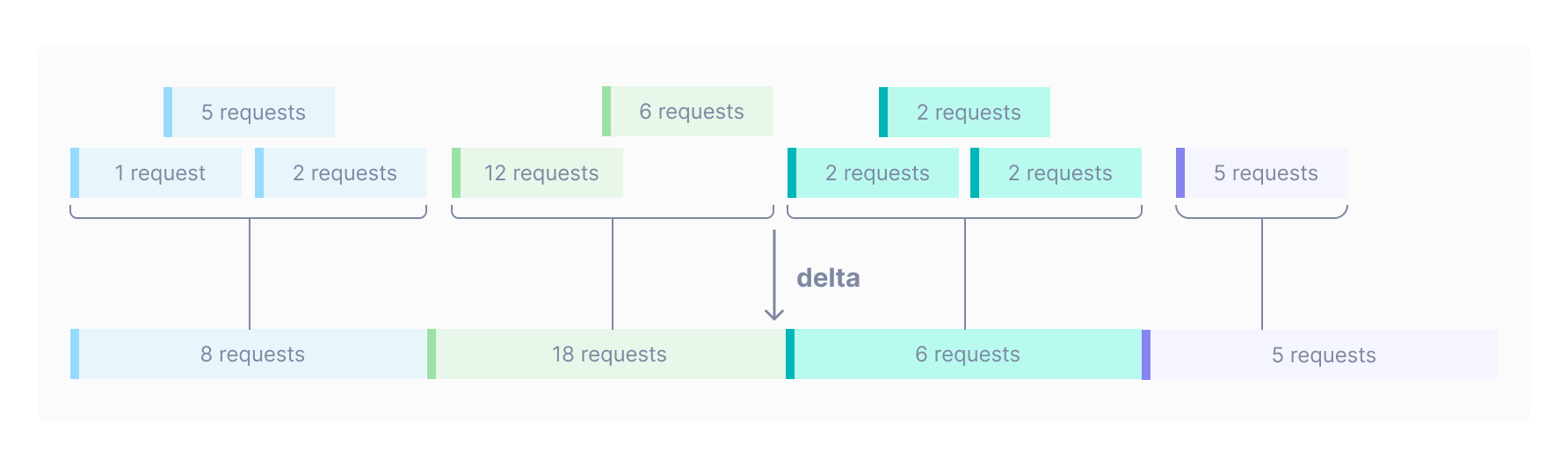
-
Delta: Computes the total number of increments in the input window as whole numbers. Deltas are most useful for infrequent events and are best visualized as stacked bar charts.
-
Rate: Computes the number of operations per second in the input window. Rates are most useful for ongoing operations and are best visualized as line charts
Gauge metrics also allow the following aggregations:
-
Latest: Computes the latest value in the input window. When using
latest, the input window is the same as the output period. -
Mean: Computes the average value of the time series in the input window.
-
Max: Computes the maximum value of the time series in the input window.
-
Min: Computes the minimum value of the time series in the input window.
The query builder automatically configures the aggregation for distribution type metrics. If the distribution is a gauge, the aggregation is set to latest. If it is a delta or cumulative, the aggregation is set to rate by default, but you can change it to delta.
-
Set the rolling input window (Unless using
latestaggregation. Alerts require an input window):
By default for charts in notebooks and dashboards, the input window is the same as the output window (determined by the time period for the chart). Click Specify a time aggregation to set an explicit input window and smooth out your data to avoid noise.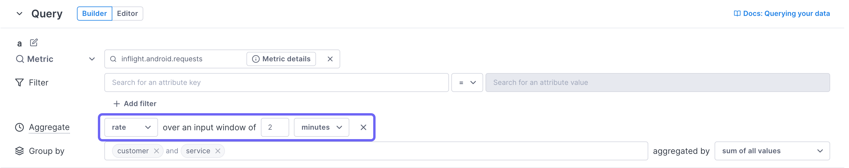
-
Compute percentiles (distribution type metrics only):
When the metric data is a distribution type (a set of values for each point in time), Cloud Observability can compute percentiles for you. Enter the value in the Percentile field (no%needed).For existing Cloud Observability customers interested in tracking distribution metrics, please opt-in here. For new customers to Cloud Observability, this feature is already enabled in your account.
When using distributions in an alert, you must select only one percentile to alert on.
-
Group the data:
By default, Cloud Observability spatially aggregates the data from the metric into one line.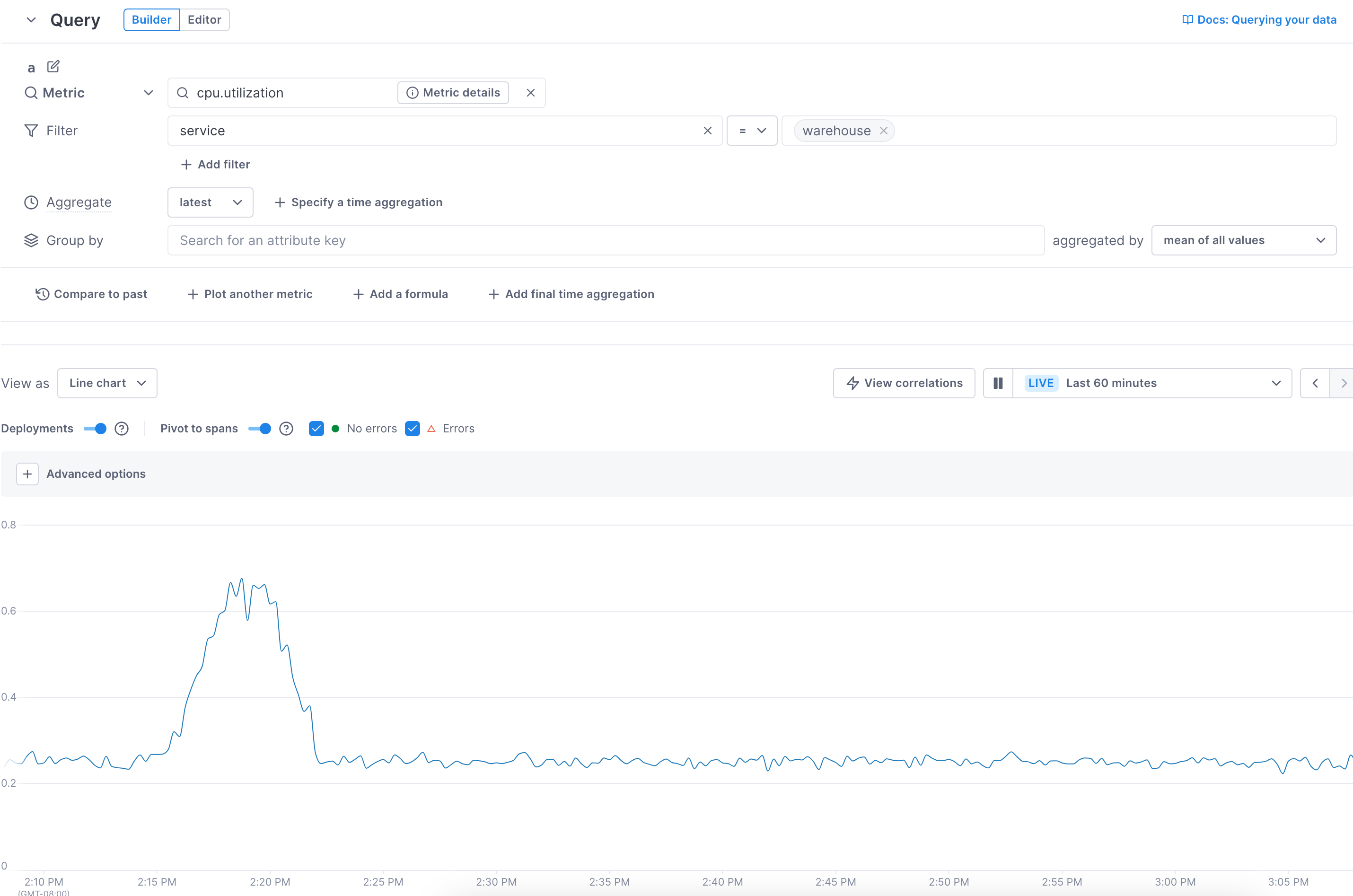
Instead, you can show lines for each available attribute value (group by). Select an attribute to display lines for each of the attribute’s values.
In this example, by choosing to group by the
hostattribute, you can see the metrics for the individual hosts.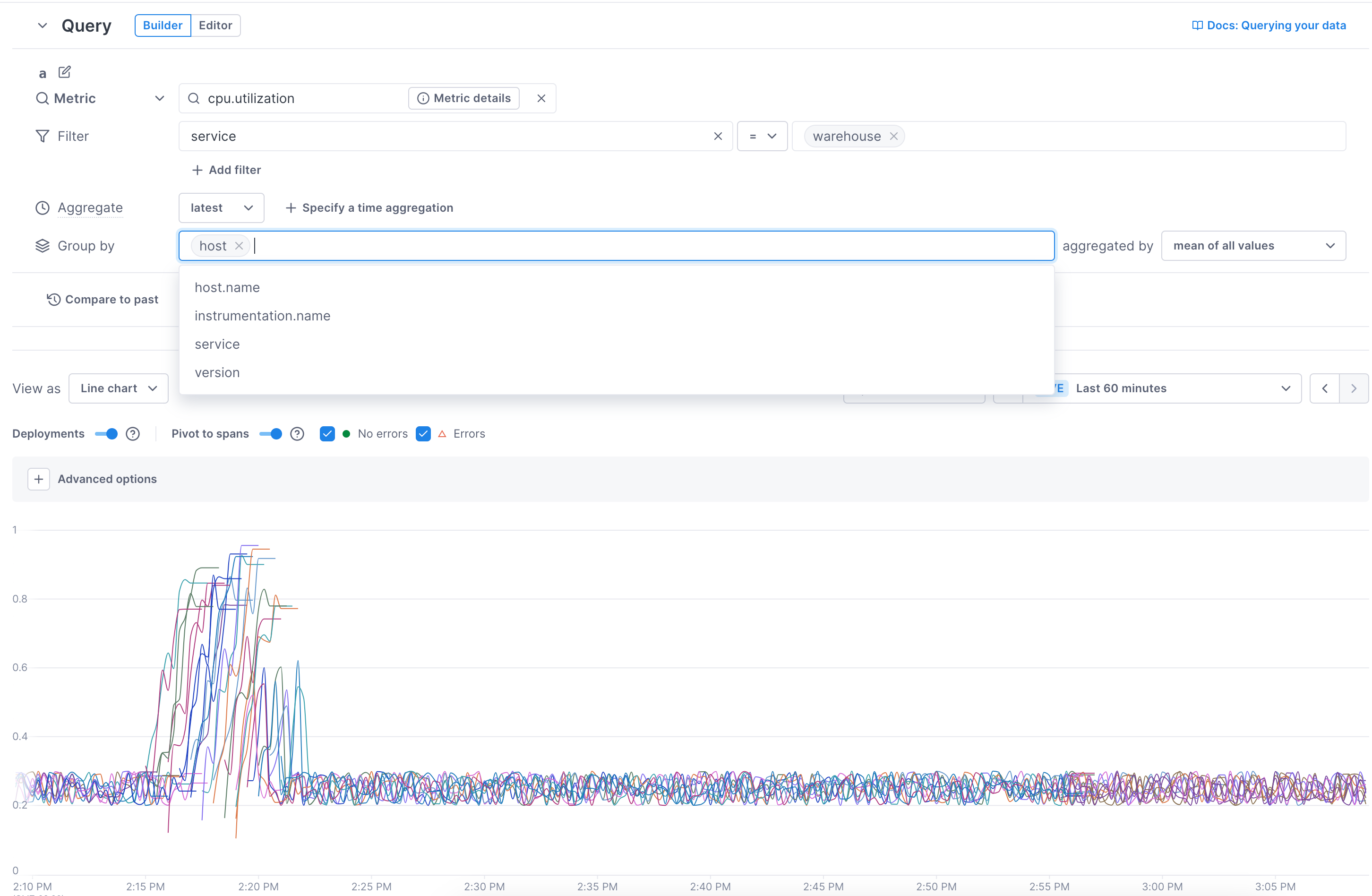
Grouping isn’t available on big number charts.
-
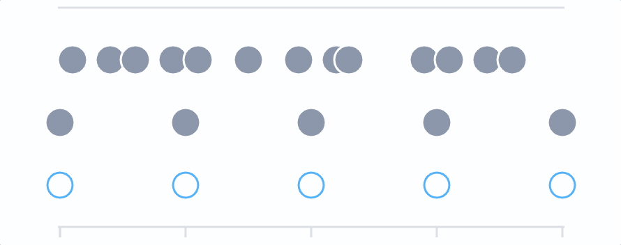
Choose how you want the data spatially aggregated into the chart.
- count of non-null values: The number of values found that are not null. For example, given the values of [10, 15, null, 50] the count is 3.
- count of non-zero values: The number of values found that are not zero (null is counted). For example, given the values of [10, 15, null, 0 50] the count is 4.
- maximum value: The highest point in the data.
For example, given the values of [10, 15, 50] the max is 50. - mean of all values: The average (sum of the data divided by the count) of the data.
For example, given the values of [10, 15, 50] the mean is 25. - minimum value: The lowest point in the data.
For example, given the values of [10, 15, 50] the min is 10. -
sum of all values: The total of all points in the data.
For example, given the values of [10, 15, 50] the sum is 75.Distribution type metrics are automatically summed and then aggregated into percentiles.
- Click Save to save your chart.
When you hover over a point on the chart, you can see each group points’ value. 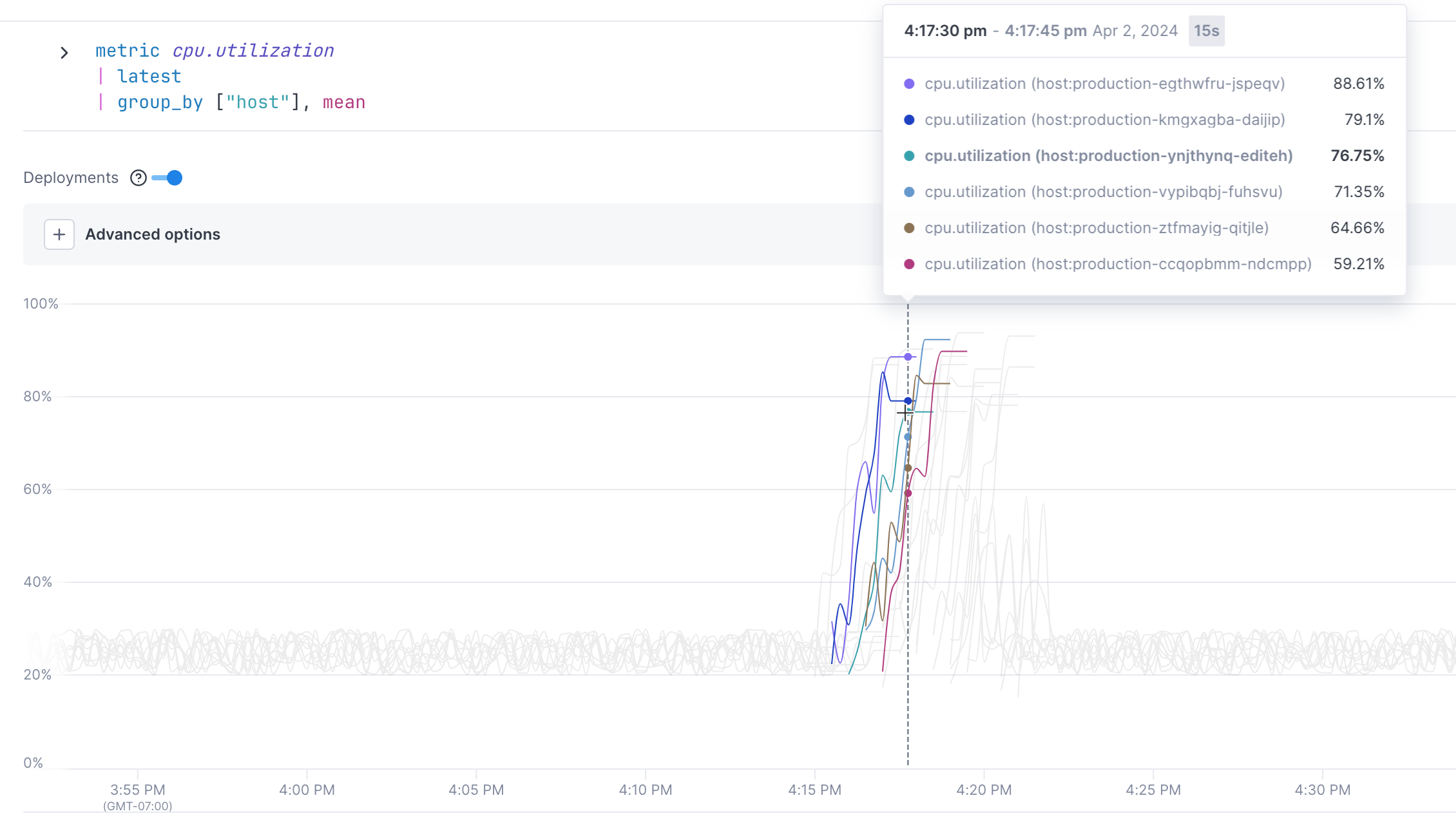
The shaded number in the header shows you the distance between points. 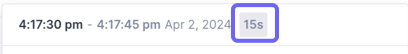
Clicking on a point allows you to start finding correlations or view associated logs to determine what may have caused the change in performance.
Below the chart, a table displays the data for each line in the chart. 
Query span data
-
In the first field, select operation or service, or start typing another attribute key name.
You can select Spans with from the All telemetry dropdown to narrow your search to only span data.
By default, the query builder displays attribute keys that it’s seen in the last three days. But you can type in an attribute not in the dropdown and Cloud Observability will find it.
Select an operator or enter a regular expression (regex), and enter one or more values. Multiple values are joined by
OR.You can also query latency thresholds (for example latency over or under a given time period). See Query latency thresholds.
When using regex (especially a wildcard
.*), your query may match more results than can be returned. When this happens, try updating the regex so it matches a smaller range of values.
Also note that if the query is saved as a Stream, as new values that match the regex become available, the cardinality may become too high for the Stream to record and save the data. For example, if a query filters byhosts=.*and a huge number of hosts are added, the Stream may stop saving the data. The UI shows a warning when this type of “cardinality explosion” happens.By default, queries are named alphabetically (a, b, c, etc). Click the Edit icon (
) to give your query a meaningful name.
-
Add an optional filter.
You can further refine your query by adding adding a service, operation, or attribute key and value(s) to a filter where it makes sense (Cloud Observability prunes the available list as you add filters).
Multiple filters use
ANDto join filters. -
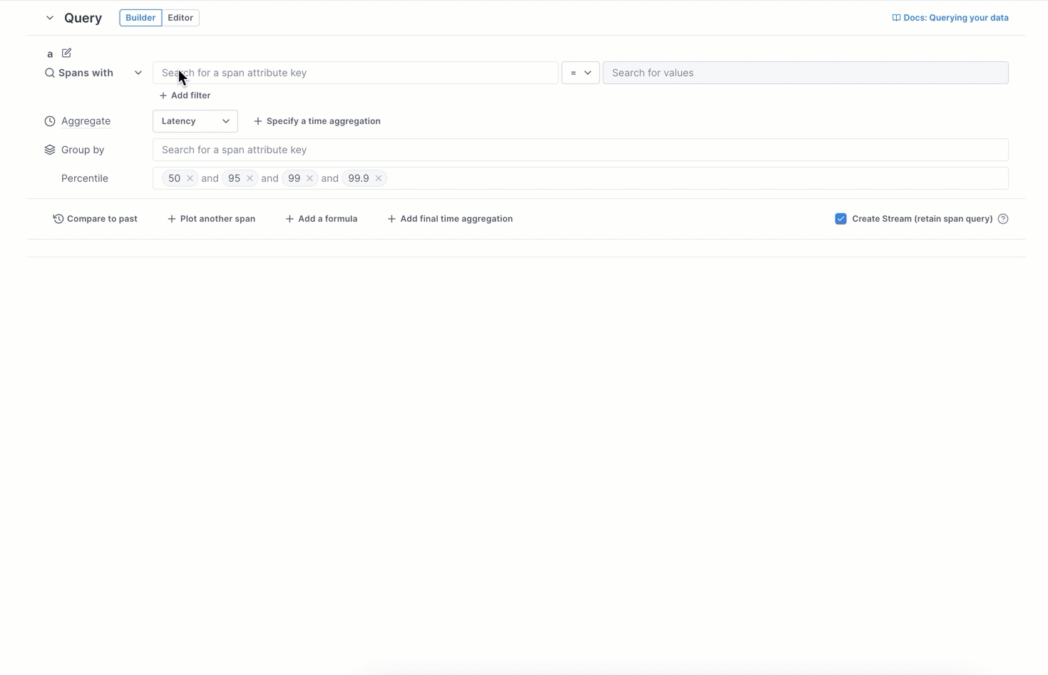
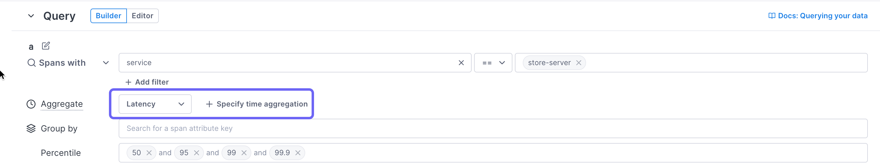
In the Aggregate field, choose an SLI for the chart (latency percentiles, error rate, operation rate, or count of spans)
-
Set the rolling input window (Unless using
latestaggregation. Alerts require an input window):
By default for charts in notebooks and dashboards, the input window is the same as the output window (determined by the time period for the chart). Click Specify a time aggregation to set an explicit input window and smooth out your data to avoid noise.Alerts require a specific input window to determine how far back to look for alert violations.
Whenever you make a query, Cloud Observability determines the number of output points to display that will make the chart detailed without making it feel crowded or hard to read. This optimal distance between points is called the output period. Cloud Observability adjusts the output period depending on the the amount of time being displayed on the chart. If you set the time picker to one week, the output period is 2 hours (meaning that the query produces a series of points which are all two hours apart). If you change the time picker to one hour, the output period is 30 seconds.
The rolling input window is the duration of time that the data is pulled from. By default, the input window is the same as the output period. That is, if the output period is 30 seconds, the data is aggregated over the last 30 seconds to produce the data point.
Alerts require that you specifically set an input window.
If your chart appears very noisy, it can be helpful to smooth the output data by using data from a wider input window.
-
Optionally group the results (not supported for alerts).
The builder aggregates the data from the span’s performance into one line. You can show lines for each available attribute value (group by). Select an attribute to display lines for each of the attribute’s values. In this example, by choosing to group by the
customerattribute, you can see the percentiles for the individual customers.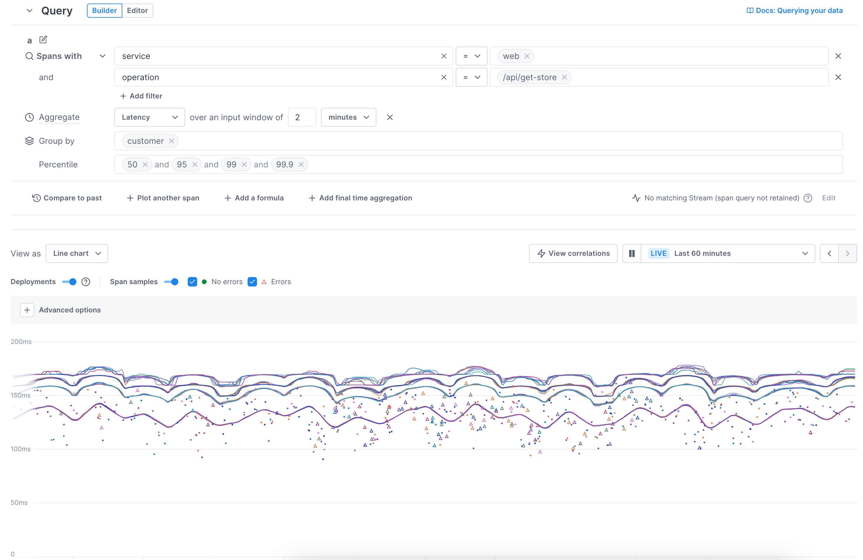
-
For latency charts, the 50th, 95th, 99th, and 99.9th percentiles are added by default. You can delete any you don’t want and add others by typing the value in the field (no
%needed). For alerts, you can have only one value to alert on. -
Click Save to save your chart.
The result of the query displays in a chart below the query builder.
By default, the chart shows lines for each series (group-by), and dots for sampled spans. Triangles represent spans that have errors.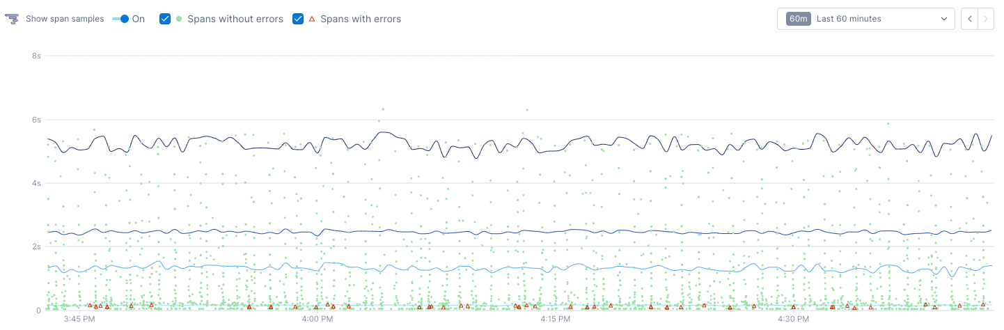
The chart’s Y axis is scaled to the resulting time series, which may mean that some outlier spans exist above the chart’s display. When this happens, you can view those outliers using the Resize y-axis toggle 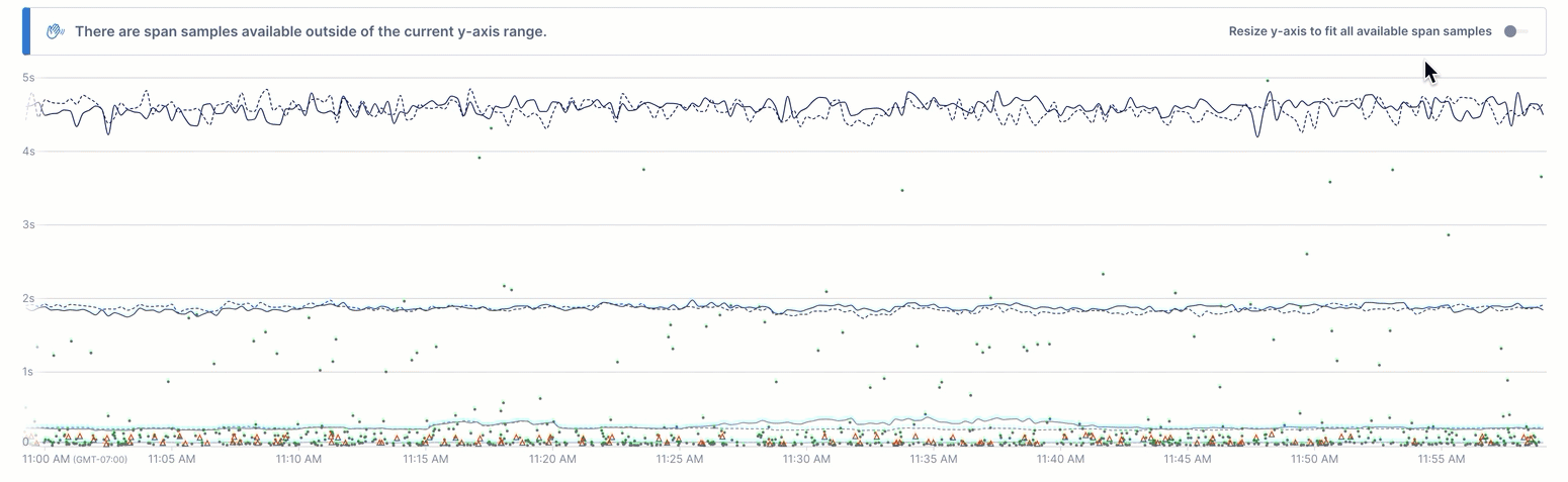
Spans are sampled intelligently to bias towards high latency and errors.
Use the Show span samples toggle to turn these off.
With span samples displayed, when you hover over a point, you can see the values for each group at the point. 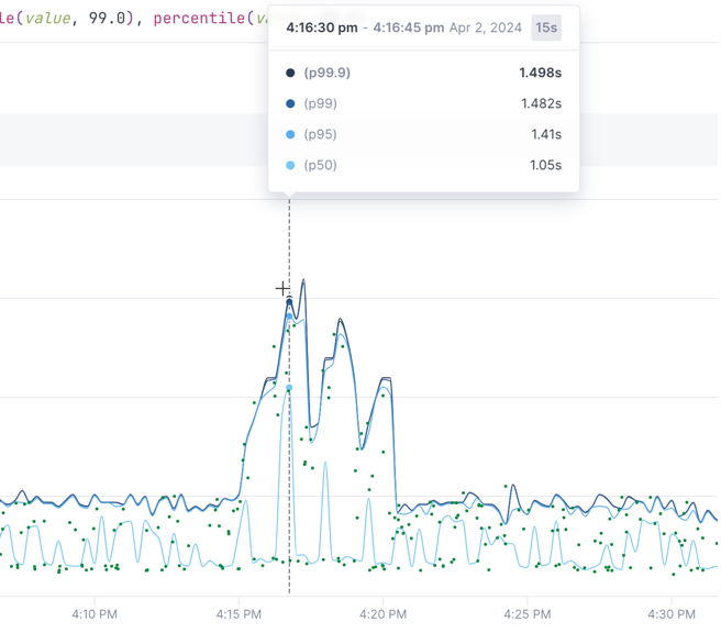
The shaded number in the header shows you the distance between points.
Clicking on a point allows you to start finding correlations or view associated logs to determine what may have caused the change in performance.
Below the chart, tables display details about the data. 
The Latency table shows latency details for each percentage.
The span examples table shows details for spans in the chart. Click on a row to open the span in the full trace view.
You can sort by any column in the tables.
Query latency thresholds
Instead of choosing a service, operation, or other attribute, choose latency, and operator (either <= or >=), and then a time duration.
The rest of the query accepts the same fields as a standard span query.
For example, say you want to see latency on the iOS service that’s over 5 seconds and grouped by customer. You would enter the following:
- Spans with: latency >= 5 second
- Filter by (and): service == iOS
- Group by: customer
Latency queries can’t be saved as Streams.
Query Cloud Observability-specific attributes
Cloud Observability has attributes you can use to query for specific spans or traces.
-
Search for a specific span ID
lightstep.span_idExample: Return span with the ID
1a2b902a0ff1a9e3You can find the span ID in the Trace view
-
Search for spans from a specific trace
lightstep.trace_idExample: Return spans that are not included in a trace with the ID
bd1285b6af0acd8dYou can find the trace ID in the Trace view
-
Search for spans sent by a specific tracer
lightstep.tracer_idExample: Return spans from the tracer with the ID
cebd0875ab -
Return a distribution of bytes
lightstep.bytesizeExample: Return the 99th percentile of bytes sent to Cloud Observability by service
spans lightstep.bytesize | delta | group_by [service], sum | point percentile(value,99) -
Search for spans that have no parent
lightstep.is_root_span:
Add a final time aggregation
Once you’ve filtered and grouped your data, or added a formula, you may find it necessary to include a final time aggregation. The final aggregation takes all the values into account over the specified time period, and further smoothes the data.
Choose the aggregation operation (min, max, or mean) and then set the rolling input window. The final input window must be larger than the input windows set on individual queries.
For span queries, if the input window is longer than your data retention period, there will be a 10-minute delay before the time series is plotted.
Another time you may want to use the final aggregation is for data that may cause flappy alert. For example, say you set an alert to be sent when the rate of requests is over 2,300, and you set the initial input window to two minutes (because you want to smooth out super short spikes). There may be cases where during a two minute period, it does cross the threshold but then goes below it immediately after, multiple times, leading to your alert notifications flapping. If you set the final aggregation window to 10 minutes, the alert will still trigger within 2 minutes and will remain open for at least 10 minutes.The alert remains open until there has been a 10 minute period where the metric has consistently been under the threshold.
Add multiple queries to a chart
You can add more than one query to a chart. For example, you might want to show the request rate for iOS and Android on one chart.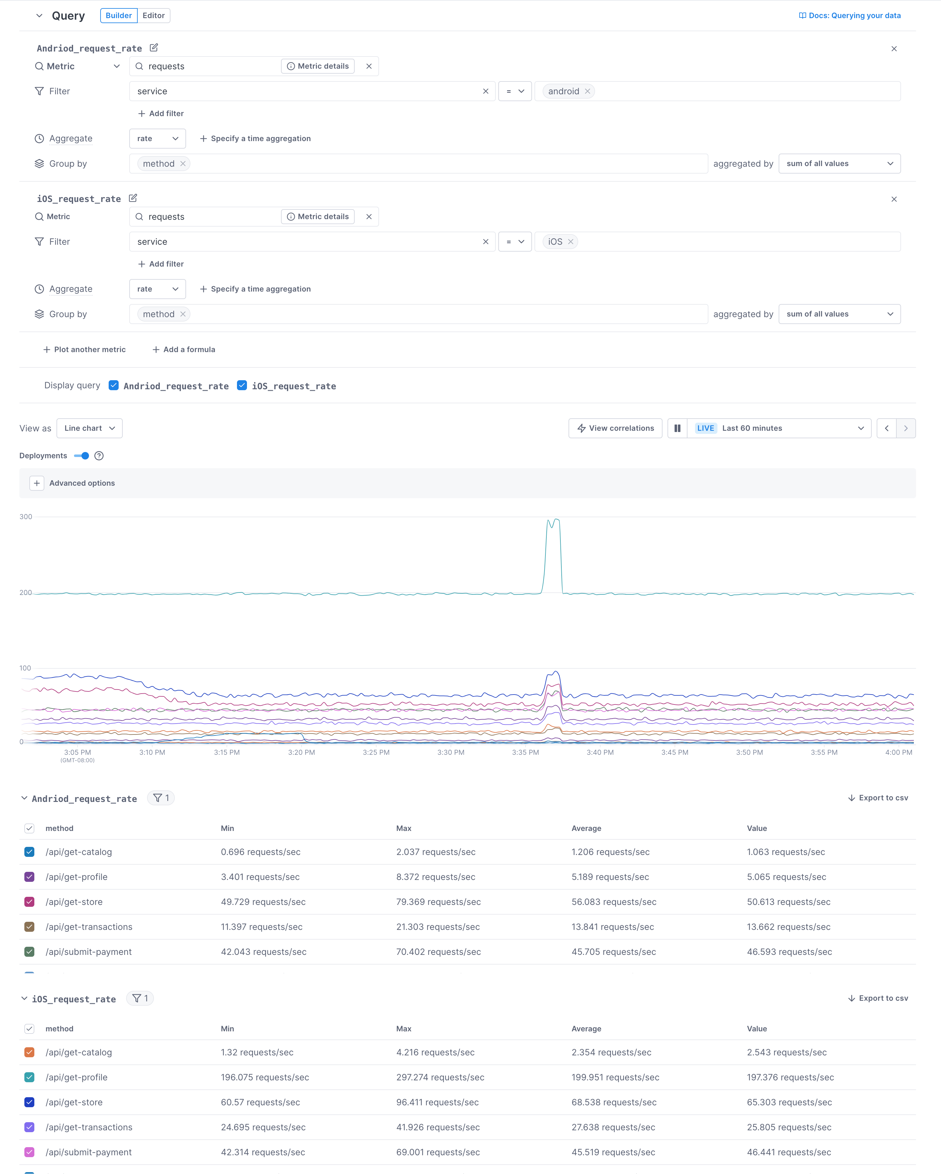
For alerts, if you add more than one query, you must join them with a formula.
By default, queries are named alphabetically (a, b, c, etc). Click the Edit icon () to give your query a meaningful name.
To add a query, click Plot another metric or Plot another span and build your query as you did the first one.
When you have multiple queries, you can edit the chart so only certain time series display. For example, in this chart, only the timeseries for metrics from the iOS service is displayed. 
Once you save the chart, this display toggle is persisted to the chart in the dashboard.
You can delete a query by clicking the X for that row. When you do, the remaining queries retain their order (for example if you deleted b, the remaining queries are a and c). If you then add another query, it uses the order that was deleted. If you continue to add queries, the order continues down the alphabet from the “highest” letter. 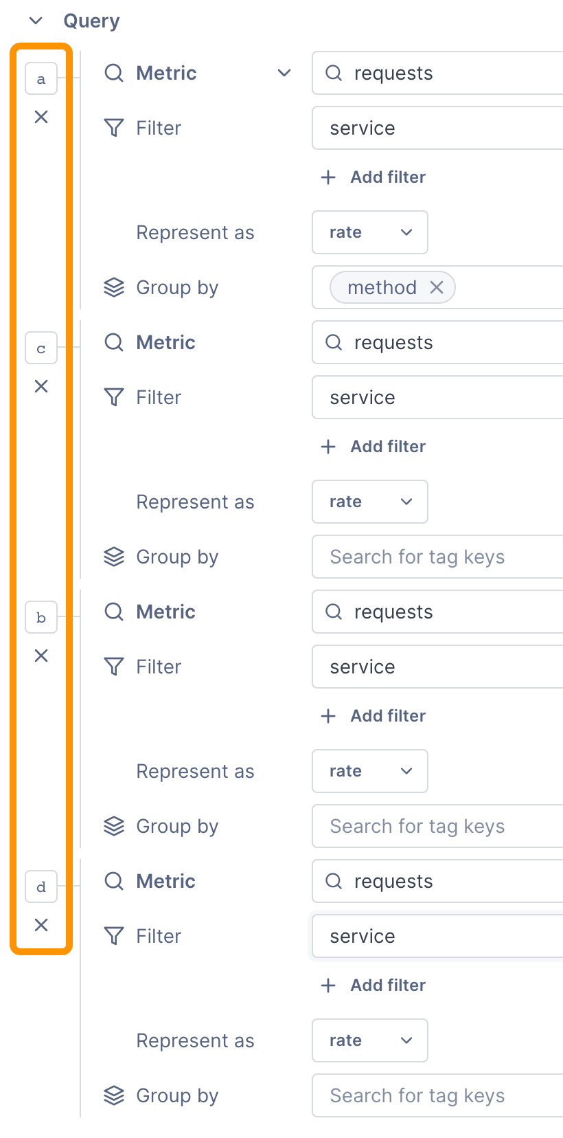 In the above example, three queries were originally plotted:
 a, b, and c. The user deleted b, so the next query plotted used b. When adding another query, the order continued to d.
If you want to use a big number metric chart with more than one metric, you need to combine them using a formula (big number charts can only display a single value).
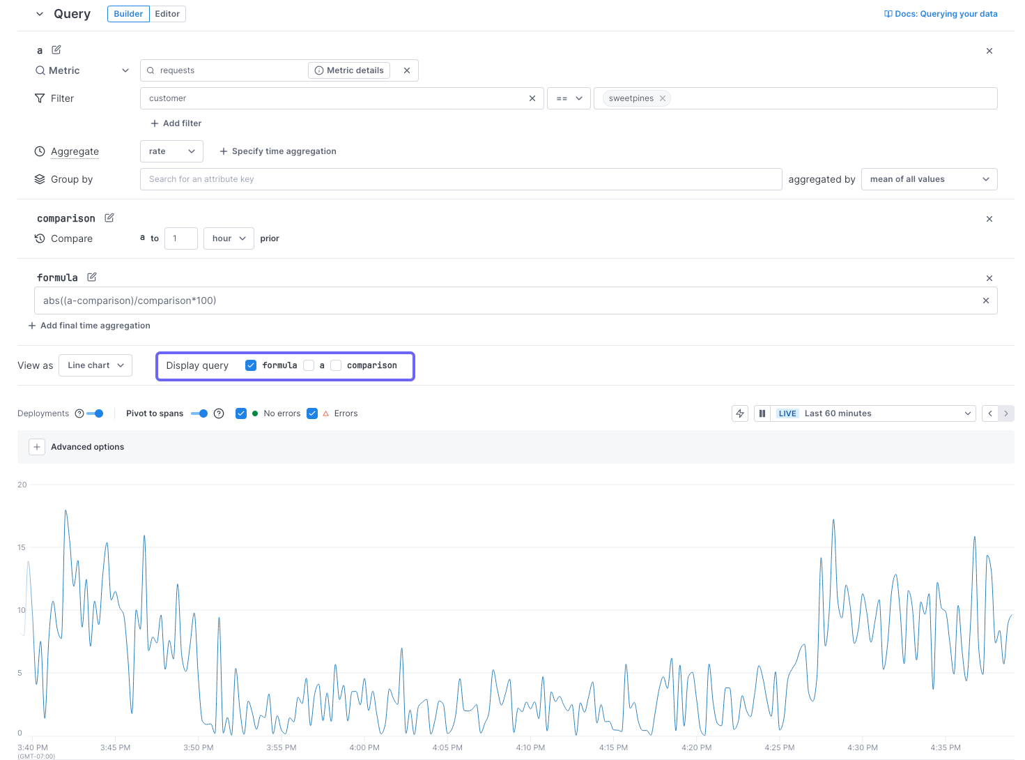
Compare current data to past data
The UQB lets you visualize changes in your data over time. With the Compare to past option, you can create charts comparing current data to data from the last minutes, hours, days, or weeks. Use this option to monitor and track system-health trends over time.
Follow these steps to compare data over time:
- In Cloud Observability’s UQB, select Compare to past.
- Next to Compare, enter the time range you want to compare your current data to. For example, data from the last 30 minutes or 1 week.
- View your data in the chart.
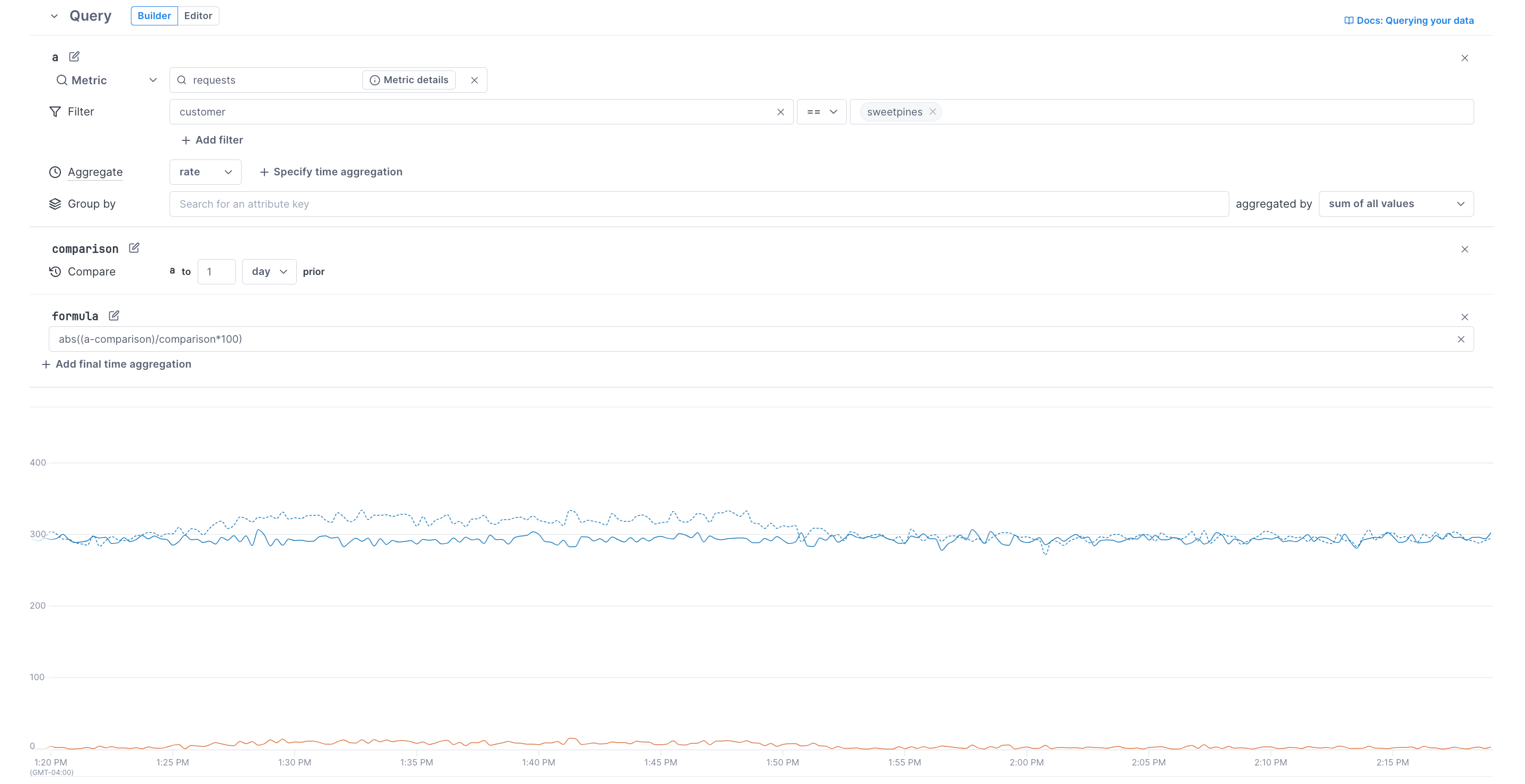
Cloud Observability plots two series in the chart:
- a is the solid line, showing recent data.
- comparison is the dotted line, showing data from the past.
You can also add formulas to do arithmetic on the two series. For example, the formula (abs((a-comparison)/comparison*100)) in the image below calculates the absolute percentage change between a and comparison. The chart visualizes the query results, showing all three series.
If you’re creating alerts, select the Change template to alert on changes in your data over time. Visit Create alerts for more information.
Add a formula to the query
For span queries, you must be using Microsatellites to add a formula.
You can perform arithmetic on a single time series or on multiple time series using Add a formula. For example you might enter a/(a+b) if you want to chart the percentage of the a metric to the sum of the a+b metrics.
Cloud Observability supports +, -, /, and *.
You must use * for multiplication. Implicit multiplication (for example, ab) is not allowed.
When using a metric that is a distribution type in a formula, you must select only one percentile.
If you’re performing the arithmetic on multiple queries, they must all be grouped by the same attribute.
You can edit the chart so only the formula is shown. For example, in this chart, only the timeseries for the result of the formula is displayed.
The toggle display doesn’t affect when the alert is triggered. Alerts are triggered only on the result of the formula
 Once you save the chart, this display toggle is persisted.
Considerations for alert queries
When creating queries for alerts, keep the following in mind:
- You must set an input window (unless using
latestfor aggregation). - When querying distribution metrics or latency on spans, you can select only one percentage to query on.
- If your query includes multiple sub-queries, you must use a formula to join them and create one output.
- Group-by isn’t supported in alerts.
- To include Regex in metric queries, you must be running this release or later of the Microsatellites.
- Consider adding a final time aggregation to prevent “noisy” alerts.
Troubleshoot query results
If your chart doesn’t look as expected, it may be because of one of the following:
-
The No data found message displays when Cloud Observability can’t find a metric or span attribute key (service, operation, or attribute) by that name. Ensure you are using the right name in the query.
-
The No data found message also displays if you’re using the wrong time series operator for the metric kind.
The
latestoperator can only be used with gauge metrics. -
If no data displays and there’s no No data found message, then Cloud Observability found the metric or span attribute key, but had no data to display
-
When adding a formula over multiple queries, they must all be grouped by the same attribute.
Visualize your data
Once you’ve completed your query, depending on the type of data, you can choose from a number of different visualizations.
Data retention
Data retention depends on the data type:
-
Logs are queryable for 3 days by default.
You can change that value or query older logs by rehydrating logs from cold to hot storage.
- Metrics are queryable for 13 months.
- Span retention depends on the feature:
- For notebooks, spans are retained for your retention window length.
- For dashboard charts, you can retain the data longer by creating it as a Stream.
- For alerts, span data is always saved as a Stream.
Learn more about data retention.
See also
Understand data retention in Cloud Observability
Updated Mar 7, 2024