
Once you create a query you can use panels to visualize that data in notebooks, dashboards, and alerts (alerts only support line charts). You can also adjust the Y axis for a chart.
Visualization types
This page lists and describes Cloud Observability’s visualization types.
Alerts list
Available in dashboards for alerts on logs, metrics, and traces.
Displays alerts and their statuses in a sortable table. Use alerts lists to view specific alerts and track system health in dashboards.
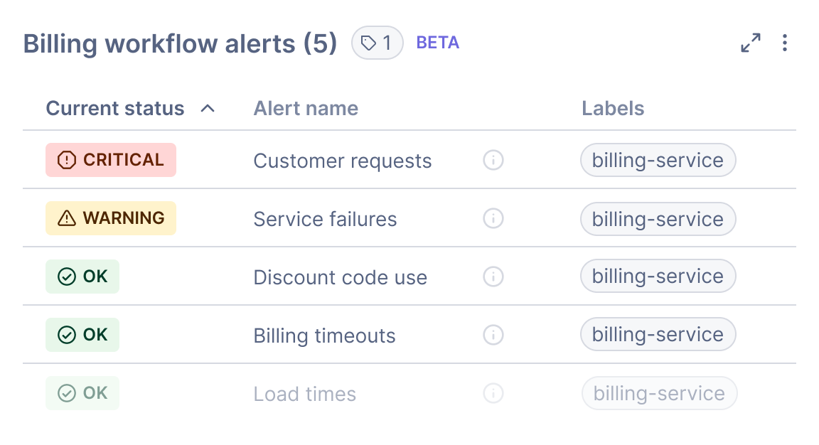
Follow these steps to create alerts lists:
- In a dashboard, click + Add > Alerts list.
- Configure the list:
- Enter a title.
- Filter alerts by label. You can include or exclude labels, and you can combine filters with or and and.
- Sort the list by column and in ascending or descending order.
- Click Save to return to the dashboard.
- On the dashboard, view the relevant alerts and their statuses. To learn more about an alert and its configuration, click an alert.
Alerts lists don’t yet work with these dashboard features: time picker and template variables.
Area chart
Available for metrics and logs in dashboards and notebooks.
Displays a shaded area for the value. Area charts are helpful when you’re charting more than one metric.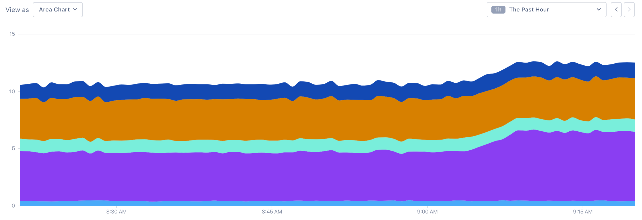
Bar chart
Available for metrics and logs in dashboards and notebooks.
Displays a bar for the value at a given time point. Bar charts are good for displaying discrete values, like the number of requests.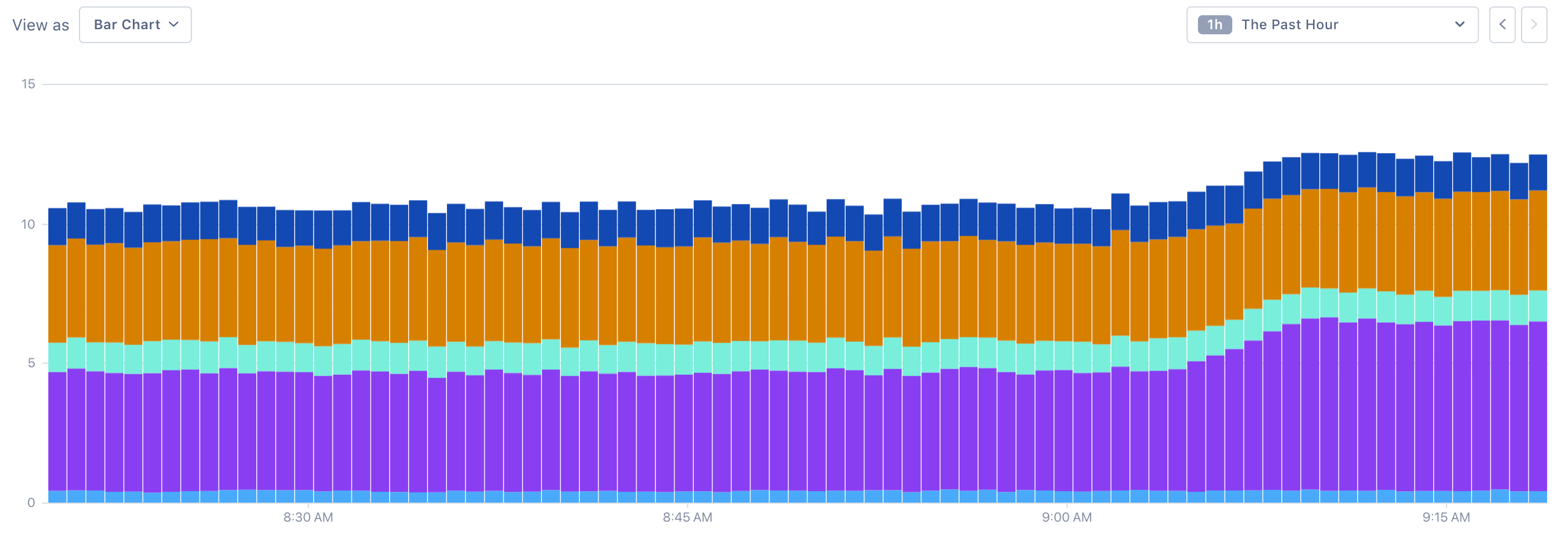
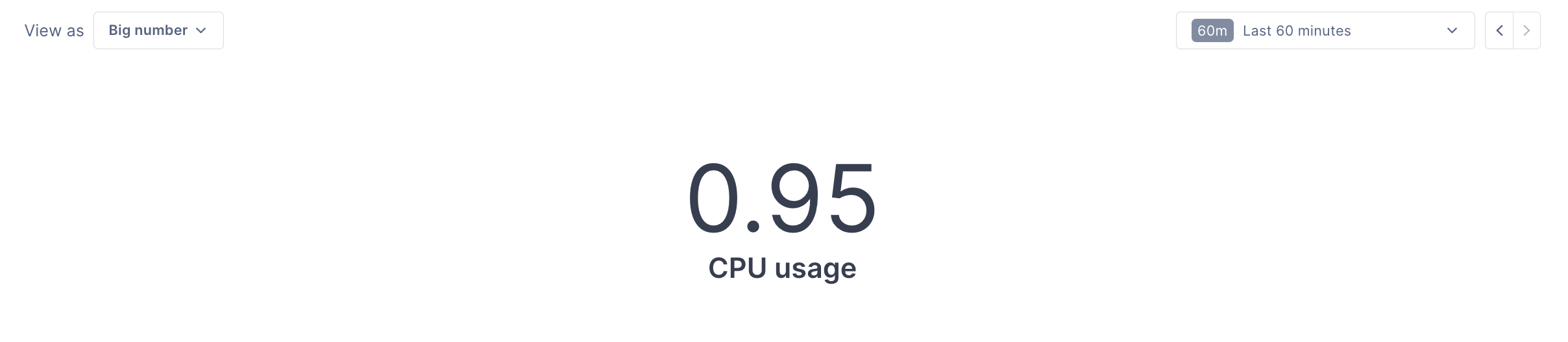
Big number
Available for metrics in dashboards and notebooks.
Displays an aggregated value over time as a number. Big number charts are useful when you only need to know the current value of a metric and don’t expect to investigate any changes. When creating a big number chart, note the following:
- Click under the number to add a subtitle.
- Because a big number chart displays a single value, you can’t group by an attribute. If you use more than one metric for your chart, you need to combine them using a formula.
Dependency map
Available for spans in dashboards and notebooks. Multiple queries aren’t supported.
Displays a map showing services (and optionally operations) dependent on the queried data. You can query on services, operations, and other attributes.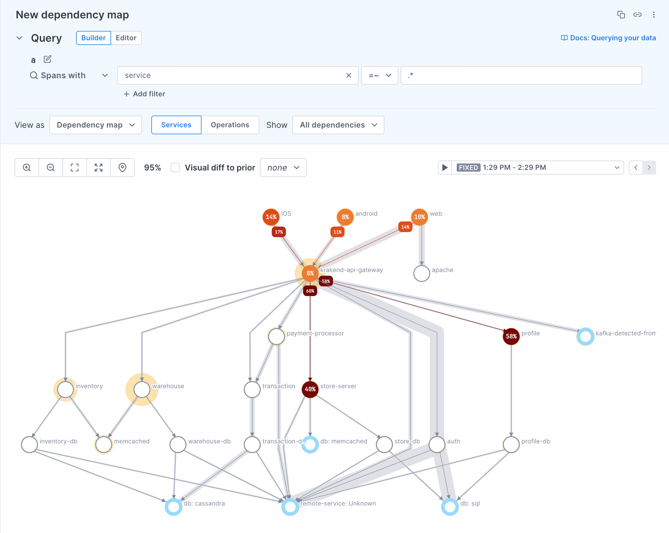 Learn more about dependency maps.
Gauge
Available for all data types
Gauges are enhanced big number charts that show you how close to a target value the data is. For example, you may want to keep track of memory usage using a gauge chart. You might set four thresholds so that a value under 25% displays as OK, up to 50% displays as fair, up to 75% displays as warning, and anything over 75% displays as critical. 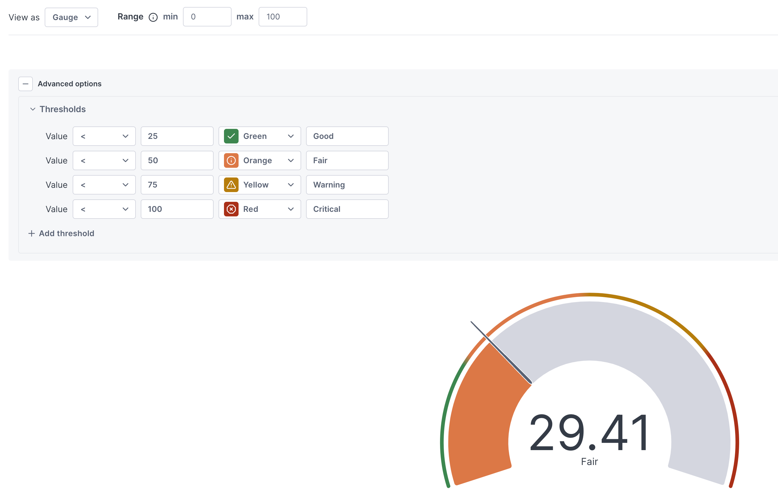
The min and max values for the range are set by default based on the range of data returned. You can override this by setting values for the range.
See Conditional formatting for procedures for setting threshold colors and text.
Heatmap
Available for span latency and distribution-type metrics in dashboards and notebooks. Multiple queries aren’t supported.
Heatmaps allow you to see the distribution of values over time. Unlike a line chart, you can see the number of data points for a particular value, at a particular point in time. Color saturation in the map represents the amount of data points - the darker the color, the more data points for that value, at the point in time.
For example, in the following heatmap, you can see that there are 300 points with a value between 500ms and 600ms around 9:10 am. 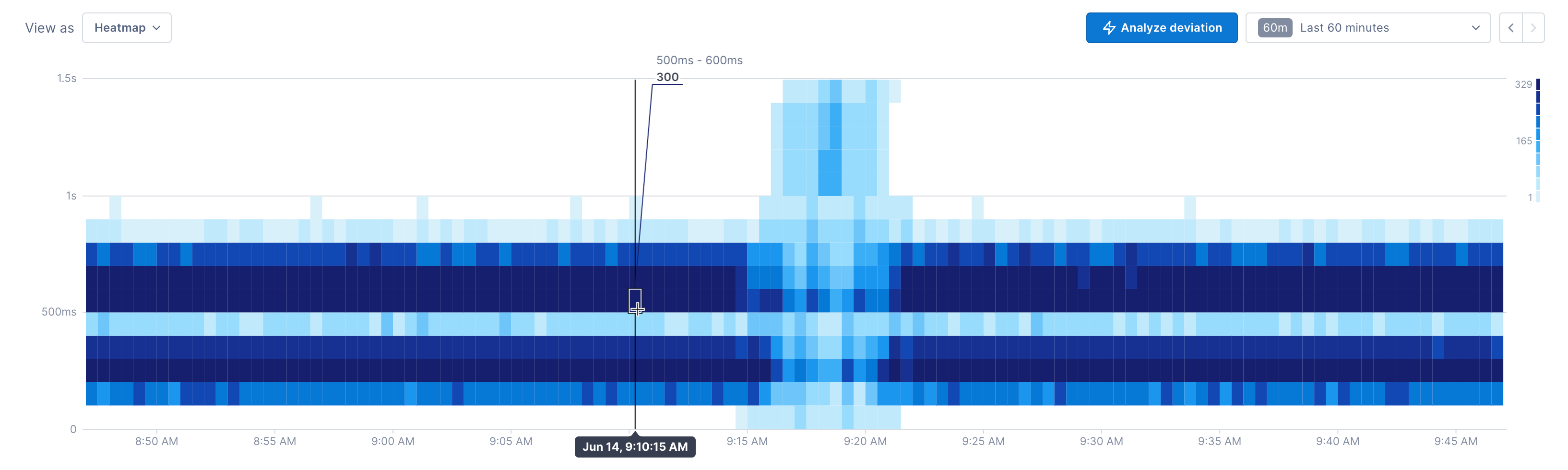
But starting at around 9:18 am, the distribution of data points shifts. There are now a number of points in the higher range of latency and fewer data points at the lower range (many of the dark blue cells changed to a lighter blue). The legend on the right shows the range of color values.
Line chart
Available for all data types.
Displays a line that connects the charted values.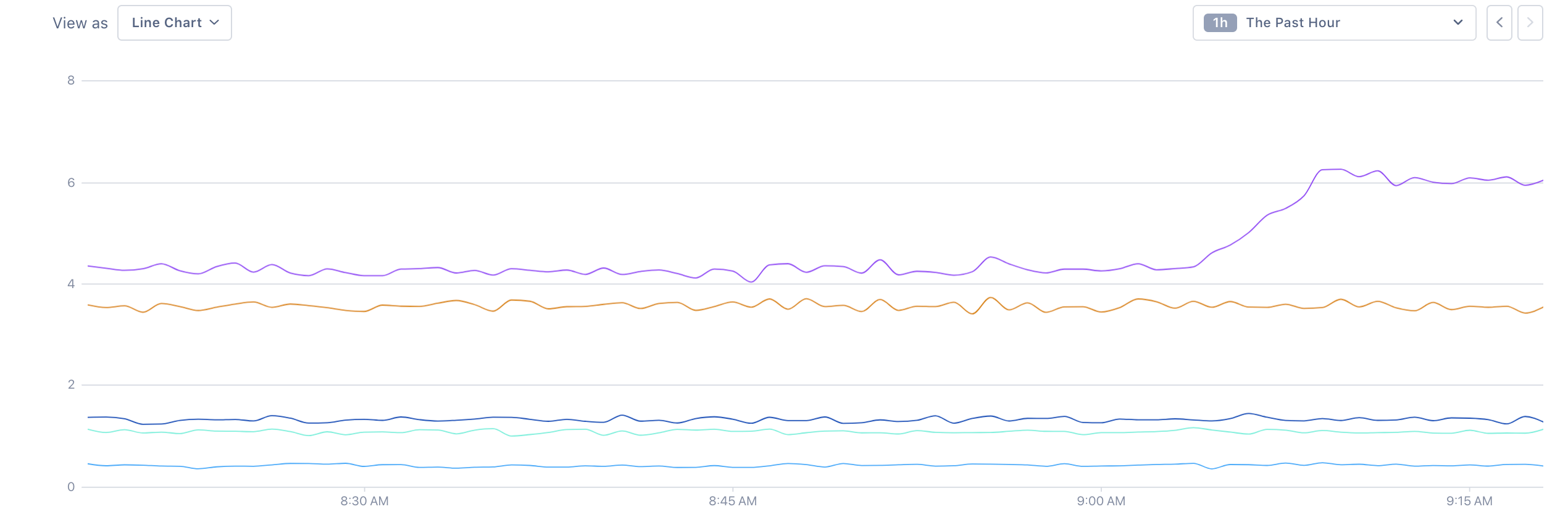
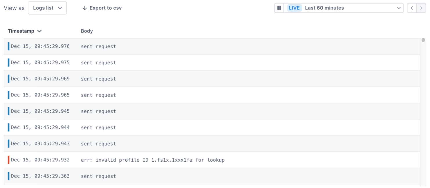
Logs list
Available for logs queries in dashboards and notebooks.
Displays individual logs matching certain conditions.
Logs lists show timestamps and body values of up to 1000 logs.
To get more information about a log, click the log to open the Log details panel. The panel shows the log’s attributes in tabular and JSON format. You can also use the panel to open linked traces and see logs in context.
Ordered list
Available for all data types in notebooks and dashboards. Multiple queries and formulas are not supported.
The ordered list chart displays the results of your query in descending/ascending order of value using a bar graph. The highest value is shaded to 100% and subsequent values are shaded to a relative percent. Use the Sort by dropdown to change the sort order. Click the time series icon to copy a row’s query to a notebook where you can view span samples and start your investigation. 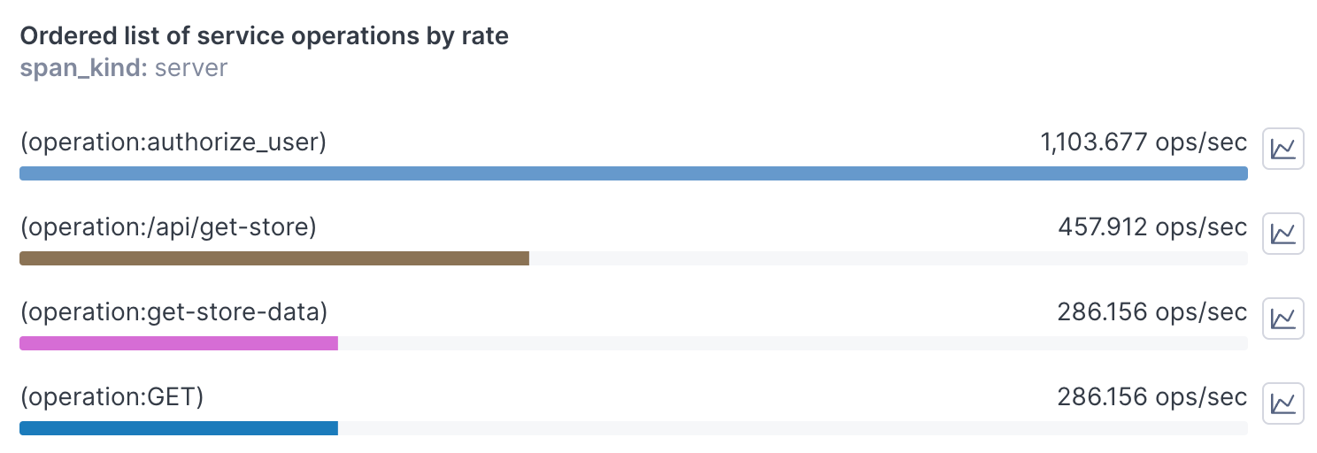
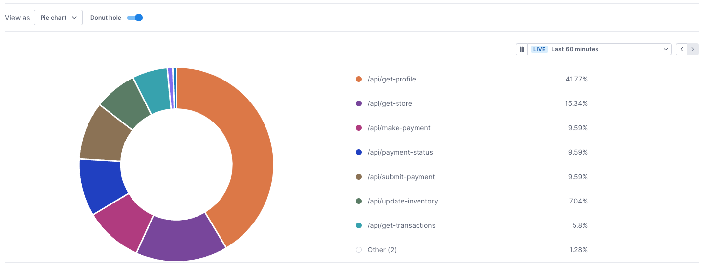
Pie/donut chart
Available for all data types in notebooks and dashboards. Formulas are not supported.
The pie chart displays the result of a query in proportional values that fill up a circle. A legend shows the colors assigned to each value in the chart (the legend may only display when you expand the chart if there isn’t enough room).
You can display a pie chart as a donut chart by activating the Donut hole option.
Scatter plot
Available for spans_sample queries in dashboards and notebooks. Scatter plots don’t support multiple queries.
Scatter plots display spans_sample results, visualizing spans and the traces they come from.
In the example below, the query returns spans from traces where at least one span has operation == GET.
The scatter plot visualizes the results:
- Green points are spans without errors.
- Red triangles are spans with errors.
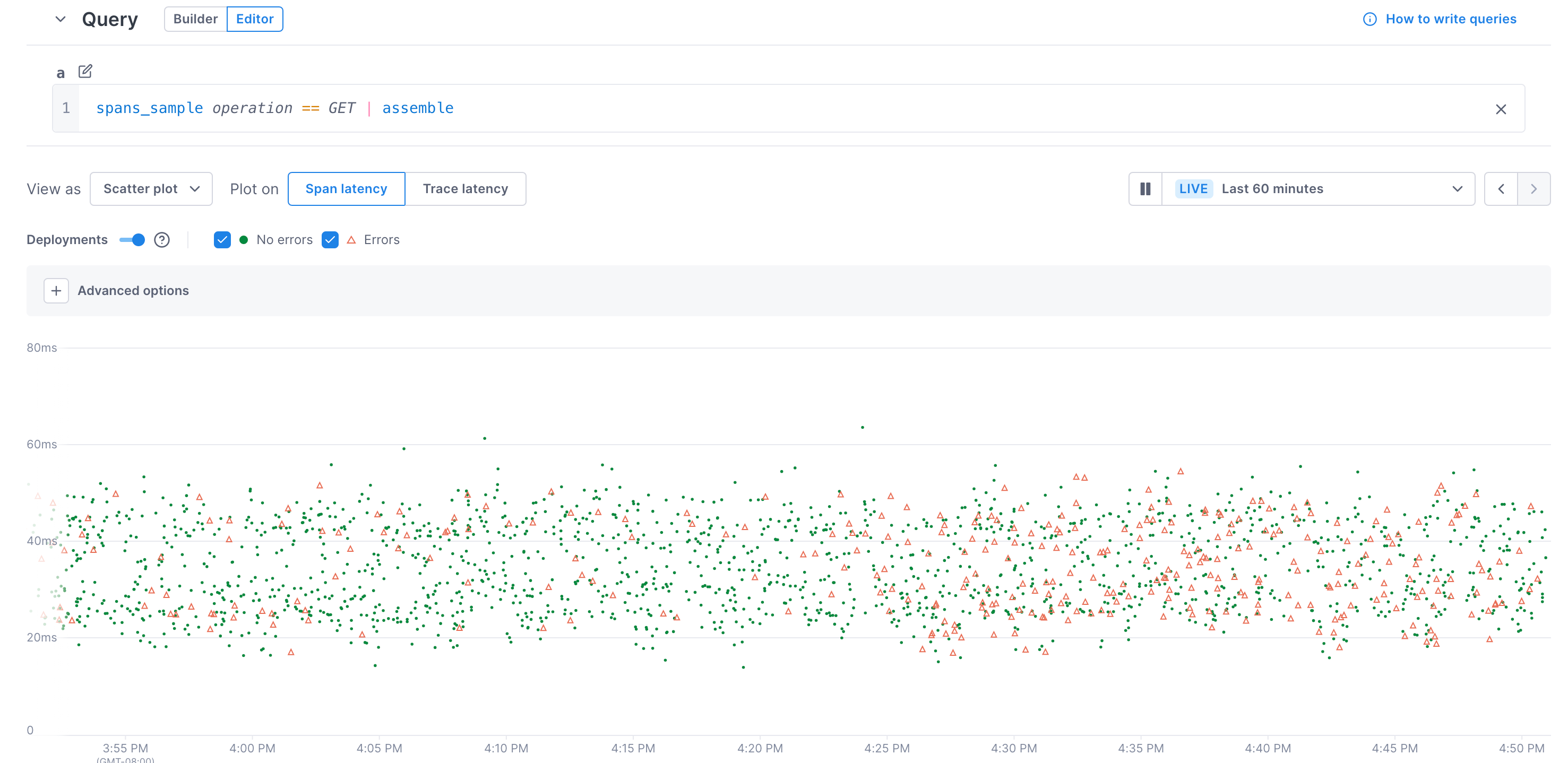
Visit Use scatter plots and UQL reference to learn more about spans_sample queries and scatter plots.
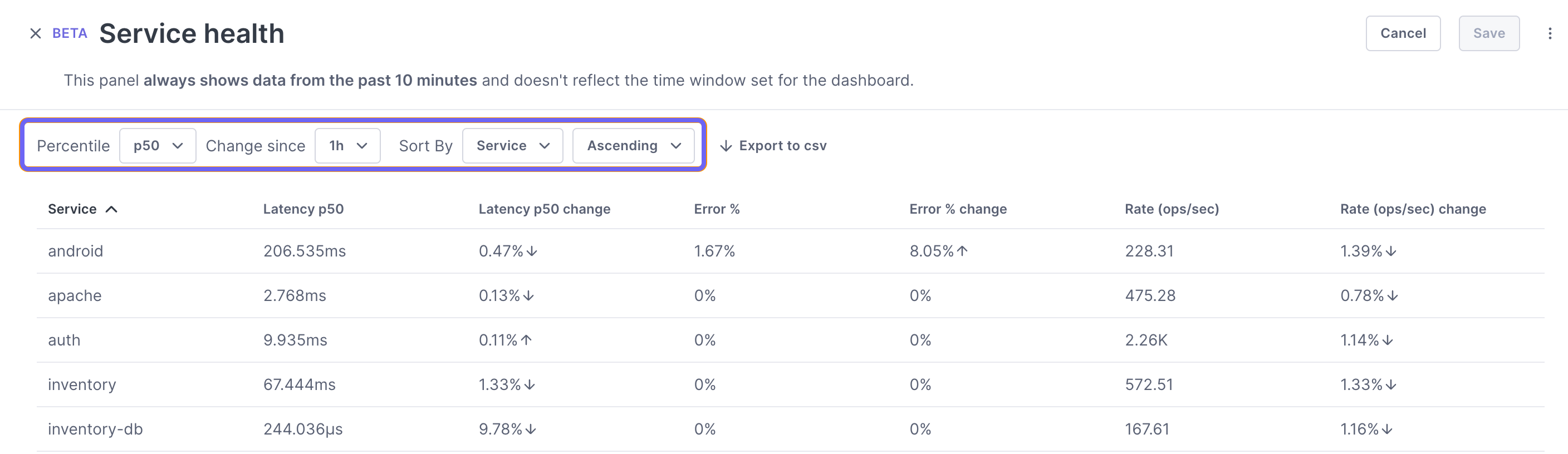
Service health panel
The Service health panel is currently in Beta.
Available for span data emitted by services. Queries aren’t supported.
The Service health panel displays performance SLIs emitted from services. Unlike other visualizations, you don’t use a query to create the panel. Any service emitting relevant span data appears in the table.
By default, the panel lists the services alphabetically and shows the p50 latency, error, and rate for each, along with the percentage change in those SLIs over the last hour. You can change the latency percentile, the time period, and the sort order.
The Service health panel always shows data from the past 10 minutes and doesn’t reflect the time window set for the dashboard.
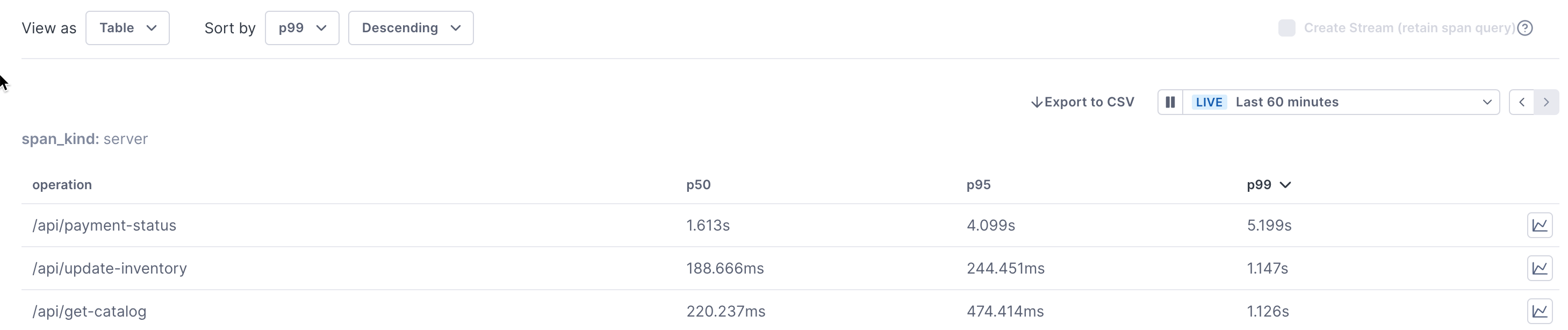
Table
Available for all data types. Multiple queries and formulas are not supported.
The table panel shows your data in a tabular format, similar to the table shown below each chart in notebooks and the expanded chart view in dashboards. Tables are useful when your query includes a group-by. Use the Sort by dropdowns to change the attribute to sort by or to change the sort order. Click the time series icon to copy a row’s query to a notebook where you can view span samples and start your investigation.
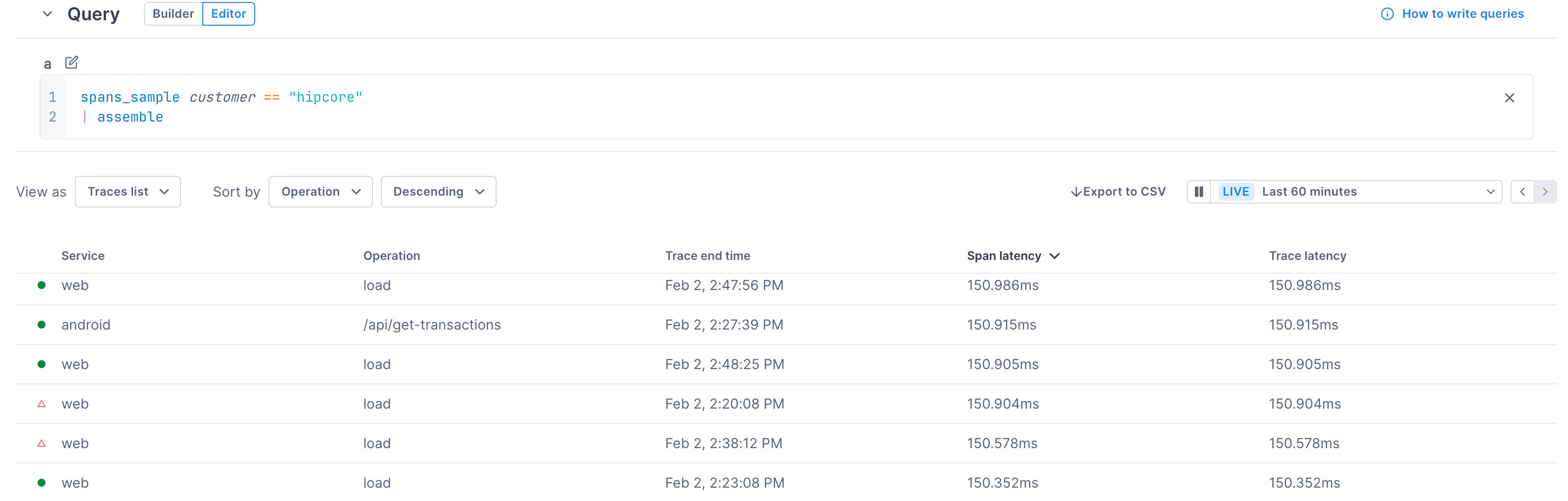
Traces list
Available for spans_sample queries in dashboards and notebooks. Traces list doesn’t support time aggregation, group-by, or percentiles.
The traces list panel shows you sample spans from traces returned by your query. Use this panel when you want to be able to quickly choose a problematic span and view it in the Trace view.
Use the Sort by field to set a global sort order (users can change this locally using the column headers to sort).
Click a span’s row to view the span in the Trace view.
In the example below, the query returns spans from traces where at least one span has customer == "hipcore", sorted by Span latency.
- Green circles are spans without errors.
- Red triangles are spans with errors.
Trichart
Available for spans in dashboards and notebooks.
Displays latency, rate, and error percentages, all on one chart. This set of metrics is considered the most helpful in understanding the overall health of microservices.
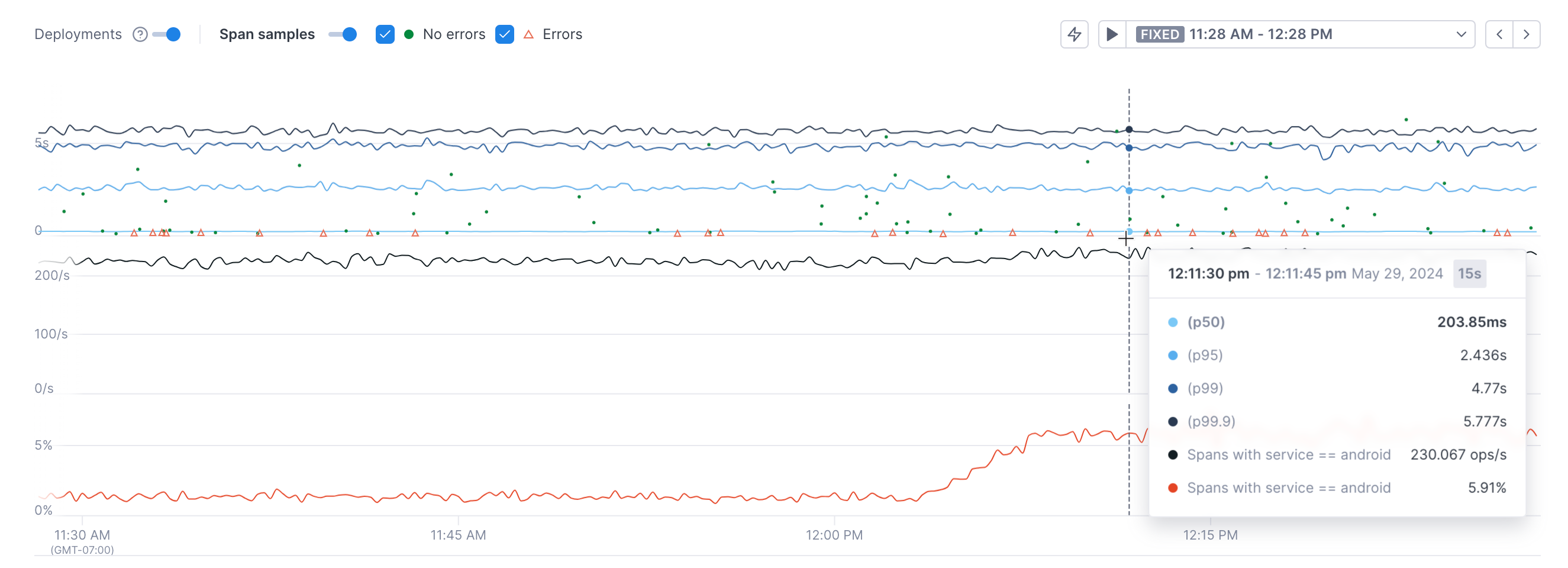
The blue series at the top show the p50, p90, p99, and p99.9 latency. The middle black line shows the rate and the bottom red line shows the error percentage.
If you switch from the query builder to the editor, you’ll lose your query if you switch back to the builder.
Conditional formatting
Available for line, area, bar, table, gauge, and big number charts in notebooks and dashboards
You can set thresholds on charts to provide a visual clue when a value crosses a given value. Once configured, a colored border displays around the chart. This makes it easier to understand when a chart requires your attention.
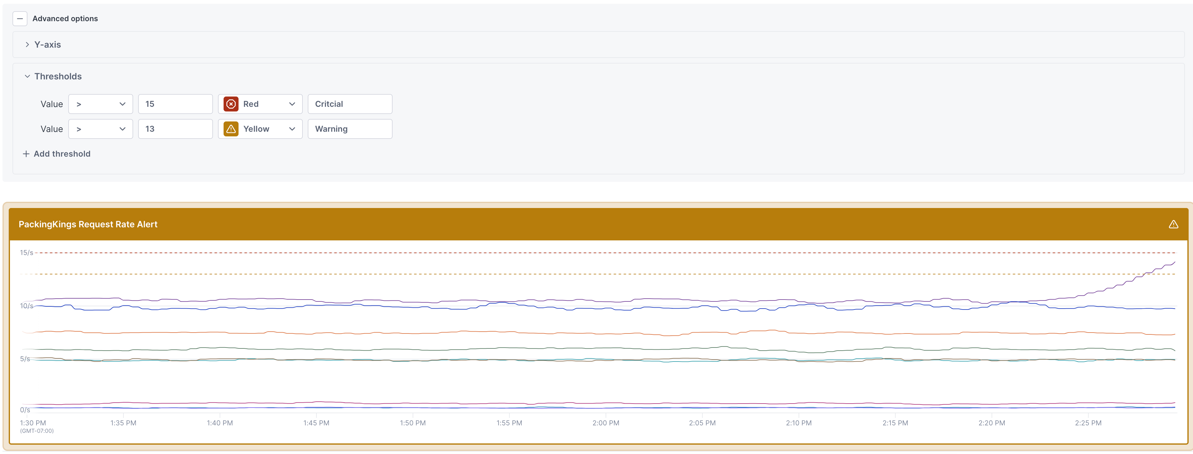
If your chart contains multiple time series and you only want a subset of those to trigger the threshold, hide the remaining time series.
When you copy an alert with thresholds to a notebook, those thresholds are added to the chart. This allows you to monitor the status of an alert without having to navigate to the alert itself.
When you copy a line chart with thresholds to an alert, the alert’s thresholds are set to match the chart’s thresholds, as long as you’ve selected Red (critical), Yellow (warning), or Green (ok). Other thresholds are ignored.
To set a threshold on a chart:
-
From a chart in a dashboard or notebook, expand Advanced options > Thresholds section and select Add threshold.
-
Select an operator and enter the threshold value. Select a color to display the threshold and the border on the chart for when the threshold is crossed and an optional text description.
If you copy this chart to an alert, only the Red, Yellow, and Green color options are used to create alert thresholds. All other thresholds are ignored in an alert
-
Optionally enter text for the status.
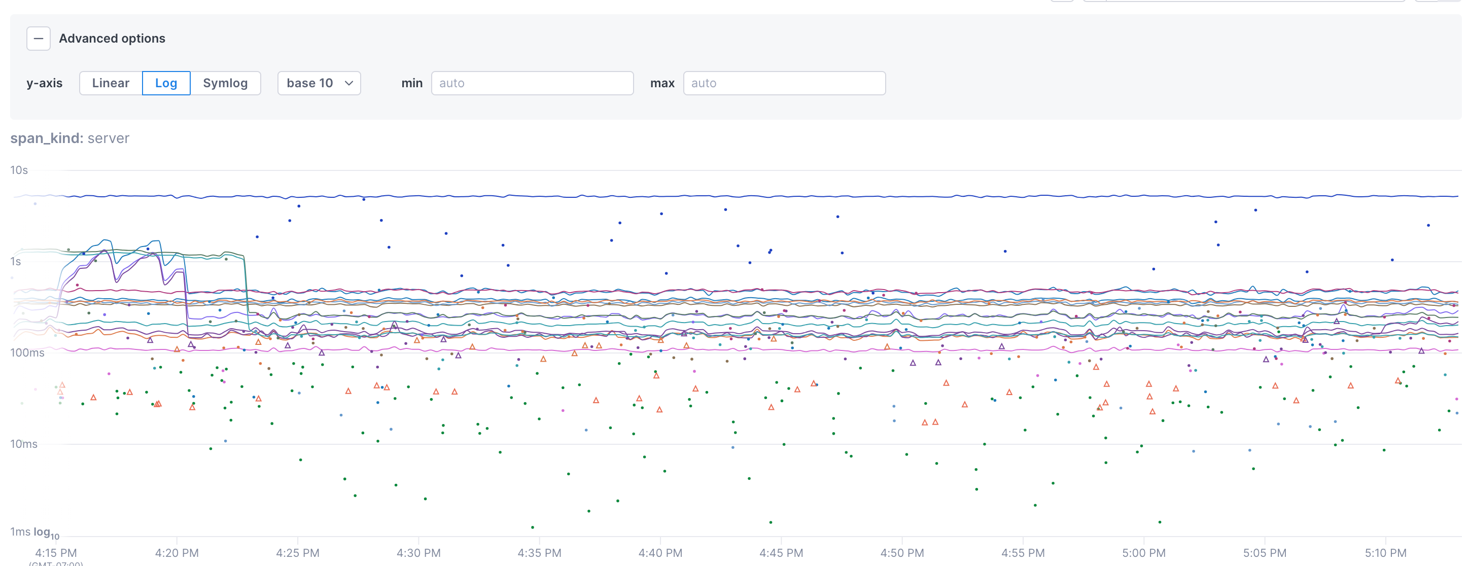
Adjust the Y axis scale
By default, the Y axis for charts uses a linear scale. You can instead use logarithmic (log) or symlog scales. You can also set the min and max values for the Y axis.
Expand the advanced options section to change the scale.
- Linear: Value difference between points on the axis are the same.
- Log: Allows you to chose an exponential scale for the points on the axis (base 10 by default).
- Symlog: Allows the chart to display negative values.
See also
Updated Sep 19, 2024