
Dependency maps provide an aggregated view of span data across your system. They are drawn based on a sample of up to 1000 traces that match your query and selected time period.
Dependency maps provide a clear visualization of inter-service relationships and insight into the performance of distributed software. You can see services (and optionally operations) both upstream and downstream from the queried service and pinpoint services or operations that contribute to the latency of the request. They also allow you to easily visualize a complex system architecture, identify services or operations with errors, and quickly formulate or eliminate hypotheses.
Dependency maps are useful in the following situations:
- Identifying relationships between services and between operations on those services
- Visualizing error, rate, and latency contribution in your system
- Understanding how those issues are affecting services up and downstream
- Pinpointing the source of those issues
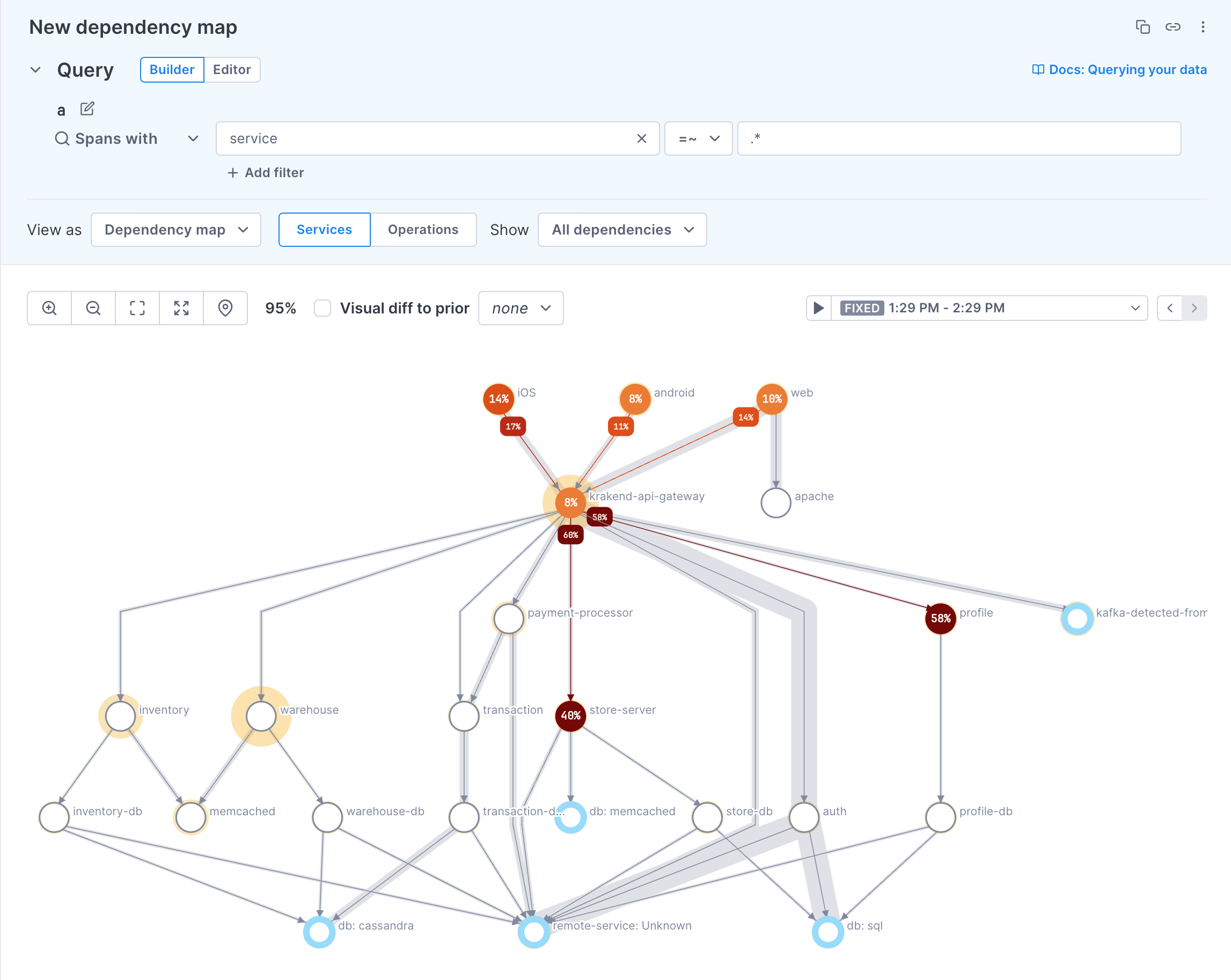
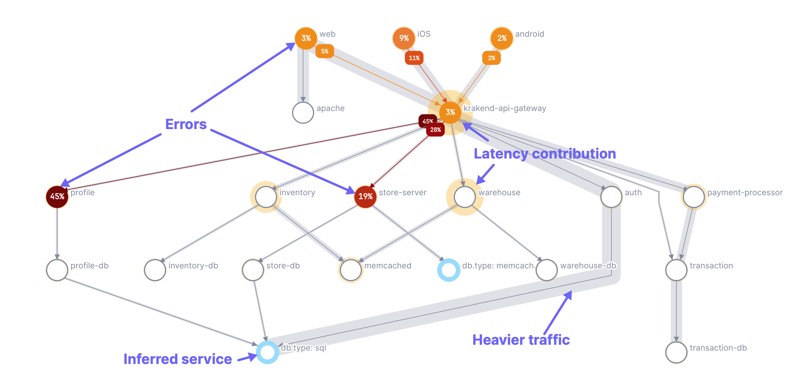
Dependency maps can also display inferred services. Inferred services are external services, libraries, or dependencies that haven’t been instrumented with traces, like a database or a third-party API. Cloud Observability checks leaf spans (spans that don’t connect to another instrumented service) against any inferred service rules you’ve configured. When Cloud Observability infers a service from those rules, it reports the that service’s error counts, span counts, and average latencies.
View the Dependency map
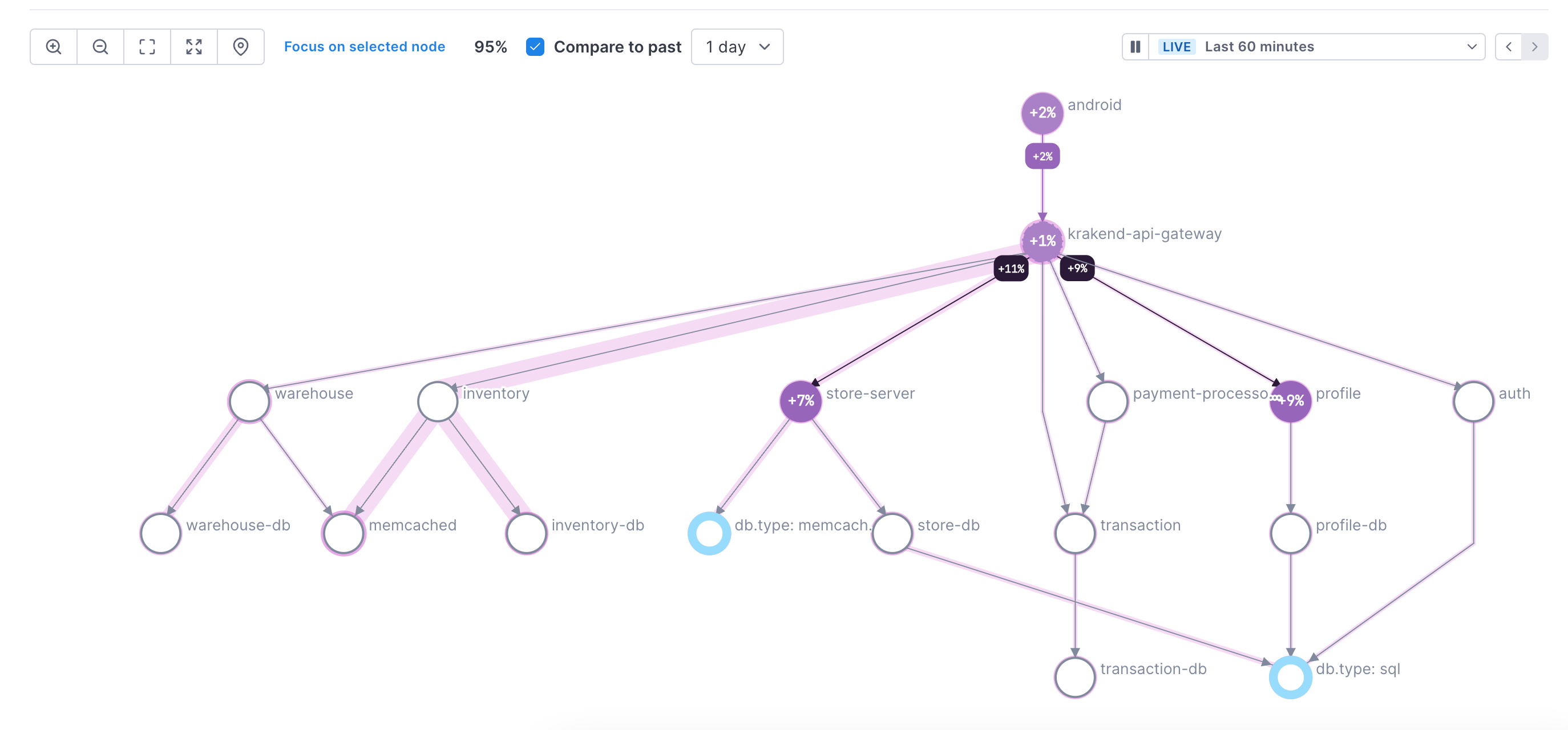
Each node on the map represents a service or operation in the path (you choose which to display in the UI). Each path shows the edge between two nodes.
The following annotations are used to describe system behavior:
- Orange-to-dark-red circles: Show error percentages; darker shades indicate higher error contributions.
- Yellow halos: Indicate contribution to the p50 latency; larger halos mean a higher contribution of latency to the critical path of the trace.
- Gray shading: Depicts the traffic between nodes (edges); wider shading represents higher traffic.
- Blue halos: Represent inferred services.
Hover over a node to view performance details for that node in a popup. Click View time series charts in notebook to add time series charts for the selected node to a notebook.
Animations show the request paths from the edges on that node to other nodes.
Hover over a path to view performance information for that part of the request.
Dependency maps refresh every 5 minutes.
Edges represent relationships between spans and is dependent on the quality of your instrumentation. Missing spans may cause edges to appear when there is no parent-child relationship.
The following can cause missing spans:
* The Collector or Microsatellite dropped the span (for example, your Microsatellite pool is not auto-scaling to keep up with traffic)
* The tracer dropped the span (for example, your application crashed or never called span.flush() )
* There is an issue with your instrumentation (context was dropped, or the service with a parent span is not instrumented).
When you see missing spans, check the Reporting Status page to find the culprit.
Add a dependency map
You can add a dependency map to a notebook or a dashboard, or from the Service Directory.
-
Add to a notebook:
Click the + icon and choose Add a dependency map. By default, the map is for your full system. -
Add to a dashboard:
Click Add and choose Dependency map. By default, the map is for your full system. -
Add from the Service Directory:
From the Deployments tab, click Create dependency map. The map is added to a new notebook and the query is filtered to the service and operation selected in the Service Directory.
You can edit the query as needed. Note the following:
- Queries can be on services, operations, or attributes.
- Queries can’t include an aggregation, group-by, or latency percentiles.
- You can’t use more than one query or a formula
Change the dependency map display
This image shows how to change the map’s display. The steps below describe the procedure in more detail.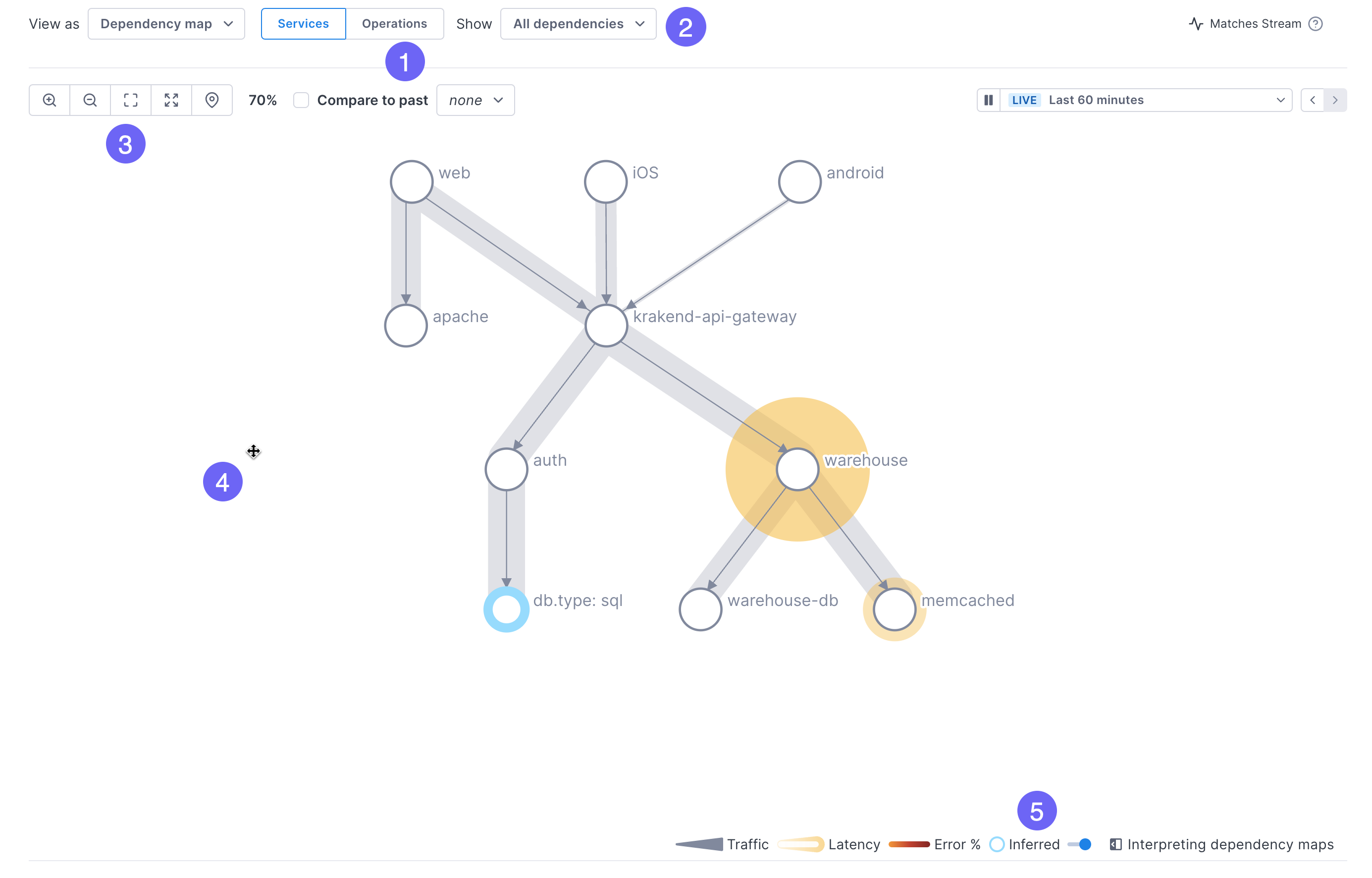
-
By default, the map shows relationships between services. You can change it to display operations by clicking the Operations button.
-
Also by default, the map shows all dependencies. Use the dropdown to view immediate, upstream, or downstream dependencies.
-
Change the size of the map:
- Zoom in and out (you can also use your mouse or track pad to zoom)
- Expand the map to fit the current container
- Open the map in full-screen mode
- Center in on a selected service
-
Move the map by clicking and dragging.
-
Toggle the display of inferred services.
Filter span table
Expand Span samples to view a table of spans used to create the map. You can filter the table to show only spans from a selected service or operation by clicking the node in the map. Return to the full set of spans by clicking Remove filter. You can also use the Search field or the checkboxes to filter the table. 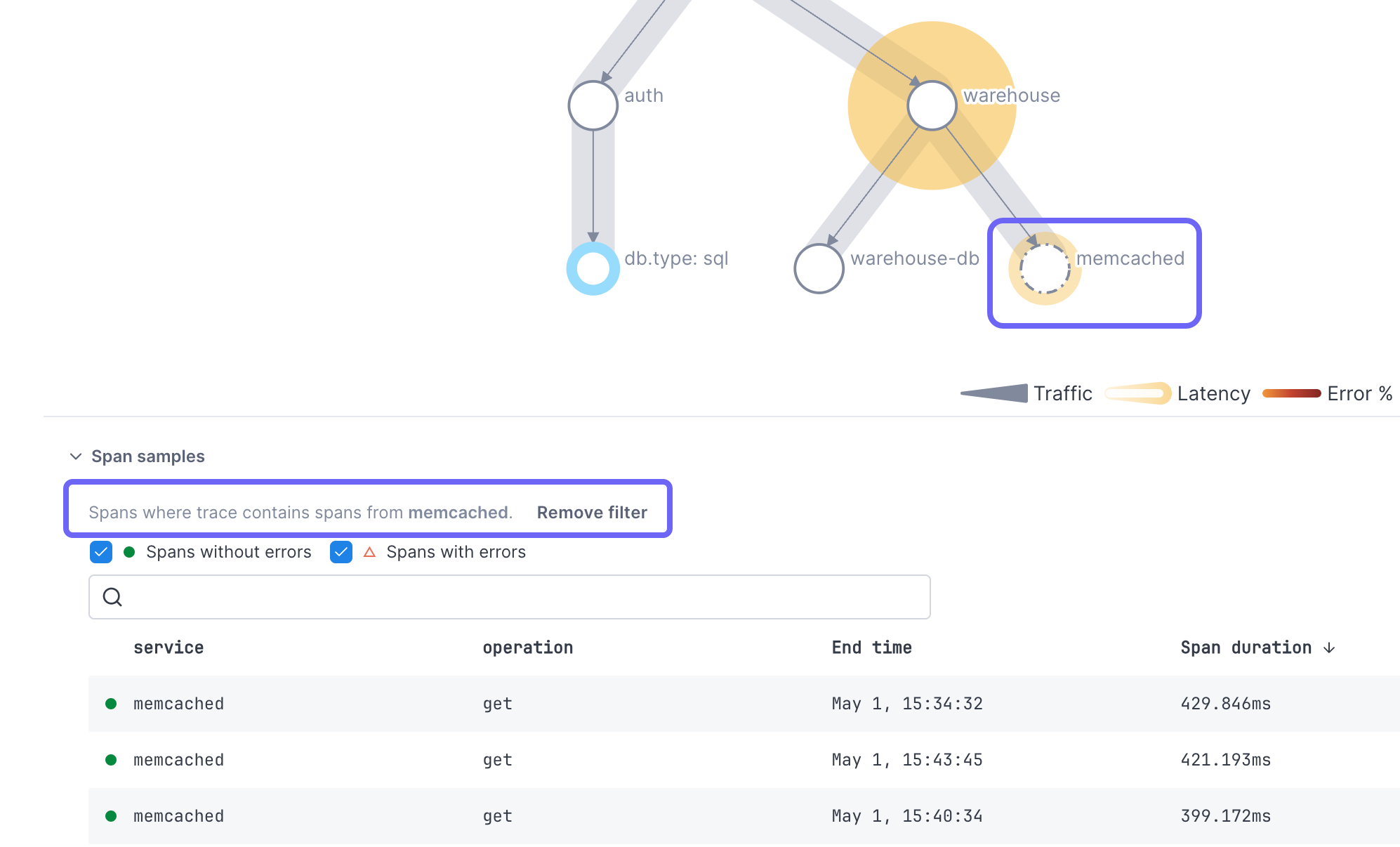
You can’t filter on inferred services.
Compare maps
Compare functionality is currently in Beta.
To compare performance against another time period, in the Compare to dropdown, select a time period from the past. The map redraws showing the difference in performance.
In the Comparison view, the annotations take on the following meanings:
- Error percentage: Reflects changes in error rates.
- Latency halos: Indicate chage in latency.
- Path shading: Represents changes in traffic between nodes.
Click on a node to view performance for both the current and comparison time periods. Click View time series charts in notebook to add latency, error rate, and operation rate charts for the selected node to a notebook.
Adding a node’s query to a notebook from the comparison view uses the current time period.
See also
Updated May 8, 2024