
Alignment is the process by which time series data points are aggregated temporally to produce regular, periodic outputs. If you try to plot a chart with millions of points, the sea of points may obscure important trends. By aligning your data before plotting it, you can tell a clearer story and more easily see anomalies.
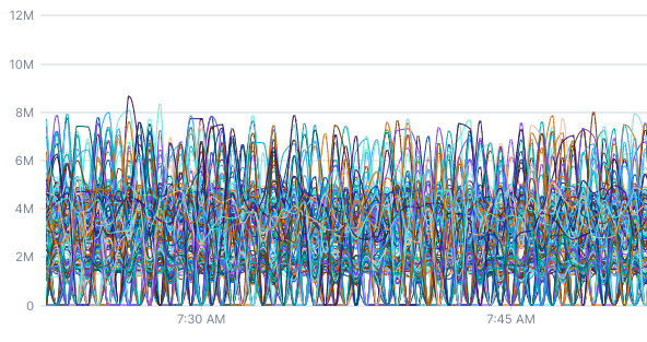
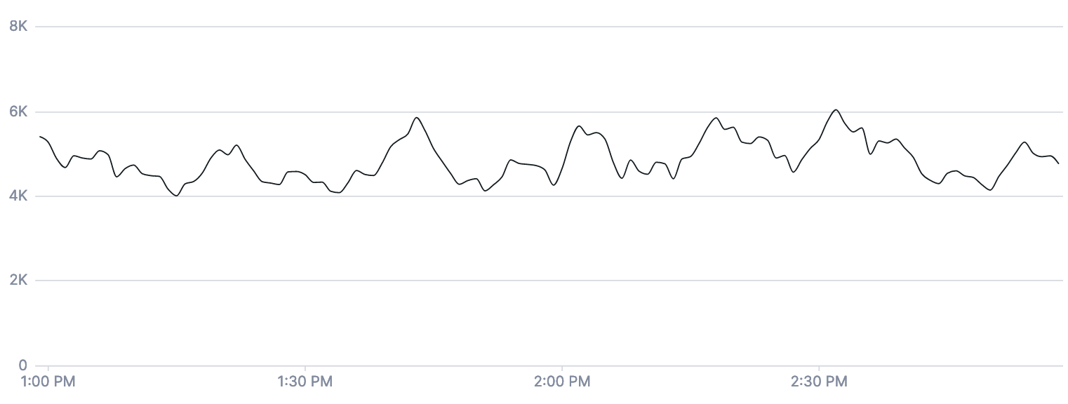
Imagine you have a server that reports network usage every 15 seconds, and you want to graph that system’s memory usage over the past week. Without some sort of alignment, you’d be looking at a crowded graph with over 40k data points on it. We run into this situation all the time at Cloud Observability! This chart is the “raw” data from our kubernetes.network.rx_bytes metric, which measures how many bytes have been transmitted by a Kubernetes container over the network. The raw data is so messy that it doesn’t provide much insight.
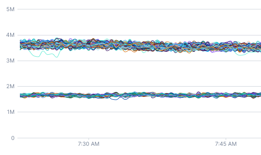
This chart also queries kubernetes.network.rx_bytes metric but has a 5-minute rolling average applied. By aligning the data, you can see that there are actually two distinct network usage patterns.
Before discussing alignment and how it works, it’s important to understand how Cloud Observability stores and displays metric data.
Metric kinds
Cloud Observability primarily stores two kinds of metrics data: gauges and deltas. Deltas are used to store the positive change in some value over a period of time. If you want to count how many requests have been processed by a server, you should use a delta metric. Every minute or so, your server would tell Cloud Observability something like: “I received 125 requests from 11:00am to 11:01am.”
Gauges are used to store instantaneous measurements. If you want to report the memory usage of a server, you should use a gauge metric. When it comes to memory usage, it makes the most sense to talk about how much memory the server was using at a specific instant.
The metric kind should help you determine what aligner you should use to temporally aggregate your data.
Span data
The count fetch type for spans produces a time series that can be thought of as a delta metric. Any aligner that can be used with a delta metric can be used with a time series produced by a spans count query. The latency fetch type produces a delta distribution, and you can use the delta aligner with this fetch type.
Log data
The count fetch type for logs produces a time series similar to a delta metric.
Because of that, logs count queries work with these aligners: delta, rate, and reduce.
Aligners
Aligners are used to aggregate points within an individual time series. They take a time series with irregular input and produce an output time series where points have consistent spacing. Cloud Observability supports the delta, rate, latest, and reduce aligners.
Delta
Imagine that you have a delta metric called requests which counts the number of requests made to a server. You can write the query metric requests | delta to produce a series of points where each point shows the number of requests that occurred between this point and the previous point:
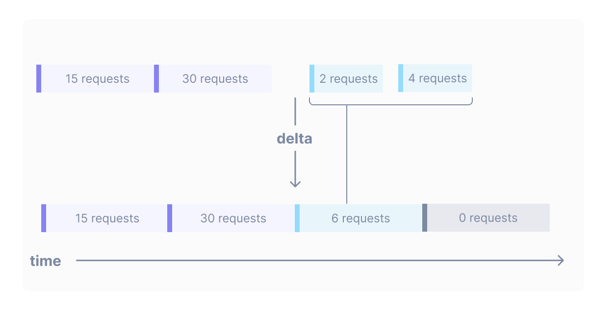
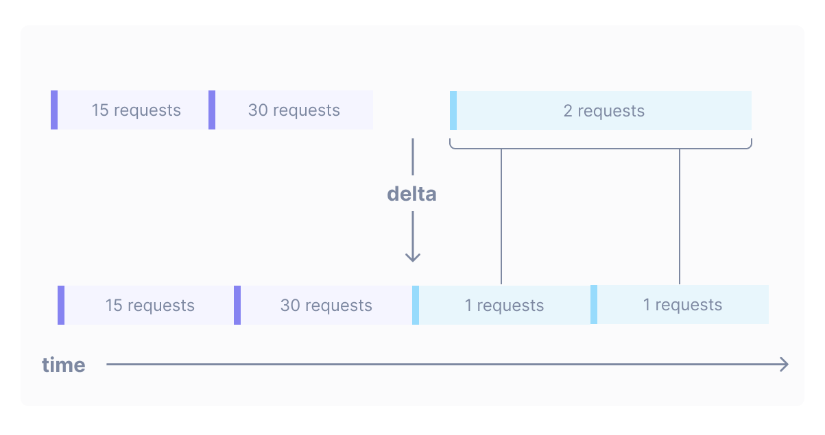
The delta operator can also handle situations where a point straddles the boundary between two output points:
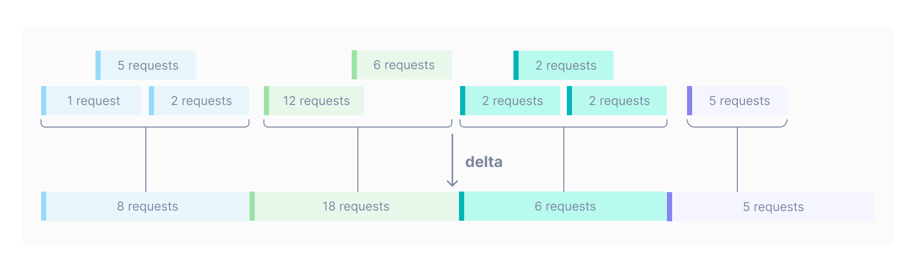
Delta becomes even more useful when trying to graph many overlapping delta points. This data would look crowded if graphed without a delta operation:
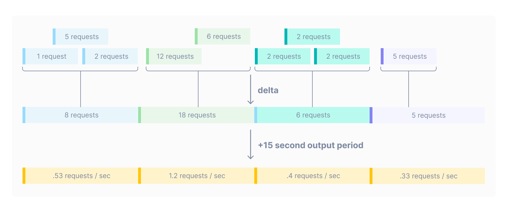
Global output period
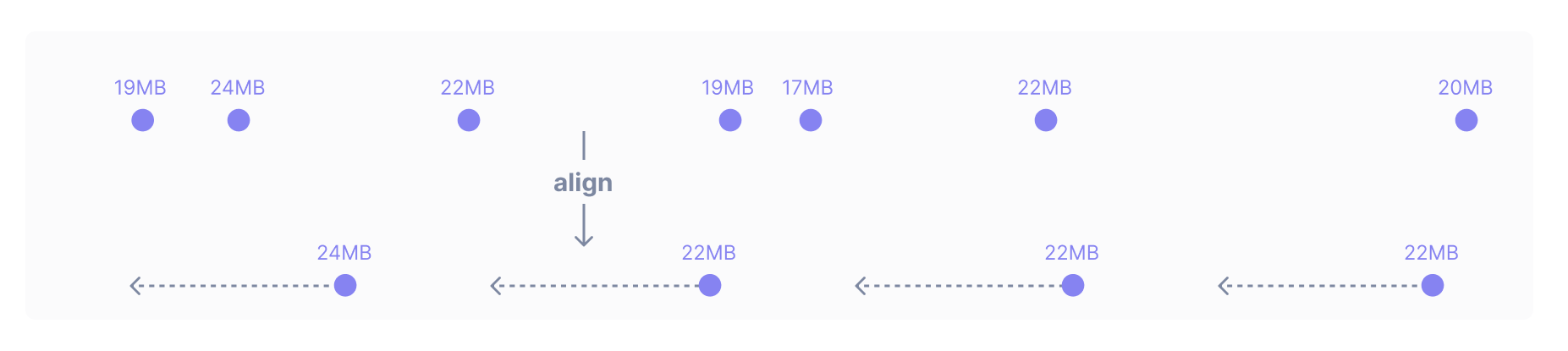
At this point, we’ve glossed over one important detail: what determines the width of the boxes in the lower part of the diagrams? Or, put differently, what determines how wide the aggregation is?
Whenever you make a query, Cloud Observability determines a number of output points to include in each time series that will make the graph detailed without making it feel crowded or hard to read. This optimal distance between points is called the global output period. Cloud Observability adjusts the global output period depending on the length of the query.
For example, if you make a one-week query, the global output period will be 2 hours (meaning that this query should produce a series of points that are all 2 hours apart). If you make a one-hour query, the global output period will be 30 seconds. The global output period is adjusted so that the graphs are not too crowded with points.
When you write a delta operation, as is the case when you use any aligner, the global output period is what determines the distance between output points.
Rate
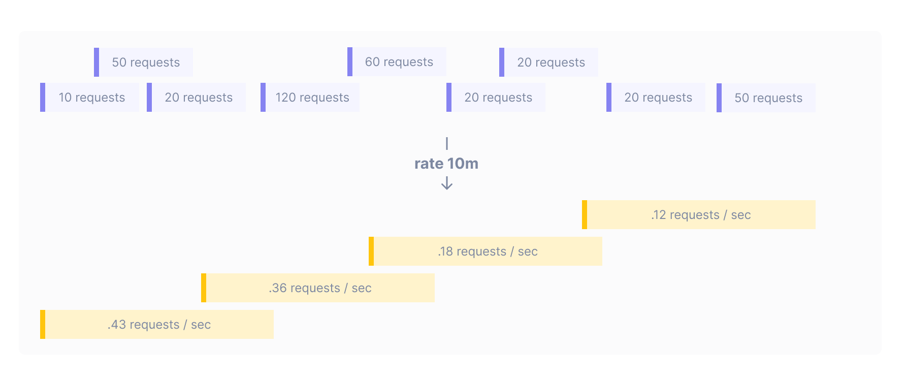
If instead of counting requests you wanted to count requests per second, you can use rate instead of delta. The two operations are quite similar, the only difference being that rate divides the number of requests by the number of seconds that they were collected over. This operation has the effect of calculating change per second:
Rate with an input window
Rate operations can produce jittery output which fluctuates wildly, especially when querying over small time intervals where the output period is 30 seconds. If your query metric requests | rate looks very noisy, it can be helpful to smooth the output data by telling rate to use data from a wider input window. The input window is the duration that data is aggregated across to produce each output point. This duration is different from the output period, which is the distance between output points.
You can add an input window to your query. For example, the query metric requests | rate 10m produces points at the global output period determined by Cloud Observability (in the example below, the output period is 5 minutes). Each of these output points is generated by taking the average rate across the previous ten minutes of data:
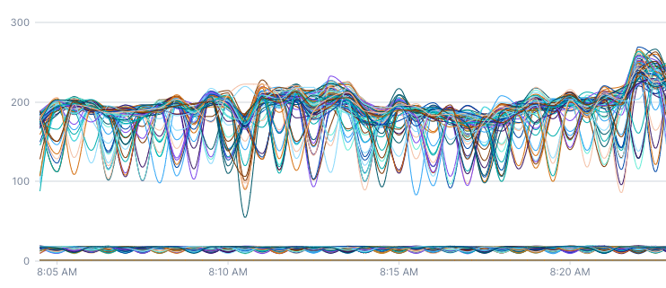
Below are two charts that both show the rate of queries to a database. This first chart uses rate. Since the query is so short, this rate is calculated over a thirty-second window (the input window and global output period are equal).
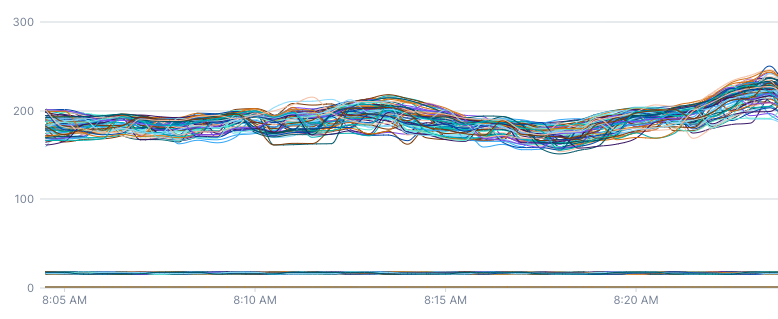
This second chart uses rate 2m, which manually sets the rate to be calculated over the previous two minutes. You can see that the second chart is much smoother and doesn’t have the same oscillations as the first chart.
The same applies to logs and spans queries - if you’d like to find the rate of requests to a particular service via a spans count query, you’ll want to use a rate aligner. An input window can be provided to smooth the time series out if there is inconsistent traffic to the service.
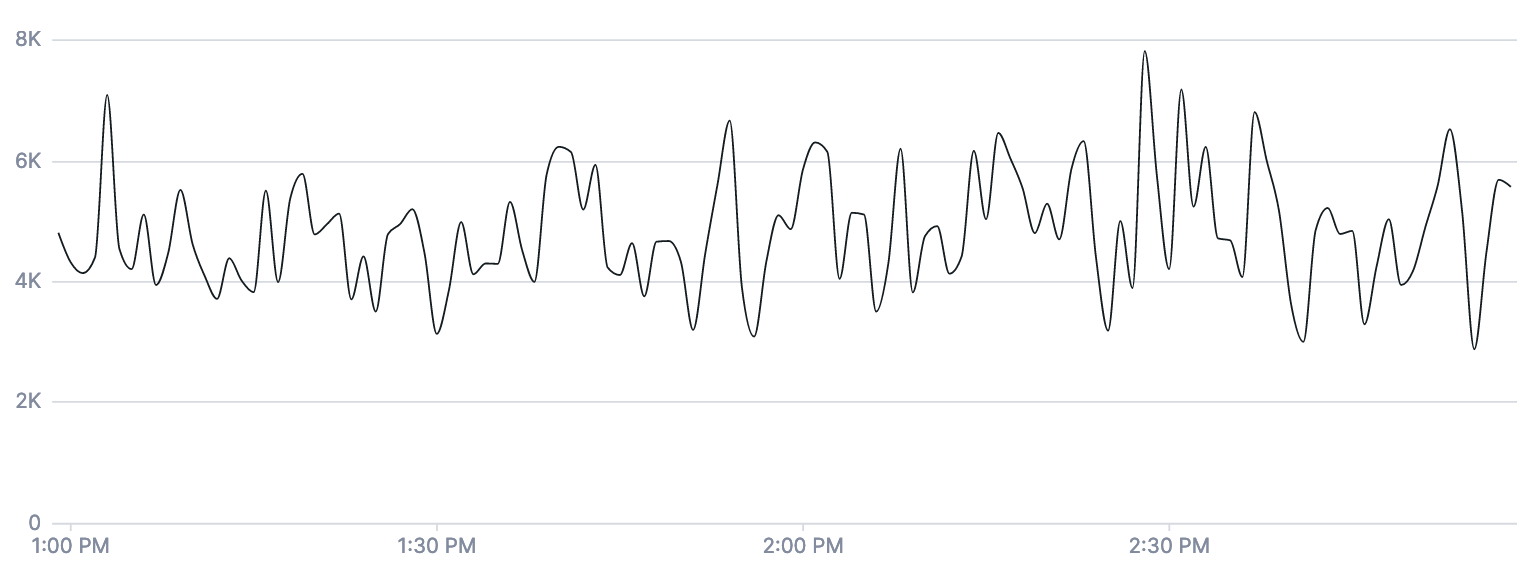
The first chart is the product of a spans count | rate | filter service = web | group_by [], sum query.
The second chart is the same query, but with a five-minute input window provided to the rate aligner: spans count | rate 5m | filter service = web | group_by [], sum
Delta with input window
The delta operation can take an input window argument as well.
Latest
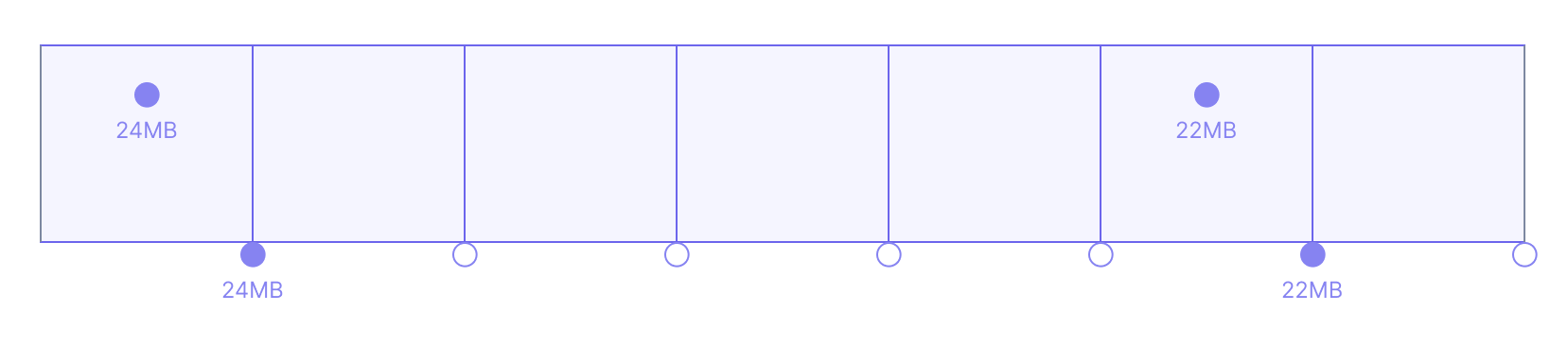
The previous examples used requests, which is a delta metric. Gauge metrics can be aligned differently. Imagine that you have a gauge metric called memory which periodically reports the memory usage of one of your servers. If you wanted to check for a memory leak, your first thought might be to plot every point reported over the past week. But as discussed before, such a graph would be cluttered and hard to read. What might work better is to write the query metric memory | latest. Just like delta and rate, latest with no arguments takes in noisy data and produces a series of points separated by the Cloud Observability-determined global output period. Each output point produced by latest takes on the value of the input point that occurred just before it.
There are dotted arrows in the graphic above because latest looks back different distances in different situations. To understand why the operation works in this way, here’s a brief example. Imagine that memory usage was only reported every 5 minutes but Cloud Observability set the global output period to 1 minute. If latest always looked back just one minute – the length of the global output period – there would be gaps in the aligned data:
Wouldn’t drawing lines between all points – regardless of whether they’re close neighbors or not – fix this problem?
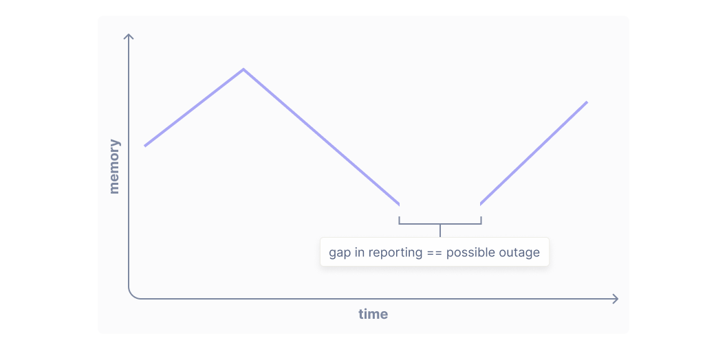
Cloud Observability only draws lines between neighboring output points because it’s useful to have a visual cue when there’s a gap in data. In Cloud Observability, if your metrics stop reporting for ten minutes, you’ll see a gap in data, which can be very useful for debugging instrumentation and identifying outages:
This is why latest always produces points unless there has been an unusually long gap lapse in reporting. You’ll only see gaps in charts when there has been a lapse in reporting or an outage. This is how latest can work without specifying a window over which to look back, which in UQL is called an input window. It calculates the input window based on the underlying periodicity of the time series it’s aligning. In other words, latest lengthens its input window when input points are spaced farther apart and shortens it when input points are spaced closer together, if no input window is specified.
Latest with input window
Sometimes, it is useful to be able to specify a fixed input window for queries. It is useful to specify an input window if the metric you’re querying reports sporadically and you want finer control over your queries.
Reduce
Imagine that your cpu.utilization metric has lots of sharp spikes because your machine has a highly variable load. You want to see whether this machine has been CPU-starved over the past week (so Cloud Observability will set your global output period to one hour). If you write metric cpu.utilization | latest, you only see big CPU spikes if those spikes happened to come directly before output points. What you really need in this situation is at each output point to see the maximum CPU utilization over the previous hour. This is expressed in UQL as metric cpu.utilization | reduce max.
The reduce operation can also take the sum, min, or mean of all input points. It can also count the number of input points.
Reduce operation with input window
You can write reduce operations with an input window, just like the other aligners. You specify the input window like so: metric memory | reduce 10m, max.
Specifying the output period
As discussed previously and as in all the examples above, Cloud Observability determines the global output period for your query based on the window over which you are querying. This ensures that the chart you’re viewing is easy to read, with neither too many nor too few points on it. However, there is one circumstance in which you want to (and are required to) specify a custom output period for an aligner in a query.
If an aligner is not the final (or only) aligner in a query, you are required to specify both the input window and the output period for the aligner. This is a restriction to help you write more precise queries.
Let’s say you have a service that processes payments. You’d like to monitor your payment service and alert if there have been 100 errors every minute for the last 10 minutes.
You might write a query like this:
1
2
3
4
5
6
7
8
9
10
spans count
| filter service = payment_service && error = true
# input window and output period set to 1m
| delta 1m, 1m
| group_by [], sum
# we want to know if there have been 100 errors over a minute
| point value >= 100
| reduce 10m, sum
# 100/10 = 10 so
| point value >= 10
Why do we set the output period in the delta aligner to one minute? If we didn’t set the output period, the number of points outputted by the delta aligner would vary as the window over which you were querying lengthened or shortened. This varying number of points, when fed into the reduce aligner, could lead to either undercounting or overcounting of errors. To avoid erroneous firing of your alert and greater precision in your query, we require you to provide an output period for any intermediate aligners, so that subsequent aligners receive the same number of points as input regardless of the window over which you are querying.
See also
Use UQL to create advanced queries
Updated Sep 26, 2023