
The Explorer view allows you to query span data from your data retention period and then view individual spans to group, compare, and find possible correlatations to pinpoint issues. You can also view a service diagram to understand up and downstream dependencies. 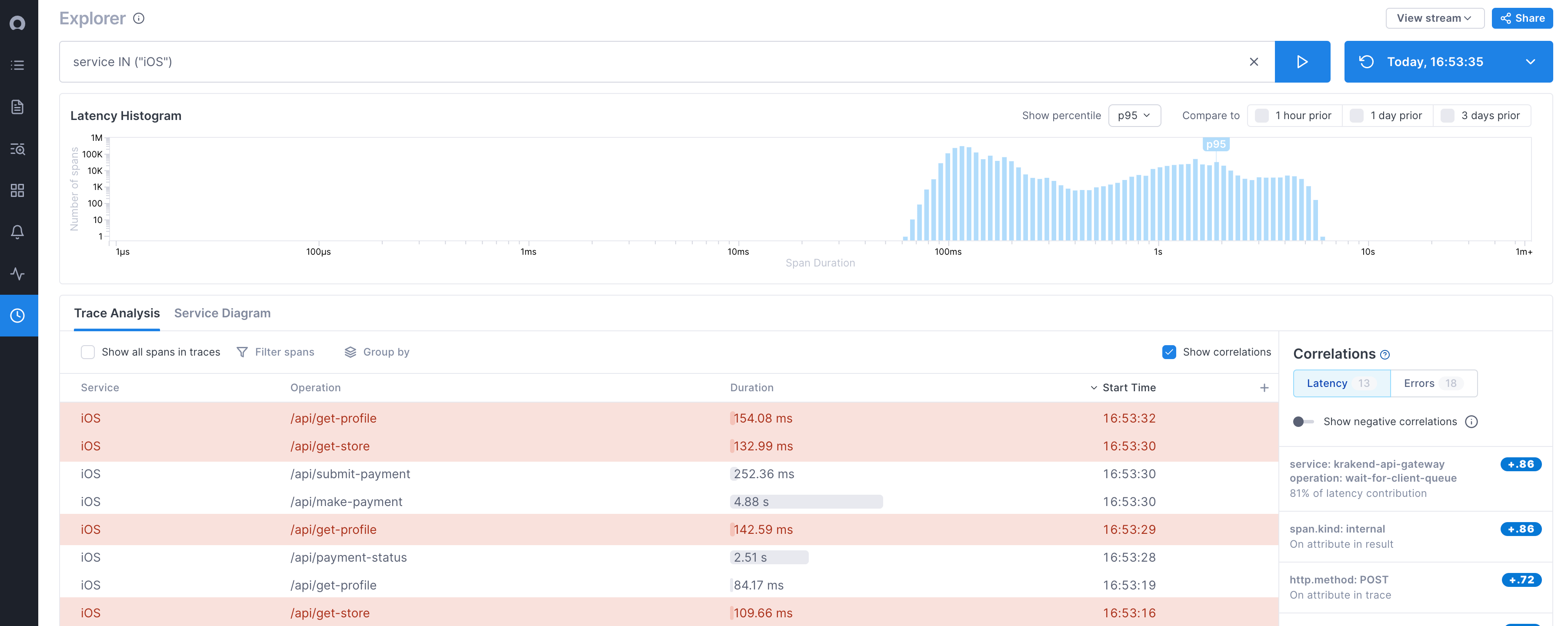
Explorer consists of four main components. Each of these components provides a different view into the data returned by your query:
-
Query: Allows you to query on all span data past hour. Every query you make is saved as a Snapshot, meaning you can revisit the query made at this point in time, any time in the future, and see the data just as it was. Results from the query are shown in the Latency Histogram, the Trace Analysis table, and the Service diagram.
-
Latency histogram: Shows the distribution of spans over latency periods. Spans are shown in latency buckets represented by the blue lines. Longer blue lines mean there are more spans in that latency bucket. Lines towards the left have lower latency and towards the right, higher latency.
-
Trace Analysis table: Shows data for spans matching your query. By default, you can see the service, operation, latency, and start time for each span. Click a span to view it in the context of the trace.
-
Correlations panel: For latency, shows services, operations, and attributes that are correlated with the latency you are seeing in your results. That is, they appear more often in spans that are experiencing higher latency. For errors, shows attributes that are more often on spans that have errors. The panel can show both positive and negative correlations, allowing you to drill down into attributes that may be contributing to latency, as well as ruling out ones that are not. Find out more about Correlations here.
-
Service diagram: Depicts the service based on your query in relation to all its dependencies and possible request paths, both upstream and downstream. Areas of latency, errors, and high traffic are shown. Learn more about the Service diagram here.
Query data to create a snapshot
You can query the span data on any combination of a service, an operation, and any number of span attributes. Every time you run a query, the results are saved as a Snapshot so you can go back to data at that point in time and analyze it in the Explorer view.
Run a query
You run your query from the top of Explorer. You can use the Query Builder to ensure valid syntax, or you can enter the query manually.
Explorer doesn’t support UQL.
When you run your query, Cloud Observability queries data from the past hour and returns all span data that matches your query.
To run a query using the Query Builder:
Click into the search bar to open the Query Builder. You can build queries for services, operations, and attributes. Use IN or NOT IN to build the query. When you click into the Service or Operation field, Cloud Observability displays valid values.
When you add multiple values to the Operation field, spans that match either value (OR operation) are returned.
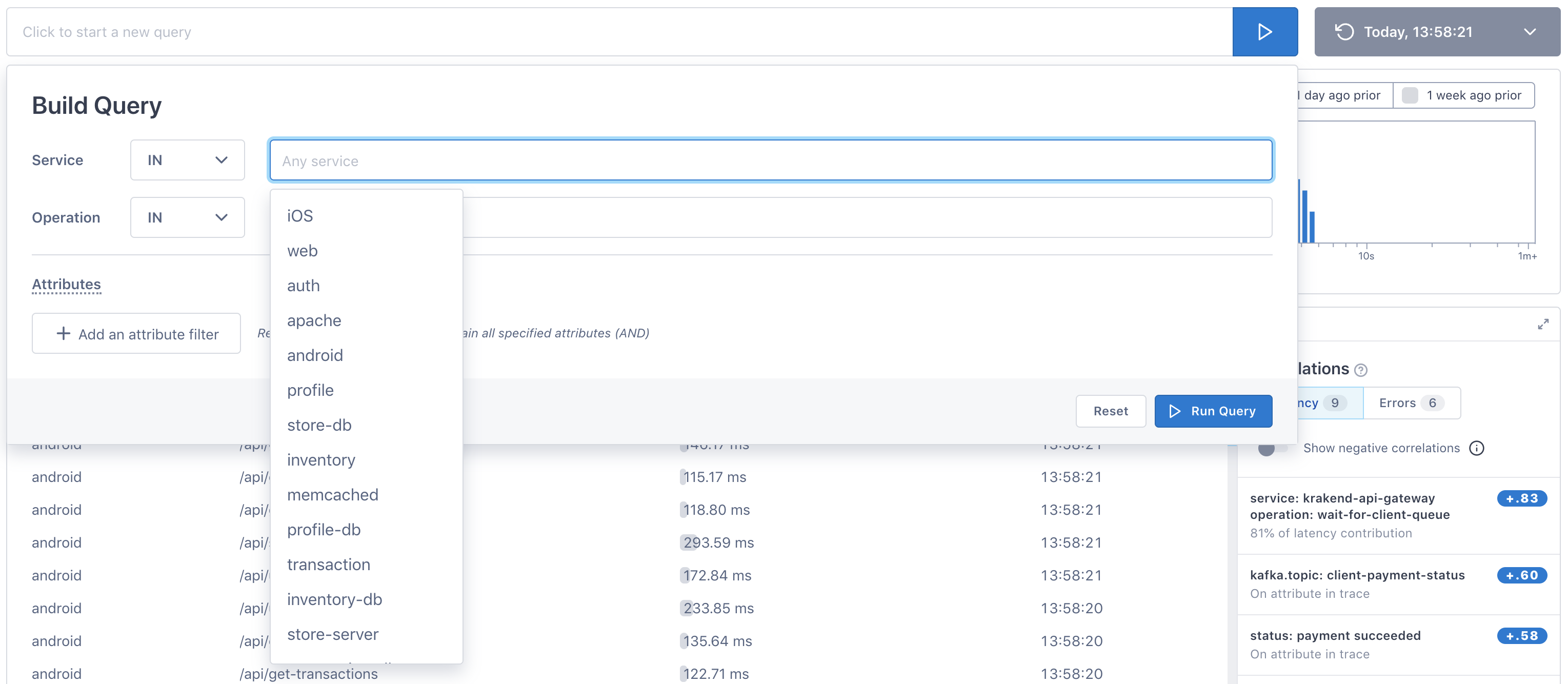
To add attributes, click the Add an attribute filter button. You can add multiple attributes.
Attributes are added to the query as an AND operation, meaning only spans that match all attributes are returned.
To run a query manually:
Explorer doesn’t support UQL.
Click into the Search bar and start typing your query.
Values must be an exact match - capitalization matters.
Supported keys
| Key | Value | Example |
|---|---|---|
| Service’s name |
|
| Operation's name |
|
| Custom attribute’s name, in quotes. |
|
| Cloud Observability generated attributes. The ID for a span, trace, or tracer. Valid values are hex strings including only the following characters: |
|
Querying multiple keys and values
Use the following syntax rules to build complex queries:
-
Use a comma to query multiple values for a key. Multiple values are treated as
ORoperations.
Example:service IN (“iOS”,“android”)
Returns spans that are from either theiOSorandroidservice“customer” NOT IN (“smith”,”jones”)
Returns spans that do not havesmithorjonesas the value for thecustomerattribute.
-
Only one set of values per key are allowed.
Example:
Valid:service IN (“iOS”, “android”)Not valid:
service IN (“iOS”, “android”) AND service IN (“web”)
-
Use
ANDoperations to build queries with multiple key/value sets (theORoperation is not supported).
Example:service IN (“iOS”,“android”) AND “aws_region” IN (“us_east”)
Returns spans that are in either theiOSorandroidservice and are in theus_eastAWS region."lightstep.trace_id" NOT IN (“edcba347fe”, “abc7584def”) AND “error” IN (“true”)
Returns spans that are not in traces with the IDedcba347feorabc7584defand have the valuetruefor the error attribute.
Full example
service IN (“iOS”, “android) AND operation IN (“auth”, “transaction-db”) AND “aws-region” NOT IN (“us-west”) AND "lightstep.span_id" IN (“edcba347fe”, “abc7584def”)
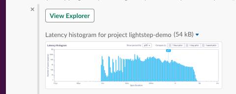
View latency histogram
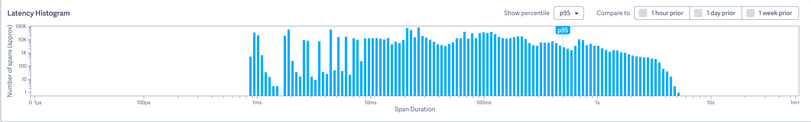
Once you run a query, the Latency Histogram is generated by 100% of the span data collected from the Microsatellites that match the query. The bottom of the histogram (X axis) shows latency time, and each blue line represents the number of spans that fall into that latency time (Y axis).
For example, in the histogram below, you can see that around 1k spans fall into the 4.42s-4.77s time range. 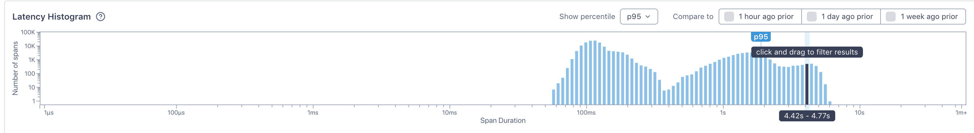
View percentile markers
By default, a marker shows the 95th percentile. You can change that using the Show percentile dropdown.
Compare with historical data
You can compare the current histogram with histograms from the past by choosing 1 hour, 1 day or 1 week prior. An overlay of that prior data displays on top of the histogram. This overlay represents data from the same time window exactly 1 hour, 1 day, or 1 week ago. If selecting a historical time period results in “No matches found,” then there were no spans matching the query during the historical window in time.
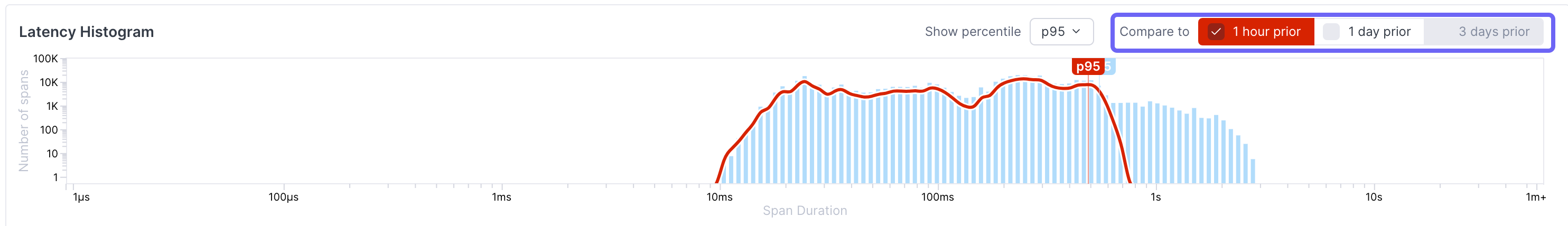
If your query returns results that differ significantly from the past, the overlay displays automatically, alerting you to a potential issue.
Now that you have an overview of latency for spans, you can get more detailed information from the Trace Analysis table.
Analyze span data
The Trace Analysis table shows information from a sample of spans used to create the histogram. By default, the table shows the service, the operation reporting the span, the span’s duration, and the start time. You can add other columns as needed.
Cloud Observability analyzes 100% of the data used to create the histogram and then selects span data that represents all ranges of performance or is otherwise statistically interesting, ensuring outliers and other anomalies are well represented.
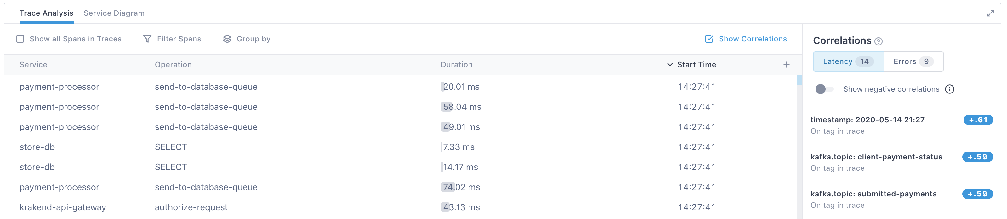
When you click on a span, you’re taken to the Trace view where you can see the span in the context of the full trace.
Add more columns to the Trace Analysis table
You can add columns that show the span’s attribute data to the right of the table by clicking the + icon. As you start typing, Cloud Observability finds attributes matching your search.
Filter data
You can filter the data in the Trace Analysis table in several ways.
Filter by latency
You can filter to see a certain range of latencies by clicking and dragging the area to filter to in the histogram.
Use the Show percentile dropdown to mark where a certain percentile starts.
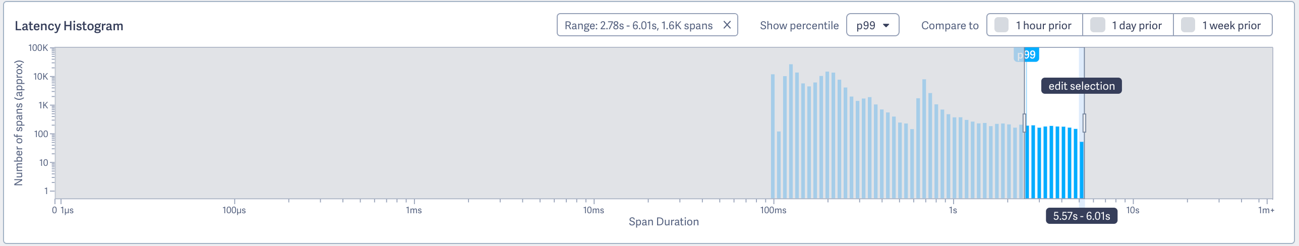
The Trace Analysis table refreshes to show spans only in the selected percentile range.
Filter by service, operation, or attribute
In the table, use the Filter spans button to filter to specific services, operations or attributes.
Group results
Use the Group by button in the table to group your results. You can group by service, operation, or attribute.
When you group your results, Cloud Observability organizes the table by those groups.
Click on a group to see the spans belonging to that group. Cloud Observability shows you the average latency, the error percentage, and the number of spans in that group.
You can also filter and group from the Correlations panel.
Add all spans from the trace to the table
By default, Cloud Observability only shows spans that match your query. For example, if you queried on a service, you’ll only see spans from that service. But often, you’ll want to see spans that participated in the same traces as the spans returned by your query. If you’re trying to reach a hypothesis, you may want a more broad view of what is going on in a trace, without having to open a bunch of traces yourself.
To see all spans that took part in a trace with your query results, select Show all Spans in Traces.
The table refreshes to show spans that participate in the same traces that your results spans do. Use the group by or filter buttons to then filter data and still include spans from outside your initial query.
View historical data
Cloud Observability saves every query you make as a Snapshot. Snapshots provide a view into saved data that you can share with other Cloud Observability users. When you share a Snapshot, the recipient can work with the data in the same way that you did. Snapshots are automatically created for you, and the data is saved for as long as your data retention policy allows. Snapshots are perfect for Slack messages, emails, post-mortem docs, and anywhere you need a definitive historical view of your span data.
To view your Snapshots:
- Click the dropdown that displays Today and a timestamp (this is the timestamp of your latest snapshot).
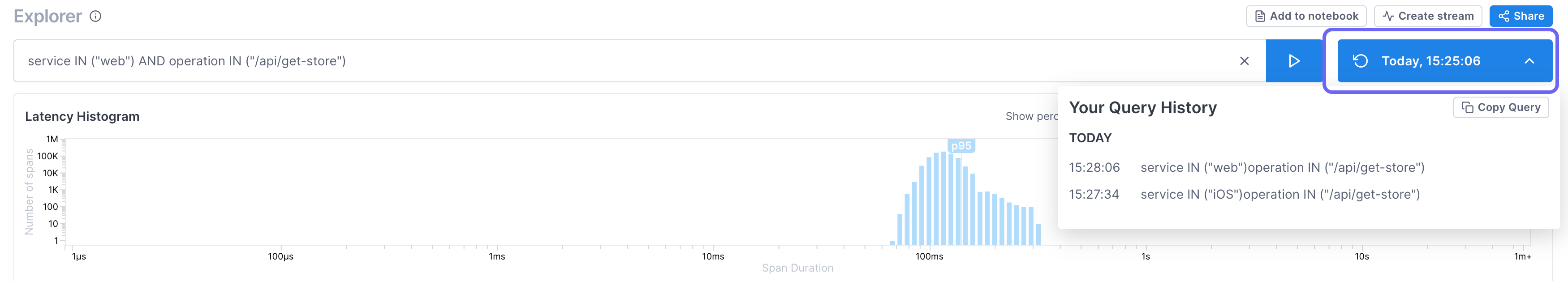
Your Snapshots are listed in reverse chronological order. - Select the Snapshot to view. Explorer rerenders using the data from the Snapshot.
Share a snapshot
You can share a Snapshot with another Cloud Observability user using a URL. When the user clicks the link, the same query is run using the data from the Snapshot (instead of live data).
To share a snapshot:
- Click Share.
The URL is copied to your clipboard. - Paste the URL wherever you want someone to access the data.
Share a snapshot in Slack
When you integrate Cloud Observability with Slack, you can share a preview of the query histogram in any channel of your workspace. Simply paste the URL from the the Share button into a Slack channel. Other Slack members can see the histogram and Cloud Observability users can click View Explorer to jump right to that page.
Add a query to a notebook
You can add an Explorer query to a notebook for when, during an investigation, you want to be able to run ad hoc queries, take notes, and save your analysis for use in postmortems or runbooks. Notebooks let you view logs, metrics, and traces from different places in Cloud Observability together, in one place. While Explorer queries show you the last hour of data, notebooks allow you to view the data in your retention window.
To add to a notebook, click Add to notebook and search to choose an existing notebook or create a new notebook.
When you add to a notebook, a panel is created using the same query. You can see the latency for multiple percentiles and view exemplar traces. The annotation is a link back to the original, so you can quickly return to the origin of your investigation.
Learn more about notebooks.
Save your query and monitor the data going forward
When you want to monitor the data from a query going forward, instead of coming back to Explorer and running the query, you can create a Stream. When you create a Stream, Cloud Observability continuously collects and saves that data. The span’s data and and any associated traces are retained for as long as your data retention policy.
Learn more about Streams.
See also
Find correlated areas of latency and errors
Updated Apr 26, 2023