
Monitor and track your Cloud Observability billing and usage.
This page describes the Billing and usage pages in Cloud Observability: Overview, Trace usage, Metric usage, and Log usage. It also lists ways to monitor Cloud Observability usage at the project level.
Billing and usage: Overview
To view your billing summary, click Settings > Overview. Your Billing and usage overview page depends on your billing plan.
-
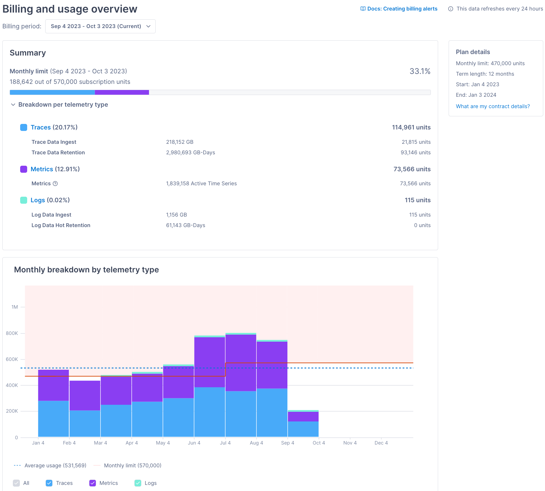
For Subscription unit plans, the page shows organization-wide usage for each telemetry type. Cloud Observability updates the page every 24 hours at 02:00 UTC.
This table describes the different visualizations and sections on the page:
Visualization or section What it is Things to do Summary visualization The top bar shows your subscription-unit usage as a percentage of your monthly limit. It breaks down the data by telemetry type. If you’re over the monthly limit, the bar and percentage are red.
Breakdown per telemetry type shows usage data broken down by detailed telemetry types. The percentages are the telemetry type’s usage as a percentage of the used subscription units.If the top bar is red, contact your customer success representative to purchase more subscription units.
Click Traces, Metrics, or Logs to visit the Trace usage, Metric usage, or Log usage page.Monthly breakdown by telemetry type visualization Shows your trace, metric, and log usage per month. The dotted line is your average usage and the red line is your contract’s subscription unit number. NA. Plan details section Shows information about your billing plan, including the term length, start-and-end dates, and monthly limit. Click What are my contract details to learn more, including your monthly purchase history. -
For Active service bundle plans, the page shows organization-wide usage for each part of Cloud Observability’s active bundle. Cloud Observability updates the page every 24 hours at 02:00 UTC.
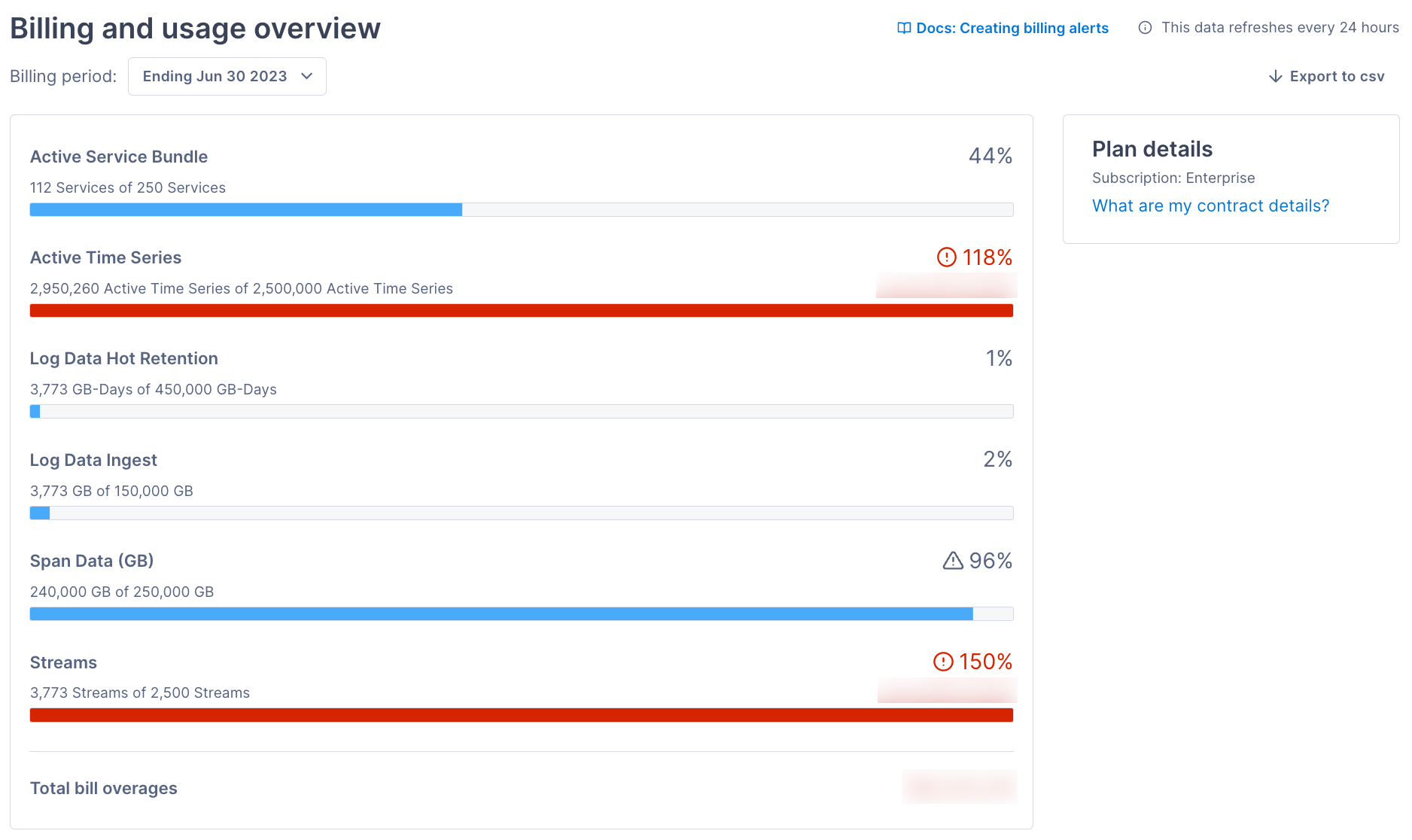
On the Billing and usage overview page, click the drop-down to select a different billing period. You can also click Export to csv to export the data to a comma-separated file.
The visualization shows your organization’s Cloud Observability usage. If your usage is over your allotment, the bar is red and shows the overage percentage. Hover over the bars to see the project breakdown.
Billing and usage overview also shows your contract details. Click What are my contract details? to view the following:
- Item - The part of Cloud Observability’s billing bundle (Active Service Bundle, Active Time Series, Span Data (GB), or Streams).
- Quantity - The amount allotted to your organization in a billing period.
- Overage rate - The dollar amount charged for each unit over the allotted amount.
- Start - The date your contract started.
- End - The date your contract ends.
- Billing Period - The billing cycle for your contract (for example, monthly).
Billing and usage: Trace usage
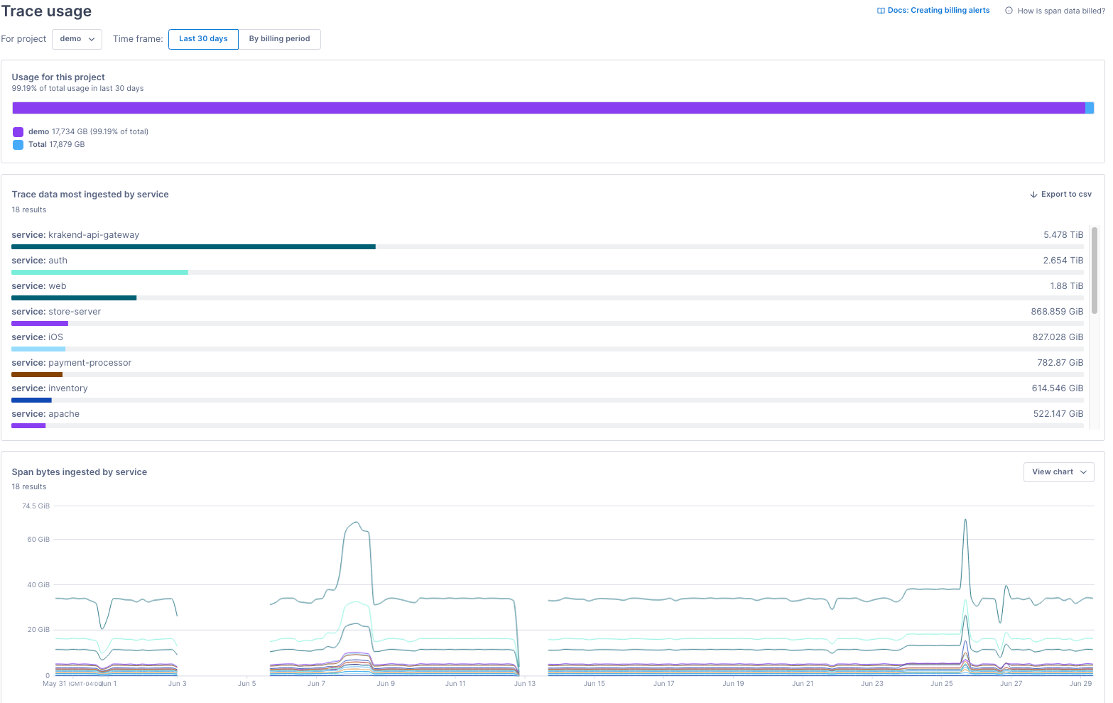
To view details about span data ingestion and usage in Cloud Observability, click Settings > Trace usage.
The page reports data at the project level for the last 30 days. To view older data, click By billing period and select a period. To view data for a different project, click the For project drop-down.
Because of recent billing-data changes, the Trace usage page has data starting May 26, 2023. To view data from April 19, 2023, and on, query the relevant metric in a notebook or dashboard.
Use this table to learn about the Trace usage visualizations:
| Visualization | What it is | Things to do |
|---|---|---|
| Usage for this project | Shows the project’s trace usage as a percentage of your organization’s trace usage. In the image above, the demo project makes up 99.19% of the organization’s total trace usage in the last 30 days. |
None. |
| Trace data most ingested by service | Shows the services with the most trace data. The visualization displays up to the top 1000 results. In the image above, krakend-api-gateway has the most trace data in the last 30 days at 5.498 TiB. |
To export the data to a comma-separated file, click Export to csv. |
| Span bytes ingested by service | Shows the services with the highest span-byte ingestion rates. The visualization displays up to the top 1000 results. | Click the View chart drop-down to export the line chart to a notebook, dashboard, or alert. To view specific values in the table below, hover over the visualization’s time series. To export the data to a comma-separated file, click Export to csv. |
Billing and usage: Metric usage
To view details about your metric ingestion and usage in Cloud Observability, click Settings > Metric usage.
The Metric usage section has two pages (Metric usage overview and All metrics) and several visualizations about your data. The sections below describe the tabs in more detail.
Metric usage pages only cover application and infrastructure metrics. Currently, the pages don’t include span-derived metrics, also known as streams. To monitor streams in Cloud Observability, click Streams in Cloud Observability’s sidebar.
Metric usage overview
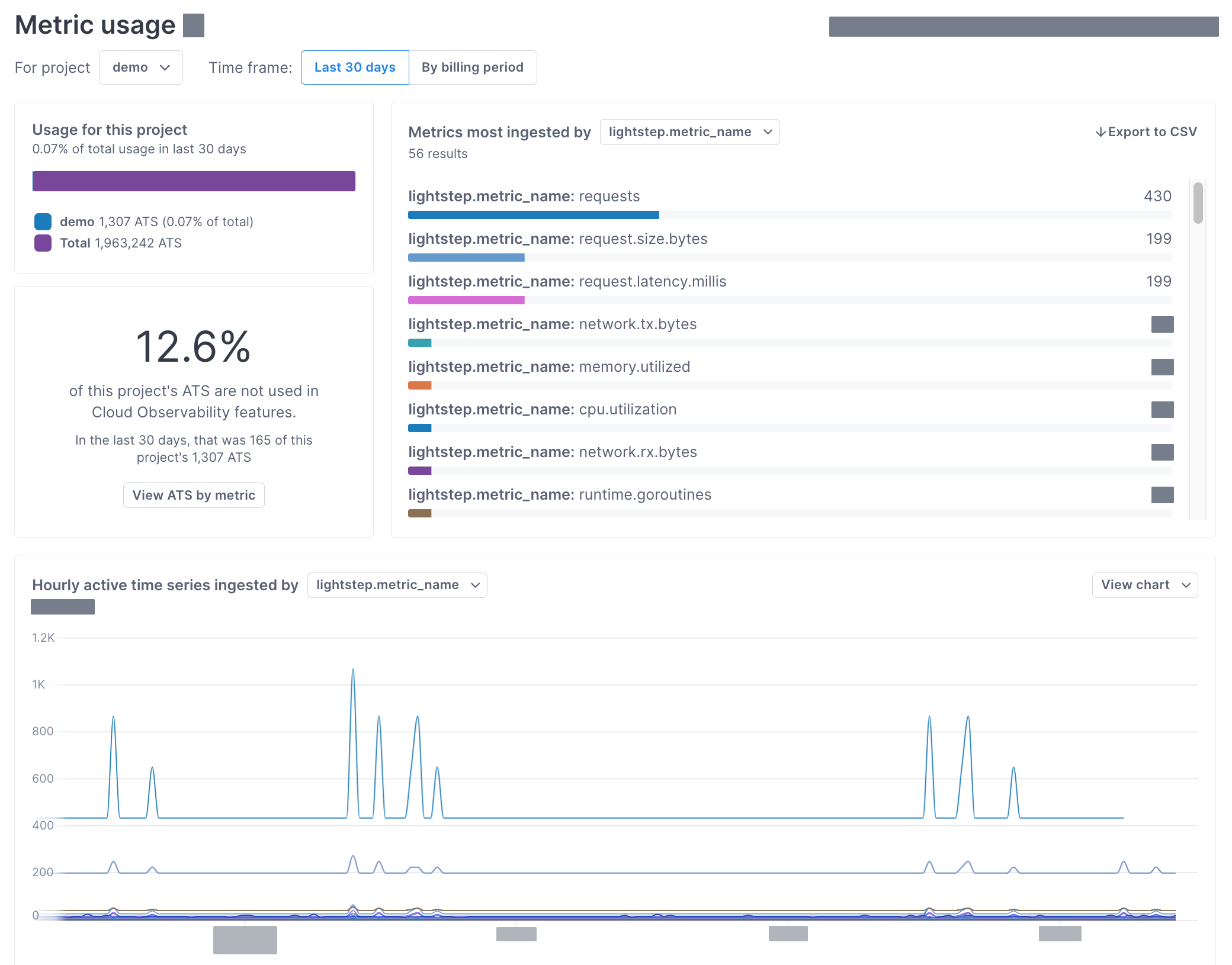
The Metric usage overview page visualizes metrics ingestion and usage. Use this page to learn about the projects, services, and metrics with the most Active Time Series (ATS).
The page reports data at the project level for the last 30 days. To view older data, click By billing period and select a period. To view data for a different project, click the For project drop-down.
Because of recent billing-data changes, the Metric usage overview page has data starting May 26, 2023. To view data from April 19, 2023, and on, query the relevant metric in a notebook or dashboard.
Use this table to learn about the Metric usage overview visualizations:
| Visualization | What it is | Things to do |
|---|---|---|
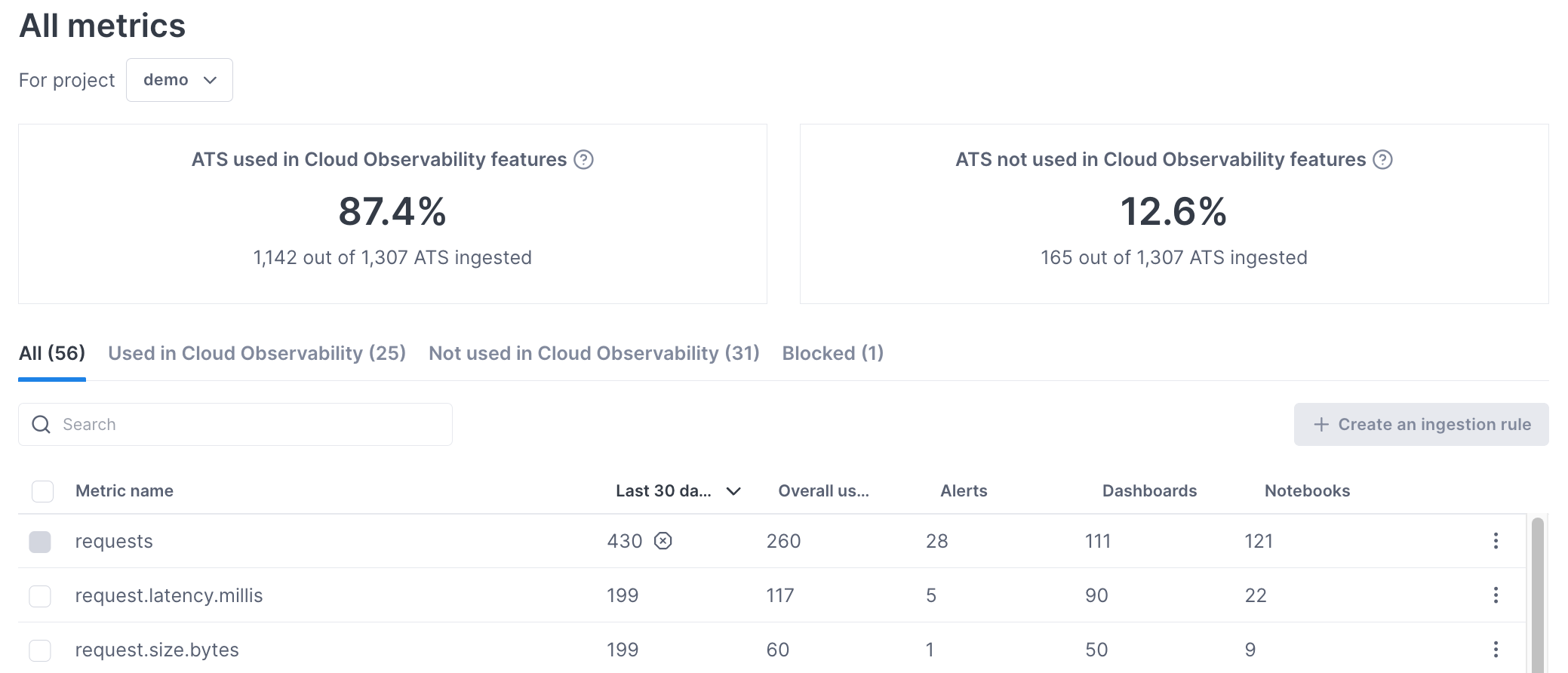
| Usage for this project | Shows the project’s ATS usage as a percentage of your organization’s ATS usage. In the image above, the demo project makes up 0.07% of the organization’s total ATS usage in the last 30 days. |
None. |
| Metrics most ingested by | Shows the metrics with the most ATS. The visualization displays up to the top 1000 results. In the image above, requests has the greatest ATS number in the last 30 days at 430 ATS. |
To learn about a metric, click the metric to view its details in a panel. To visualize the number of ATS ingested by service, click the Metrics most ingested by drop-down. To export the data to a comma-separated file, click Export to csv. |
| Single-number chart | Shows the percentage of ATS not used in a Cloud Observability alert, dashboard, or notebook. In the image above, 12.6% of the demo project’s ATS don’t appear in a Cloud Observability alert, dashboard, or notebook in the last 30 days. |
Click View ATS by metric to visit the All metrics page and learn how you’re using metrics in Cloud Observability. You can use that information to create metric ingestion rules and control Cloud Observability costs. |
| Hourly active time series ingested by | Shows the metrics with the highest ATS ingestion rates. The visualization displays up to the top 1000 results. | To visualize the rate of ATS ingested by service, click the Hourly active time series ingested by drop-down. Click the View chart drop-down to export the line chart to a notebook, dashboard, or alert. To view specific values in the table below, hover over the visualization’s time series. To export the data to a comma-separated file, click Export to csv. |
Cloud Observability uses the service.name attribute or the attribute you registered to determine the services that emit metrics.
All metrics
The All metrics page shows if and where you’re using metrics and ATS in Cloud Observability. Use this page to find and block low-value data, helping you reduce your Cloud Observability costs.
The page reports data at the project level for the last 30 days. To view the data for a different project, click the drop-down next to View the last 30 days for project.
Click the tabs below to learn about the different All metrics sections.
-
The single-number charts show the percentage of ATS from the last 30 days used and not used in Cloud Observability features:
- Used - The ATS is in a Cloud Observability alert, dashboard, or notebook.
- Unused - The ATS isn’t in any of those features.
The used and not used values omit cases where ATS appear in other tools via the API. This table shows examples of when ATS are used and not used:
ATS case Used Not used The ATS is in a Cloud Observability alert and notebook. ✅ The ATS is in a Cloud Observability dashboard. ✅ The ATS isn’t in a Cloud Observability alert, dashboard, or notebook. ✅ The ATS isn’t in a Cloud Observability alert, dashboard, or notebook. The ATS is in a Grafana dashboard. ✅ -
The tabs (All, Used in Cloud Observability, Not used in Cloud Observability, and Blocked) show the following information in a table. You can sort the table by column and search the table.
Metric name
The name of the metric. Cloud Observability displays a maximum of 1000 metrics in the table.Last 30 days ATS
The number of ATS associated with the metric, ingested in the last 30 days.Overall usage
The number of Cloud Observability alerts, dashboards, and notebooks the metric appears in.Alerts
The number of Cloud Observability alerts the metric appears in.Dashboards
The number of Cloud Observability dashboards the metric appears in.Notebooks
The number of Cloud Observability notebooks the metric appears in. -
View metric details
To learn more about a metric, click ⋮ > View details. The panel displays the following:
- Attributes - Lists the metric’s attribute key-value pairs. Cardinality reports the number of values associated with the attribute key. You can hover over the Label values column to see every attribute value.
- Usage - Lists and links to the alerts, dashboards, and notebooks using the metric.
- Details - Shows other metric information, including who last edited the metric and when.
Block metrics from Cloud Observability
To block a metric from Cloud Observability, click ⋮ > Block metric ingestion. That option opens the ingestion rule configuration page. Cloud Observability only activates the rule if you enter a rule name and click Save.
Billing and usage: Log usage
To view details about your log ingestion in Cloud Observability, click Settings > Log usage.
The page reports data at the project level for the most recent billing period. To view older data, click the Billing period drop-down. To view data for a different project, click the For project drop-down.
Use this table to learn about the Log usage visualizations:
| Visualization | What it is | Things to do |
|---|---|---|
| Usage for this project | Shows the project’s log usage as a percentage of your organization’s log usage. | None. |
| Log bytes ingested by service | Shows the services with the most log data. The visualization displays up to the top 1000 results. | To export the data to a comma-separated file, click Export to csv. |
| The rate of log bytes ingested by service | Shows the services with the highest log-byte ingestion rates. The visualization displays up to the top 1000 results. | Click the View chart drop-down to export the line chart to a notebook, dashboard, or alert. To view specific values in the table below, hover over the visualization’s time series. To export the data to a comma-separated file, click Export to csv. |
Other ways to track usage
Cloud Observability offers several ways to monitor and investigate usage per project.
Telemetry metrics
Use the metrics below to track ingestion and reduce the risk of billing overages. You can use the metrics in alerts, dashboards, and notebooks. Visit Create billing alerts and Create billing dashboards for more information.
| Metric name | What it is | Works with group_by | Retention |
|---|---|---|---|
lightstep.billing.hourly_active_time_series |
A gauge metric tracking the number of ATS your project receives per hour. | Yes, for metric.name, service.name, and configured attributes only. |
13 months. This metric reports data with a 12-hour delay. |
lightstep.billing.log_bytes |
A delta metric tracking the number of log bytes your project receives. | Yes, for the service attribute only. |
13 months. |
lightstep.billing.log_storage_cold |
A gauge metric tracking log bytes in your project’s cold storage. This metric reports logs in cold storage only. Rehydrated logs – which appear in both hot and cold storage – are reported in lightstep.billing.log_storage_hot. |
No. | 13 months. |
lightstep.billing.log_storage_hot |
A gauge metric tracking log bytes in your project’s hot storage. | No. | 13 months. |
lightstep.billing.span_bytes |
A delta metric tracking the number of span bytes your project receives. | Yes, for the service attribute only. |
13 months. This metric reports data with a one-hour delay. |
Because of recent billing-data changes, Cloud Observability’s Billing and usage pages have data starting May 26, 2023.
To view data from April 19, 2023, and on, query the metrics above in a notebook or dashboard.
To access data before April 19, 2023, use lightstep.billing-legacy.hourly_active_time_series and lightstep.billing-legacy.span_bytes.
Those legacy metrics don’t support group_by.
Active services
You can view your active services from the Reporting Status page. 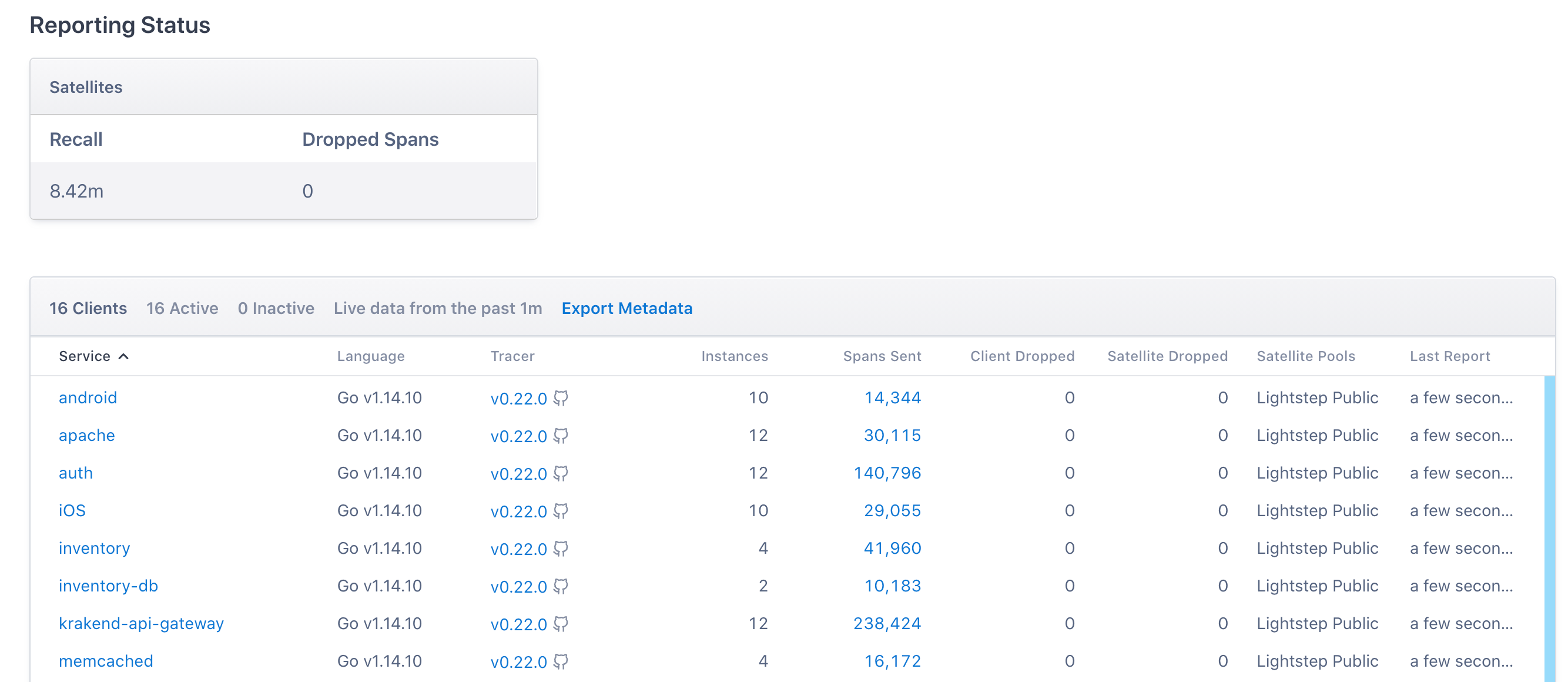
Streams (retained span queries)
The Streams view lists your existing streams and where they’re used in Cloud Observability.
See also
Control costs with ingestion rules
Updated Sep 27, 2023