
Cloud Observability offers a way to quickly see how all your services and their operations are performing in one place - the Service Directory view.
You can also use our pre-built service dashboards or the Service health panel to view service health.
From here, you can:
- See all your services in one place
- Search for a service
- Filter to view by language
- Mark “favorite” services
- See performance over time and the top performance changes for your Key Operations
- View latency, operation rate, and error rate for key operations on a service
- Start an investigation by viewing spans from an operation.
- View service health after deployments
- View all operations (server and client) on a service
- View current performance of individual operations or performance at a specific percentile or performance change over a period of time
- Start an investigation by viewing spans from an operation.
- View Streams (retained span queries).
- View existing dashboards for a service
Access the service directory view
When you first open Cloud Observability, you’re taken to the Service Directory. You can also access it from the navigation bar. 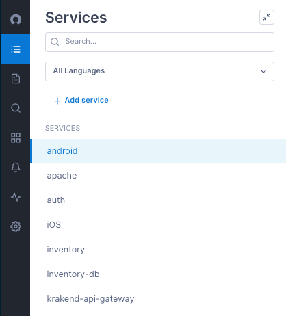
Find services
Your services are listed in alphabetical order. To make finding services easier, you can “favorite” a service so it always appears at the top of the list.
To find a service:
- Use the Search box to search for services by name. As you type, Cloud Observability filters the list of services that match your entry.
- Filter by language. All services show the language of the associated instrumentation. Use the language dropdown at the top of the list to filter by a language.
To favorite a service:
- Find and select the service to favorite.
- Click the star next to the service’s name. The service now appears at the top of the list.
View service/operation health and investigate changes
The Service Health view on the Deployments tab shows you the latency, error rate, and operation rate of your key operations (operations whose performance is strategic to the health of your system) on the selected service.
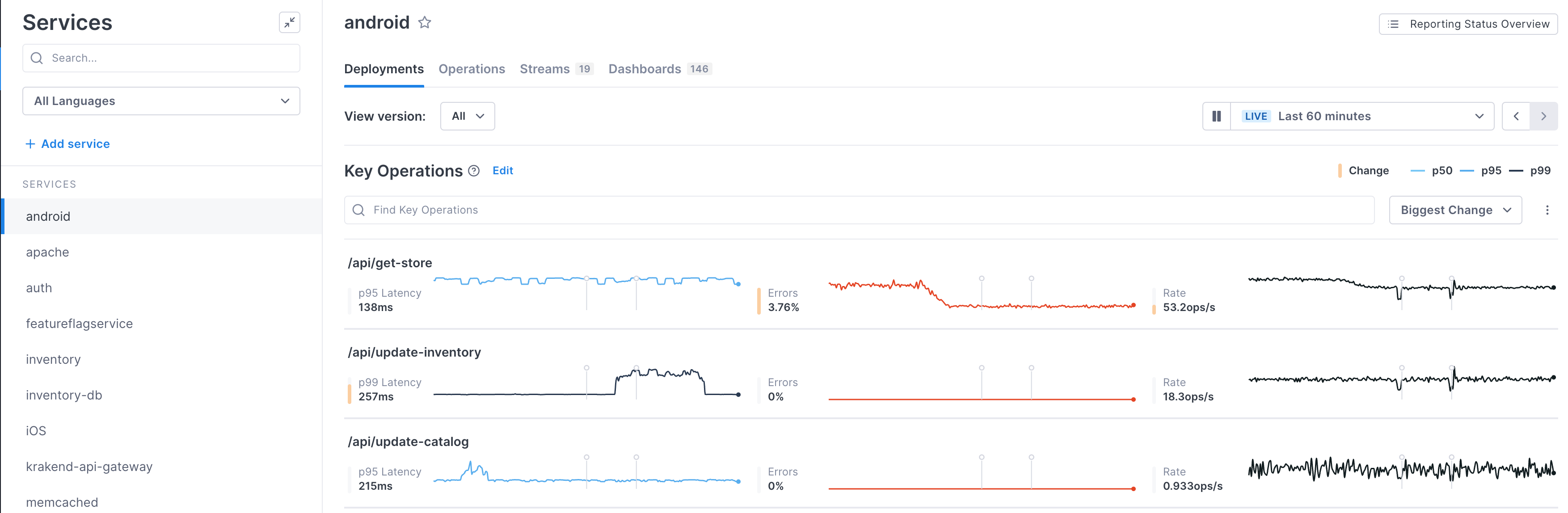
Key operations are displayed in order of magnitude of change in performance. For each chart, Cloud Observability displays a shaded yellow bar to indicate the magnitude of the change. 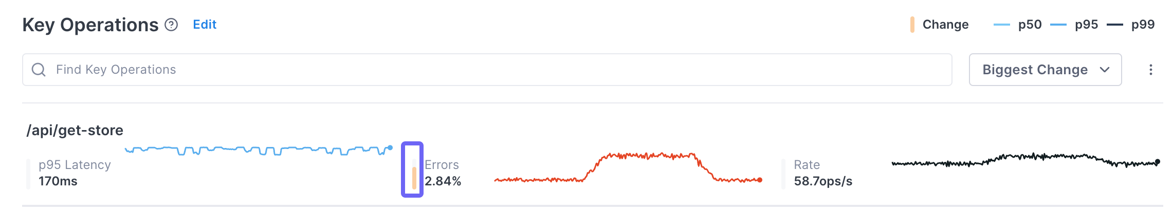
Cloud Observability measures two aspects of change: size and continuity. A full bar indicates that a large, sustained change has happened. Smaller bars indicate either a smaller change or one that did not last for the full time period. Only changes that are relative (i.e. a change of 10ms to 500ms is ranked higher than one of 1s to 2s) are considered.
The yellow bar means that an SLI had an objectively large change, regardless of service or operation. Cloud Observability’s algorithm runs on each SLI independently. For example, when the bar displays for an operation’s latency, that means latency has changed – not that its change was greater compared to the other SLIs.
When determining change, Cloud Observability compares the SLI of the baseline SLI time series to the comparison SLI time series. Those time periods are determined using the data currently visible in the charts.
You can change the amount of time displayed using the time period dropdown at the top right of the page.
The baseline and comparison time periods are determined as follows:
If there is one or more deployment markers visible:
- For latency and error rates, Cloud Observability compares the performance after the selected version to performance in all other versions.
- For operation rate, it compares the rate before the deployment marker to after the deployment marker.
If there are no deployment markers visible:
Cloud Observability compares the performance of the first half of the time period to the second half.
When you implement an attribute to display versions of your service, a deployment marker displays at the time the deployment occurred. These markers allow you to quickly correlate deployment with a possible regression. By default, performance from all versions are shown. Use the View version dropdown to show data from just one version.
If a version attribute hasn’t been instrumented for the service, or you haven’t configured Cloud Observability to recognize the version attribute, an Instrument version attributes button displays.
About key operations
By default, Cloud Observability dynamically determines key operations as the ingress or root operations that have the highest rate for that service. You can also manually select key operations so that they always display in this view.
By default, each project has 30 key operations. So if you manually select 10 key operations, Cloud Observability dynamically chooses 20 of the remaining highest rate ingress operations to display as well.
You can change the default number of key operations. Contact your Customer Success representative for more information.
To manually set key operations:
-
On the Deployments tab of the Service Directory, click Edit next to Key Operations.
-
In the dialog, select the operations you always want to be key operations, up to 30 per service. If you select less than 30, Cloud Observability dynamically determines the remaining key operations for you.
Change the display
By default, the operations are sorted by the amount of detected change (largest to smallest). Use the dropdown to change the sort.
Also by default, for each operation only the latency percentile with the largest amount of change displays. You can change the charts to show more percentiles using the More ( ⋮ ) icon. 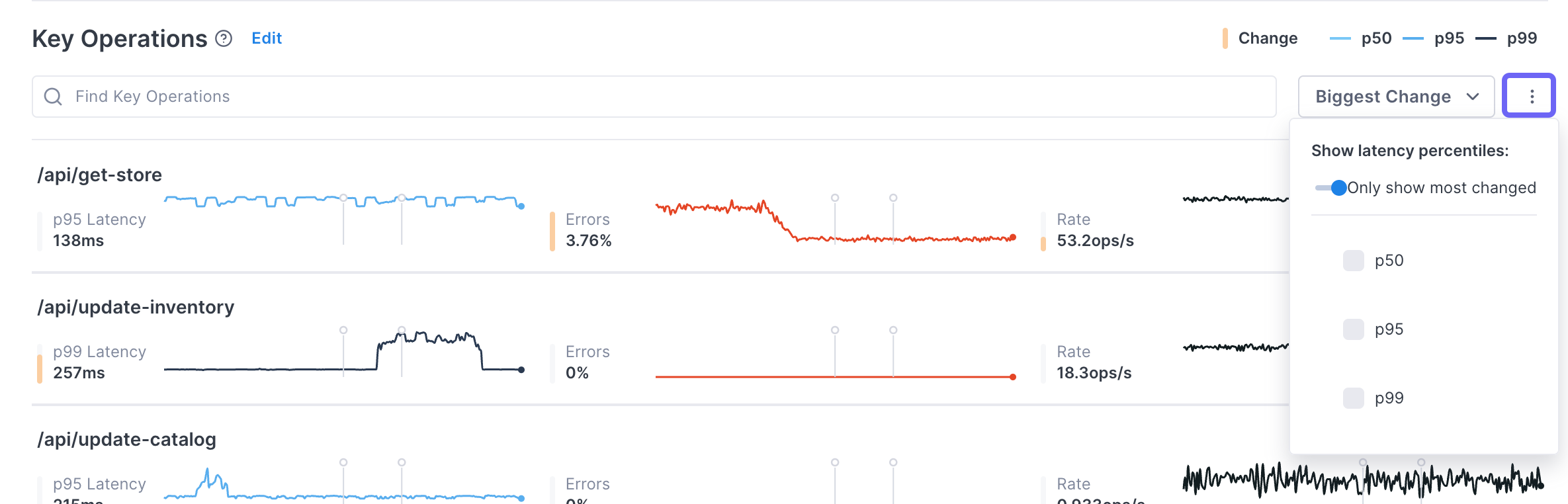
Change the reporting time period
By default, the data shown is from the last 60 minutes. You can change that time period using the time picker. Use the < > controls to move backwards and forwards through time. You can view data from your retention window (default is three days).
You can also zoom in on a time period by clicking and dragging over the time period you want a closer look at. The charts redraw to report on just the period you selected.
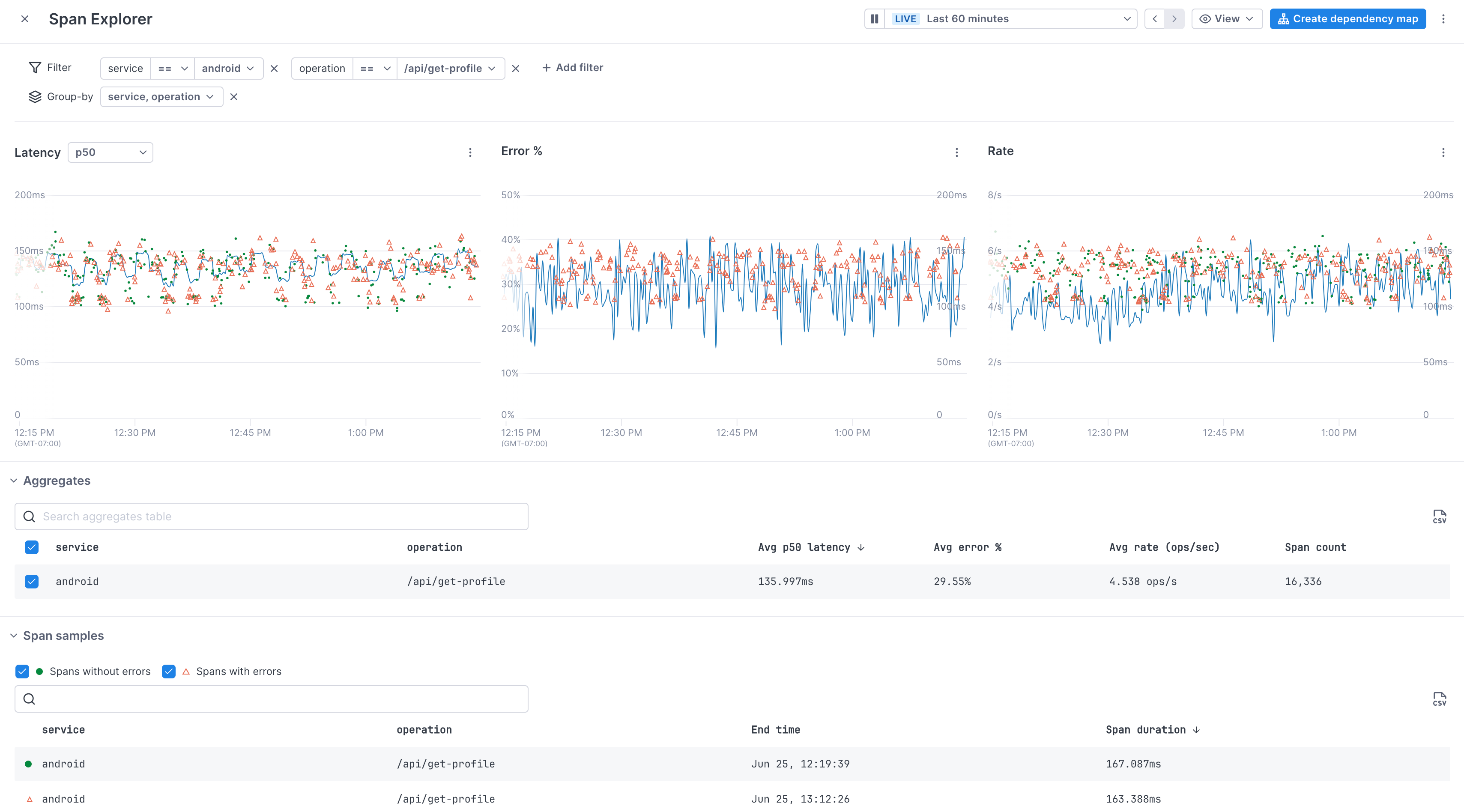
Use the Span Explorer to investigate changes in performance
When you see performance changes, you can use the Span Explorer to begin your investigation.
To open Span Explorer, click on an operation to open the Span Explorer view.
View operation performance
The Operations tab on the Service Directory view shows the selected service’s operations currently reporting to Cloud Observability in alphabetical order, along with performance metrics aggregated over the selected time period. 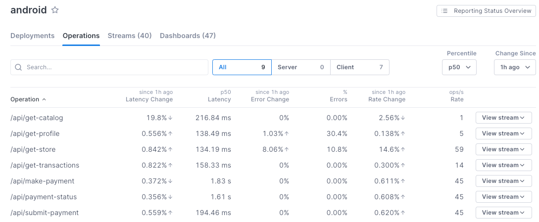
The table provides several useful performance metrics for each operation:
- Latency Change: Change in latency between now and the time period set using the Change Since dropdown.
- Latency: How long the operation took to complete for a given percentile, set using the Percentile dropdown.
- Error Change: The percentage change in error rate for the time period set using the Change Since dropdown.
- Errors: The percentage of operation instances that contain an error.
- Rate Change: The percentile change of rate in the time period set using the Change Since dropdown.
- Rate: The number of times the operation occurred per second.
- View stream: Add a trichart to a notebook or dashboard using the query for the operation.
- Create stream: Create a Stream for the operation. Creating a Stream for an operation allows you to retain the data for the associated query for longer than your retention window.
Search and filter operations
- Use the Search box to search for operations by name. As you type, Cloud Observability filters the list of operations that match your entry.
- View only server or client operations by clicking the respective tab. Server operations are the first operations handling external requests from outside that service (i.e. API HTTP GET etc.). Client operations are those that call out to external services.
To see if other services are affecting an operation, view the operation in a notebook or dashboard and use the dependency map to view upstream and downstream services and their performance.
Investigate issues using Span Explorer
As with the Deployments tab, you can use Span Explorer to view latency, rate, and error percentages, and to view example spans.
Click an operation’s row to view its data in Span Explorer.
View Streams for an operation or service
Streams are retained span queries that continuously collect latency, error rate and operation rate data. By default, data from span queries are persisted for three days. When you save a query as a Stream, the data is collected and persisted for a longer period of time.
To view all Streams for a service, click the Streams tab. The number on the tab tells you how many Streams exist for this service. 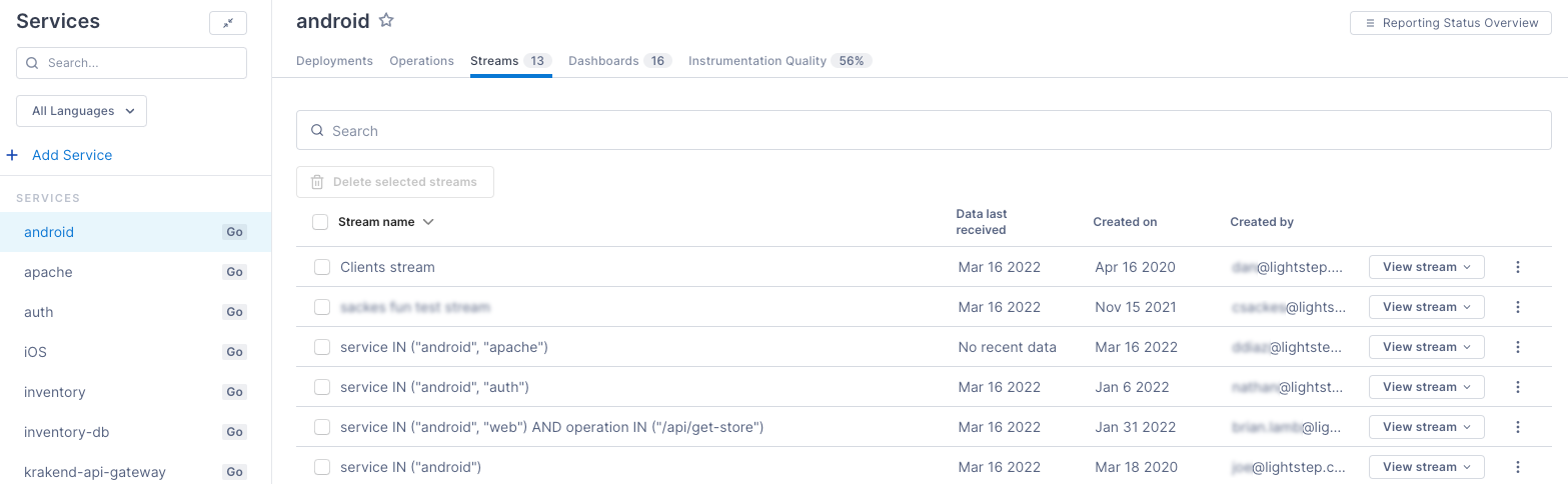
Create a Stream from the Operations tab by clicking Create Stream for an operation.
Add a Stream’s query to a notebook or dashboard
You can add a trichart that shows the Stream’s performance to either a notebook or a dashboard by clicking View Stream.
Add an Stream’s query to a notebook for when, during an investigation, you want to be able to run ad hoc queries, take notes, and save your analysis for use in postmortems or runbooks. Add the query to a dashboard when you want to monitor the performance over a period of time.
View a service’s dashboards
Click the Dashboards tab to view dashboards that include charts or a Stream for this service. The number on the tab tells you how many dashboards exist for this service. 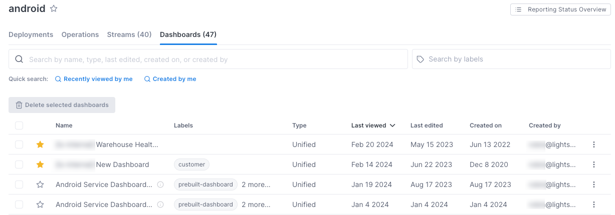
Only dashboards that have charts that contain a filter for the service are shown.
Click a dashboard to view it.
Read Create and manange dashboards to learn more.
View and improve your instrumentation quality
The data you can view and use in Cloud Observability depends on the quality of your tracing instrumentation. The better and more comprehensive your instrumentation is, the better Cloud Observability can collect and analyze your data to provide highly actionable information.
Cloud Observability analyzes the instrumentation on your services and determines how you can improve it to make your Cloud Observability experience even better. It can determine whether you instrumentation:
- Crosses services to create full traces
- Includes interior spans to help find the critical path
- Contains attributes to help find correlated areas of latency. If there are attributes that you’d like all services to report to Cloud Observability (like a customer ID or Kubernetes region), you can register the corresponding attributes and Cloud Observability will check for those when determining the IQ score.
- Uses attributes for deployments to help monitor regressions
- Contains
hostnameattributes to help find performance issues in different environments.
Click the Instrumentation Quality tab to learn how well your instrumentation measures up. The number on the tab gives your score (based on 100%). 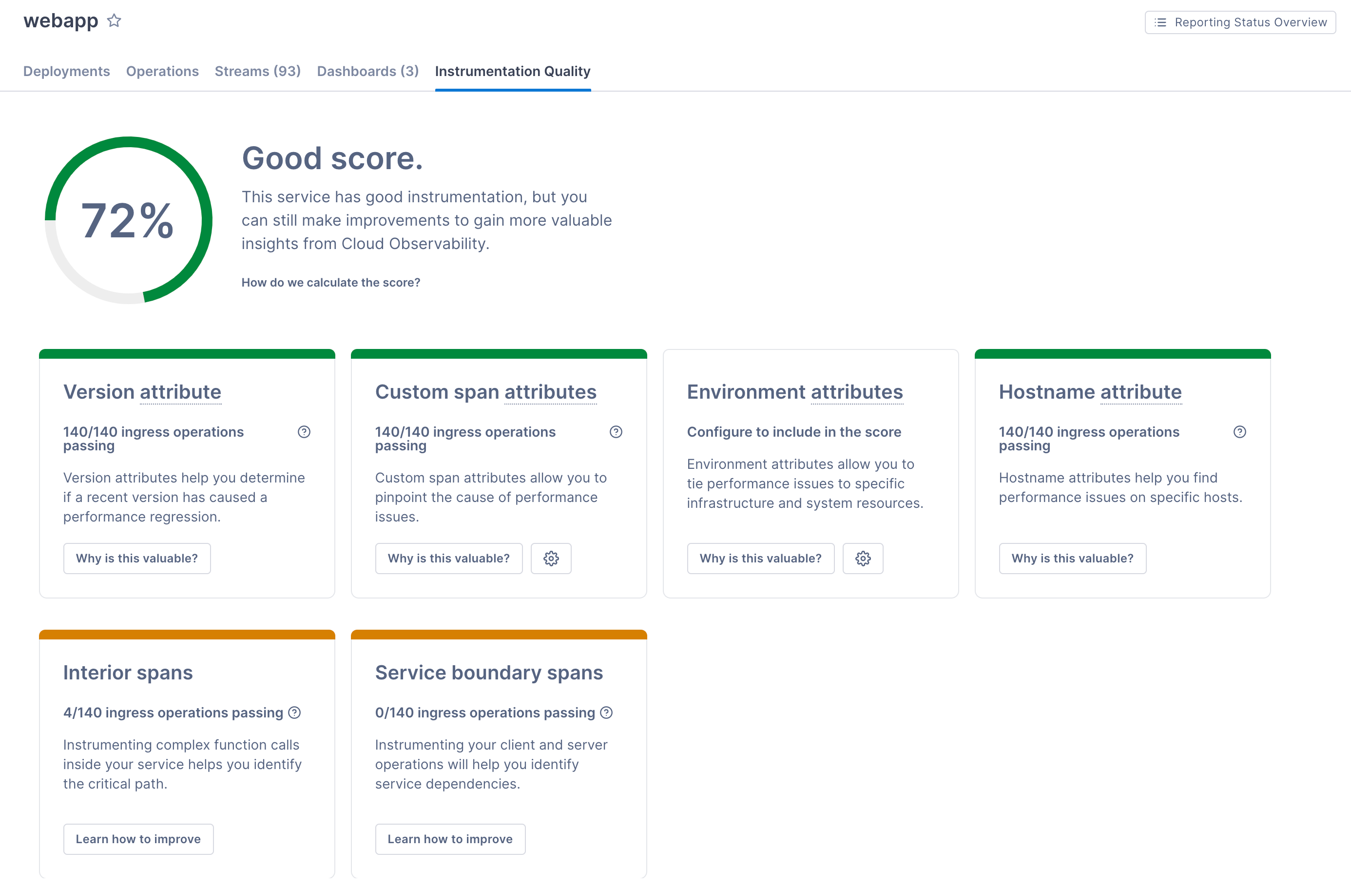
Learn more about what your score means and how to fix it.
See also
Updated Jul 1, 2024