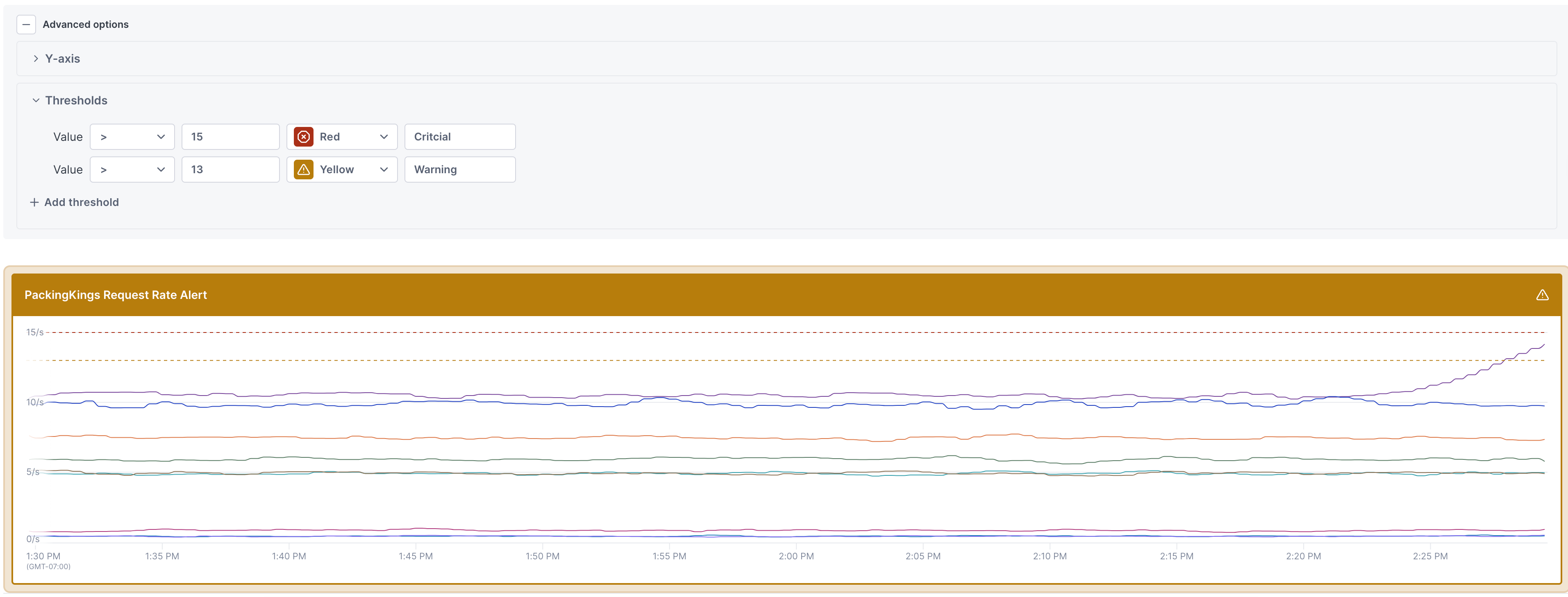
You can now set thresholds on charts to provide a visual clue when a value crosses a given value. Once configured, the threshold shows as a dotted line on the chart. When a time series on the chart crosses the threshold, a colored border displays around the chart. This makes it easier to understand when a chart requires your attention.

Updated Jul 30, 2024
