Gauges are enhanced big number charts that show you how close to a target value the data is. For example, you may want to keep track of memory usage using a gauge chart. You might set four thresholds so that a value under 25% displays as OK, up to 50% displays as fair, up to 75% displays as warning, and anything over 75% displays as critical. 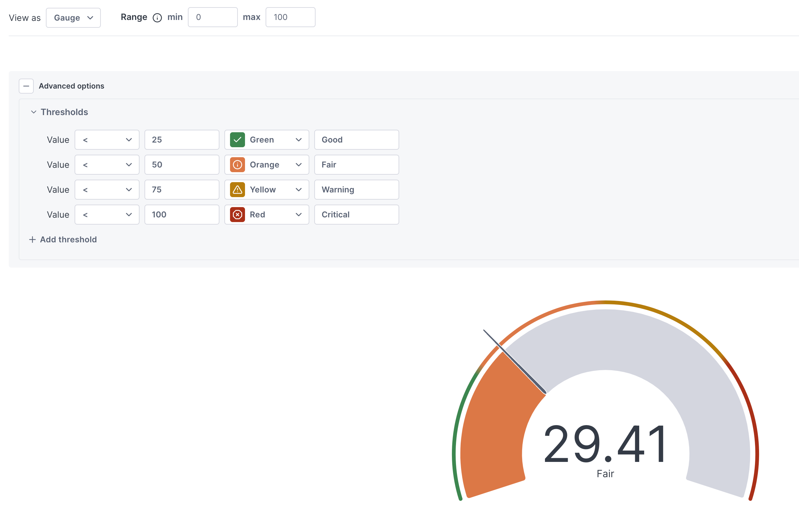
Learn how to use gauges.
Updated Sep 19, 2024