You can now use ordered lists and tables to visualize your data in notebooks and dashboards.
The ordered list chart displays the results of your query in descending/ascending order of value using a bar graph. The highest value is shaded to 100% and subsequent values are shaded to a relative percent. 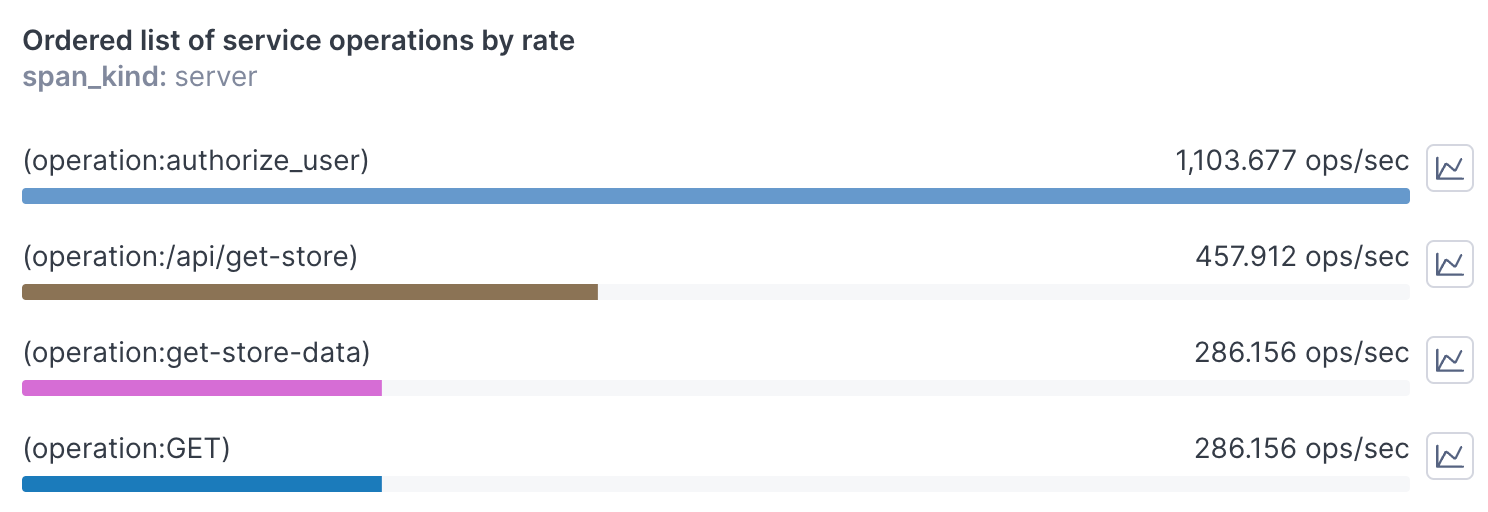
The table visualization shows your data in a tabular format, similar to the table shown below each chart in notebooks and the expanded chart view in dashboards. Tables are useful when your query includes a group-by. 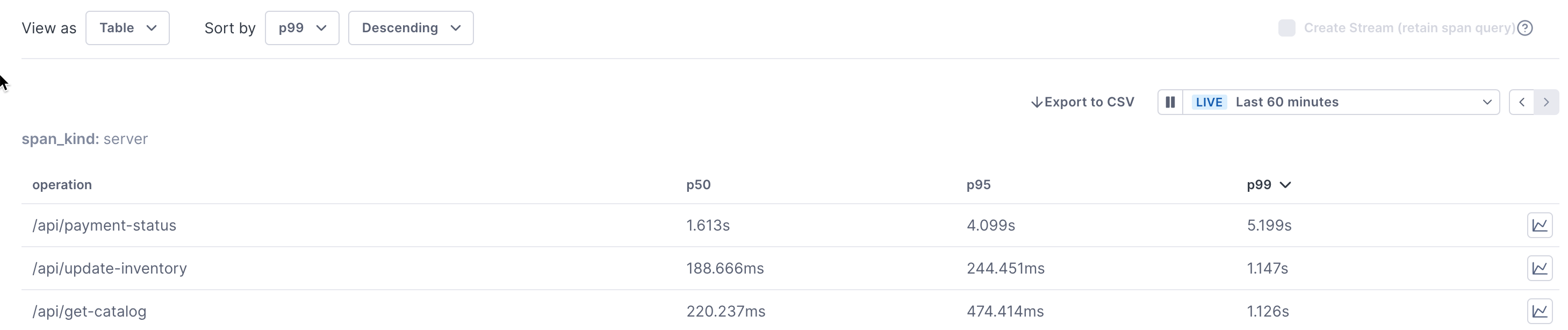
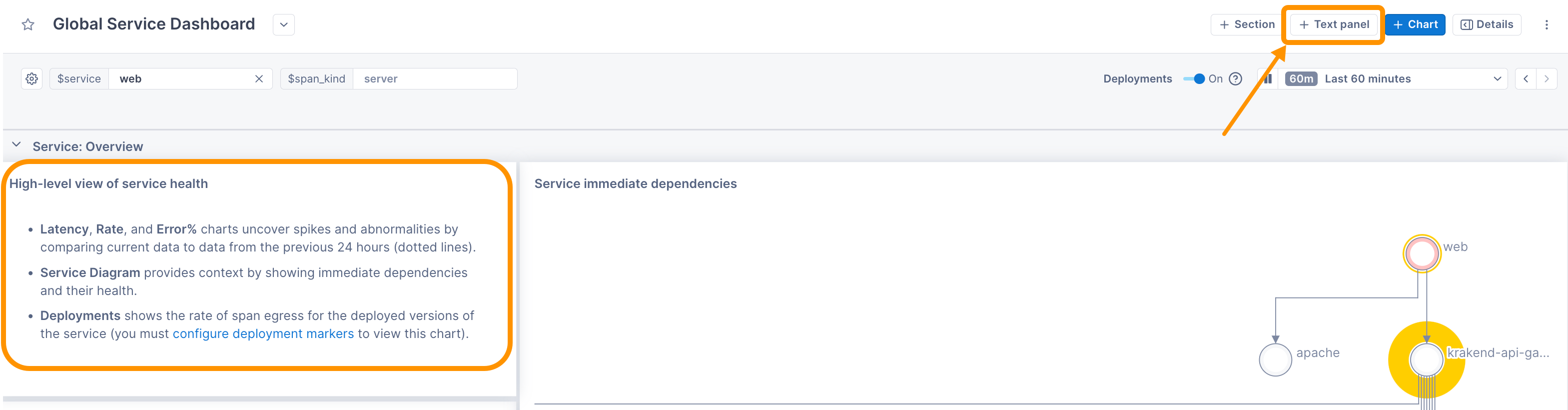
Additionally, you can now also add text panels to your dashboards to display content such as a description of a section and links to related content.
Updated Jun 14, 2023