
When you are in a performance investigation, you often need to run ad hoc queries to see the performance of your system, both at the infrastructure level and app level, and then share your findings with your team. Instead of using multiple tabs or tools, and creating “throw-away” dashboards, Cloud Observability provides notebooks that allow you to query and visualize your logs, metrics, and traces in one place. You can also add charts from other pages in Cloud Observability. You can add text blocks to note and explain your findings and share your notebook (either a live version or a snapshot in time) with anyone with a Cloud Observability account.
You can use the Unified Query Builder or the Unified Query Language (UQL) to query logs, metrics, and spans to create and filter charts for your notebook. You can find correlations directly from a notebook to begin your investigation. You can also create alerts from a chart in a dashboard.
From trace data charts, you can view example traces that have high latency, error, or operation rate. 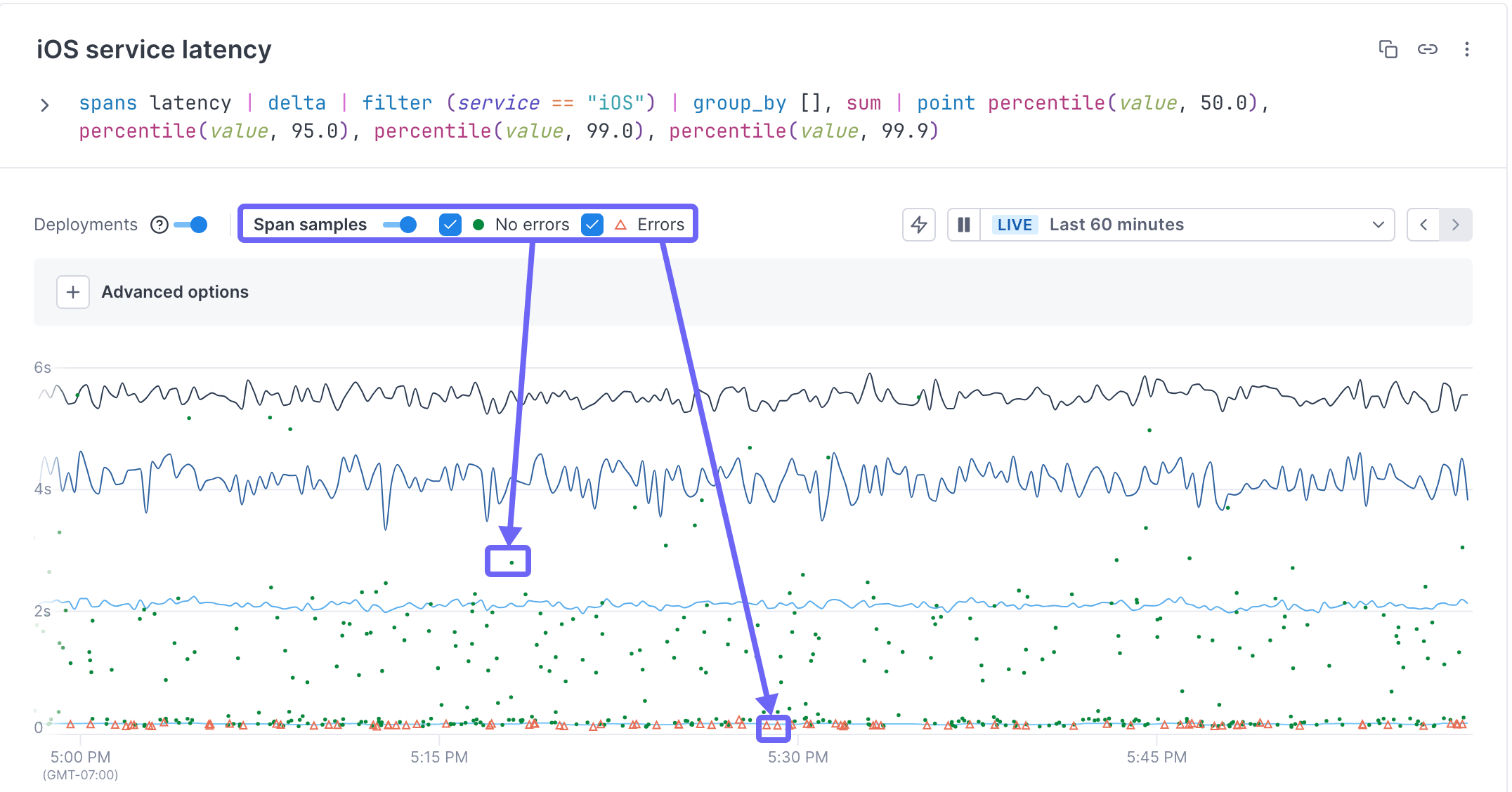
To view a trace, make sure the Show span samples toggle is on. Spans with errors are shown as a triangle. Spans without errors are shown as dots. Click on either one to view the associated trace.
When to use notebooks
Notebooks are helpful anytime during an investigation when you want to create ad-hoc queries, especially when you want to query logs, metrics, and traces. They are also useful when you want a record of your investigation for postmortems or runbooks.
Here are some examples of how you might use notebooks:
- Ad-hoc queries: You can build ad-hoc queries in a notebook and compare the charts and find correlations or view traces from there.
-
Collaboration: When your team needs to collaborate during an investigation, you can each add your own charts and text blocks to the notebook and work with the same data.
When someone adds a chart or text block to a notebook, you will need to refresh your page to see any additions/changes. If you’ve shared your notebook and know that someone else may be editing it, the general guideline is to refresh the page after each change you make to ensure you don’t overwrite each other’s edits.
- Postmortems and runbooks: When you use notebooks during an investigation, you can add your steps to resolution to the notebook once you’ve resolved the issue.
Users with Viewer permissions can create, view, and copy any notebook, but can only edit and delete their own.
Data retention in notebooks
The data for metric-based charts is stored for 13 months and for your span-based charts, data is kept for the length of your retention window and then auto-saved, so once you mitigate an issue, you can go back to the data you worked with to fully investigate and remediate.
By default, log data is queryable for 3 days. You can change that value or query older logs by rehydrating logs from cold to hot storage.
Auto-saved span data in notebooks
By default, you can explore data currently in the retention window (default is the last three days). But because your notebooks become useful tools in rituals like post-mortems, you often want to have a record of the data you worked with as you investigated an issue. Cloud Observability automatically saves the data from when you created the chart, so you can continue to view the chart and click on an exemplar (a dot or triangle) to view the associated trace. To see more recent data, you can rerun the query on a new chart by clicking Duplicate with latest data.
If you try to change the query once it’s auto-saved, you see a warning stating that you will lose data if you save the change. Data loss will happen because the data that was auto-saved is based on the retention window from the original query. Changing the query requires gathering new data which will overwrite the original. Instead, you can duplicate the original query to a new chart using data from the current retention window and edit that instead.
The auto-saved version is retained for as long as your data retention policy.
Notebook snapshots
Additionally, sharing information becomes important during an investigation. You can share a read-only snapshot of a notebook at any point in time and that snapshot is also saved for the period of your data retention. Read more about sharing notebooks.
Work with notebooks
You access notebooks from the Notebook icon in the navigation bar. 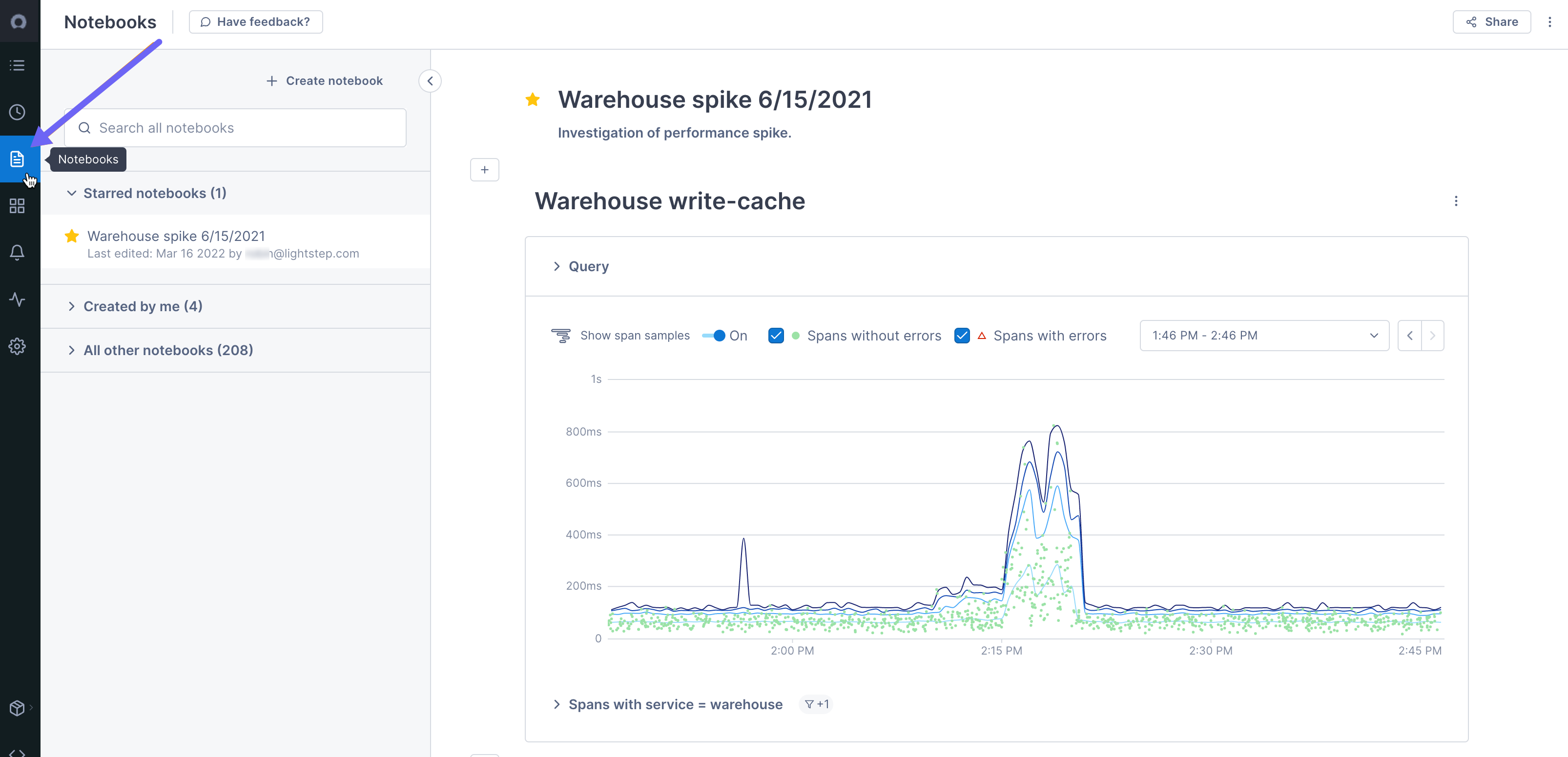
Existing notebooks are listed in the sidebar. Any notebooks that you’ve favorited are shown in the first section. Notebooks that you’ve created are in the second section, and all other notebooks are listed in the last section, in the order they were created (latest on top). You can see when the notebook was last edited and by who.
You can use the Search field to find a notebook by searching on name or user.
You can favorite a notebook by clicking the star. Your favorite notebooks are moved to Starred notebooks section of the sidebar.
Create a notebook
You can create a notebook from the Notebooks view and then query logs, metrics, and traces to add charts.
You can also add charts from existing charts, queries, or time series.
To create a notebook:
-
From the navigation bar, click Notebooks.
A new (unsaved) notebook shows the query builder.
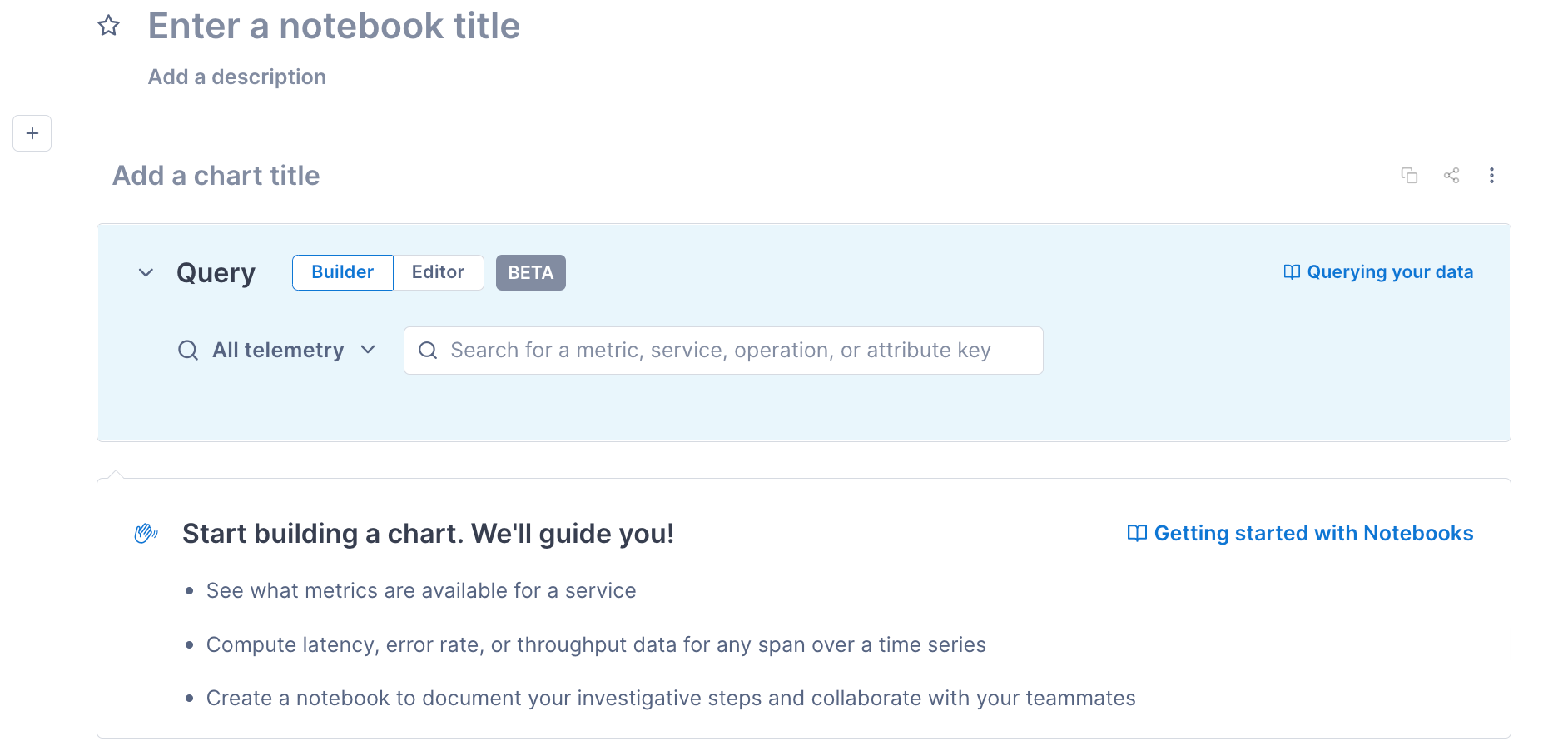
If an existing notebook is displayed, click Create notebook from the sidebar.
-
Click into the fields to add a title and an optional description for the notebook.
If you don’t add a title, Cloud Observability automatically names the notebook after the query, along with a timestamp.
-
Click Save notebook. You only need to explicitly save a notebook when you create it. All changes are auto-saved after that point.
You can now add log, metric, and span charts; add text blocks; and share the notebook.
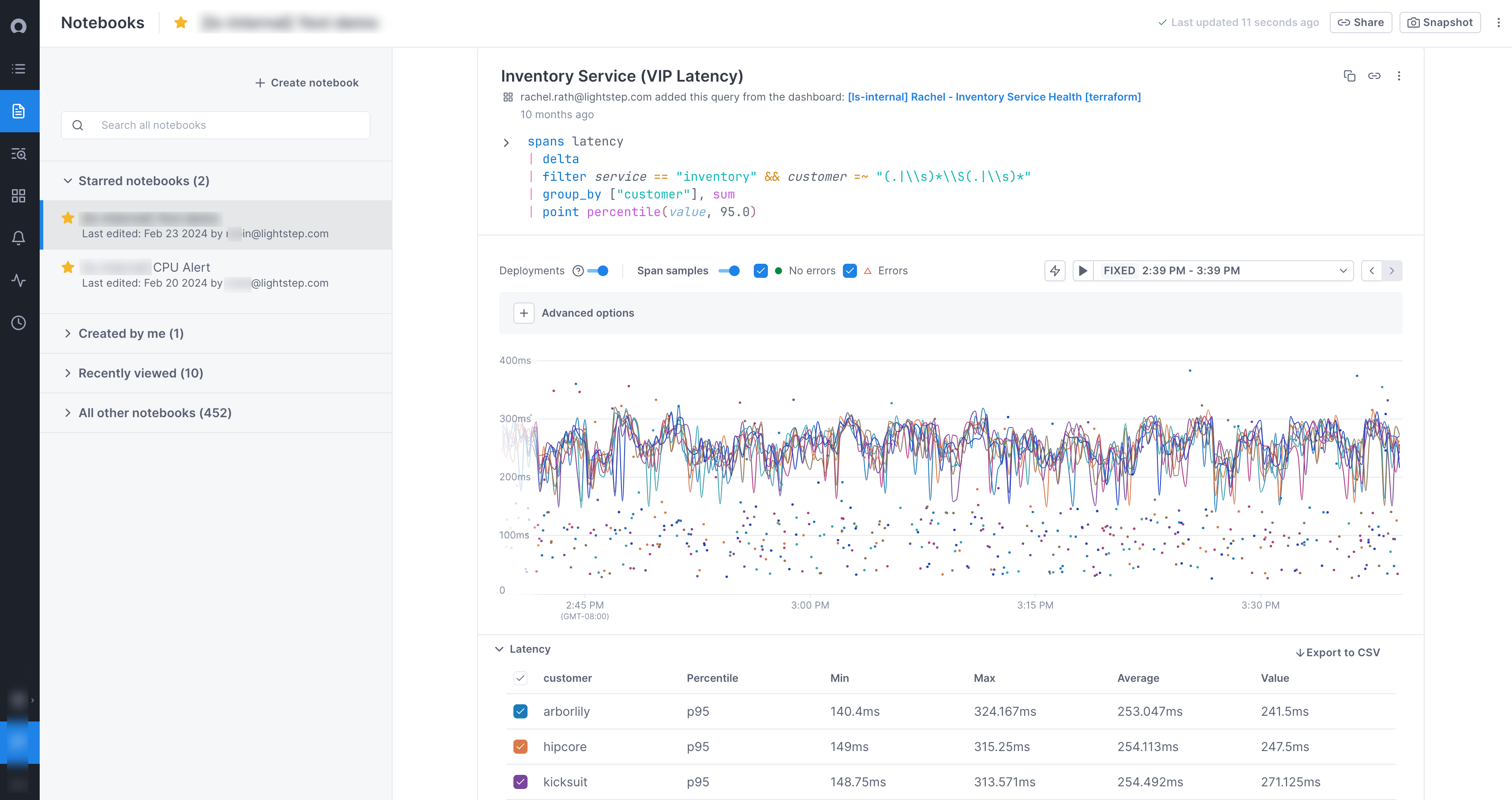
Add charts to a notebook
You can add charts based on queries to logs, metrics, and spans. You can also add charts from other parts of Cloud Observability where you may have started your investigation.
Add a chart
-
If this is the first chart in the notebook, the query builder is open.
If you’re adding a subsequent chart, to open the query builder click the + icon and choose Build another chart.
-
Create a log query, metric query, or span query.
You can add another query to the chart and you can use formulas to perform arithmetic on the time series.
You can also change how the chart displays.
Because notebooks are meant to be used in a one-off situation where you are working to investigate an issue, you really want data from when that issue occurred. So instead of using or being able to create Streams to continually collect data (which you probably don’t want), CloudObs automatically saves your query.
Add an existing chart, query, or time series
You can add charts from these places where you may have started your investigation:
- A chart on a dashboard.
- A metric chart on an alert.
- An Explorer query.
- A time series chart from the Deployments tab in the Service Directory.
- An operation’s overview in the Service Directory. This creates a chart for that operation’s performance.
- A Stream listed for a service in the Service Directory. This creates a chart using the same query as the Stream.
When you add an existing query to a notebook, a chart is created using the same query. The annotation is a link back to the original, so you can quickly return to the origin of your investigation.
Work with charts
Customize and manage notebook charts:
-
Change chart queries with the query builder and editor.
You can’t undo changes to notebook queries. To experiment with queries, duplicate the chart and then make changes.
-
Customize time ranges with the time picker.
When setting time ranges, click Apply to update the time range for one chart. To update the time range for every notebook chart, click Apply to all.
Default time ranges depend on the chart’s source. Charts imported from dashboards or alerts use the original chart’s time range. Charts created in notebooks use the time range from the chart above it.
- Move a chart by clicking the More ( ⋮ ) icon for the chart and opt to move the chart up, down, to the top, or to the bottom of the notebook.
- View logs associated with the chart’s data by clicking More ( ⋮ ) > View logs.
- Delete a chart by clicking More > Delete > Yes, delete.
- Duplicate a chart by clicking the Copy icon and selecting the notebook destination.
Add text blocks
You can add text blocks to enhance your investigation.
Users with Viewer permissions can edit only their own notebooks.
To add a text block, click the plus icon above or below an existing notebook entry and choose Add a text block.
Work with text blocks
- Text blocks support Markdown.
- URLs resolve to clickable links.
- Duplicate a text block by clicking the More ( ⋮ ) icon.
- Delete the contents of a text block by clicking the X icon.
- Delete the entire text block by clicking the More ( ⋮ ) icon
Duplicate a notebook
You can copy any existing notebook to start a new one.
To copy a notebook, at the top of the notebook, click the More ( ⋮ ) icon and select the Duplicate notebook.
The notebook is saved as Copy of [Notebook title]. Click into the field to edit it.
Delete a notebook
You can delete a notebook. When you do, all included charts and text blocks are also deleted.
Users with Viewer permissions can delete only their own notebooks.
To delete a notebook, click the More ( ⋮ ) icon and choose Delete.
Share a notebook
You can share a notebook with any other Cloud Observability user in your organization. You can share a live version of the notebook and authorized users can edit the notebook, or you can create a read-only snapshot of the notebook to share.
Share a live notebook
When you share a live notebook, users with Admin or Editor roles can edit the notebook, including changing queries, time ranges, and text blocks (users with Viewer roles will see a read-only version).
To share a live notebook, click the Share button, select Share this notebook, and copy the link. 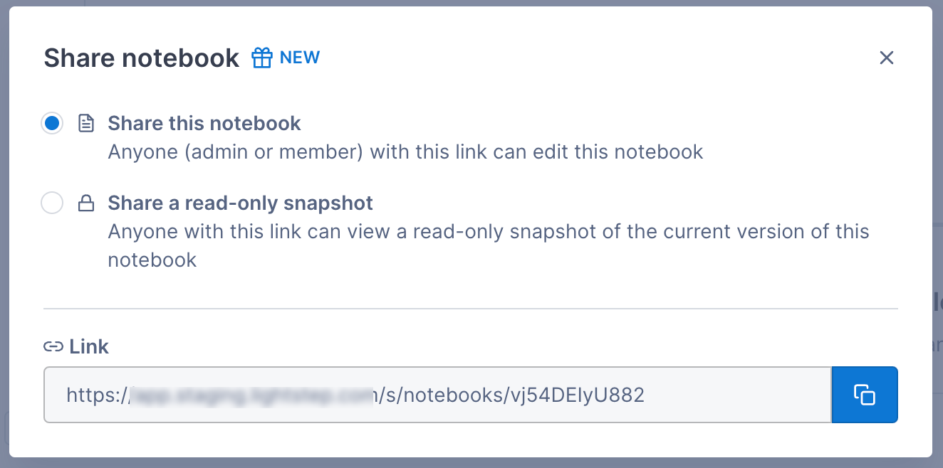
When someone adds a chart or text block to a notebook, you will need to refresh your page to see any additions/changes. If you’ve shared your notebook and know that someone else may be editing it, the general guideline is to refresh the page after each change you make to ensure you don’t overwrite each other’s edits.
Share a snapshot
When you don’t want other users to be able to edit the chart (or if you want to save off a notebook at a certain point in time), you can create a snapshot. The snapshot is saved for the length of your data retention policy.
To share a snapshot, click the Share button, select Share a read-only snapshot, and copy the link. 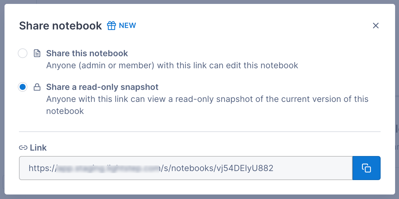
Once you create a snapshot, you can access it from the Share button.
Create an alert from a chart
You can create an alert from a chart, but because alerts require a specific structure, not all charts can be used to create one. If your query contains a group-by, you will not be able to create an alert (the option is disabled). For queries that don’t meet other requirements, you’ll be able to edit the query on the Alert Configuration page.
Creating an alert from a span query automatically creates a Stream.
Follow these steps to create an alert from a chart:
-
Click the More ( ⋮ ) icon and choose Create an alert.
The Alert Configuration page opens in a new tab using the query from the original chart. A banner describes the edits needed to create a valid alert. Fields in violation are highlighted.
-
Fix the violations.
-
By default, the title is the same as the original chart. You can change it and you can add a description, if needed.
-
Continue creating the alert.
Copy charts to a dashboard
You can copy a chart from your notebook to a dashboard.
For any chart, Click the More ( ⋮ ) icon and choose Add to a dashboard.
Choose the dashboard or create a new one.
The chart is added to the bottom of the dashboard.
Choose Copy all charts to dashboard to copy all charts in the notebook.
Use a notebook as a template (aka “reverse link”)
You can create a notebook and then use a “reverse link” that opens Cloud Observability and creates a new notebook containing the same charts as the original.
For example, say you want to add a link to your runbook for the iOS service and use it to create a notebook with charts showing error percentage and latency rate. You can create a notebook with those charts and then copy and paste the template link into your runbook. When users click the runbook link, Cloud Observability opens to a new notebook that contains the error and latency charts for the current time period.
To create a template (reverse) link:
- Create the template notebook and set its title to reflect that it’s a template (making it easier to find later).
- Click the More ( ⋮ ) icon at the top of the page and choose Create template link to copy the reverse link for the notebook.
-
Paste the link into an external source.
Notebooks created from this link use the current time period and not the time period from the existing notebook.
Investigate a deviation in a notebook chart
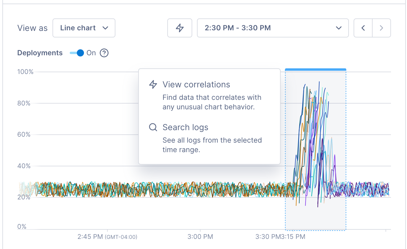
When you notice a deviation in a chart, use Cloud Observability’s correlation feature to investigate the deviation and find possible causes.
The correlation feature works with metrics and spans only. And you can’t use the correlation feature on big number charts.
To run the correlation feature, click View correlations or click directly in the chart and select View correlations. Cloud Observability opens a side panel where you can begin your investigation.
Visit Investigate deviations for more information.
See also
Updated Sep 21, 2023