Streams (queries whose data is saved beyond the default three day period) can be viewed in a tri-chart. The tri-chart shows the latency, error rate, and operation rate for the queried data.
Best practice is to view Streams in a notebook or dashboard, where you can also include metric queries, and create more complex queries against your data.
Using Terraform? You can use the Cloud Observability Terraform provider to create and manage your Streams. You can also use it to export existing dashboards and alerts into the Terraform format.
For example, here’s a tri-chart for the Stream of /api/get-profile operation on the android service: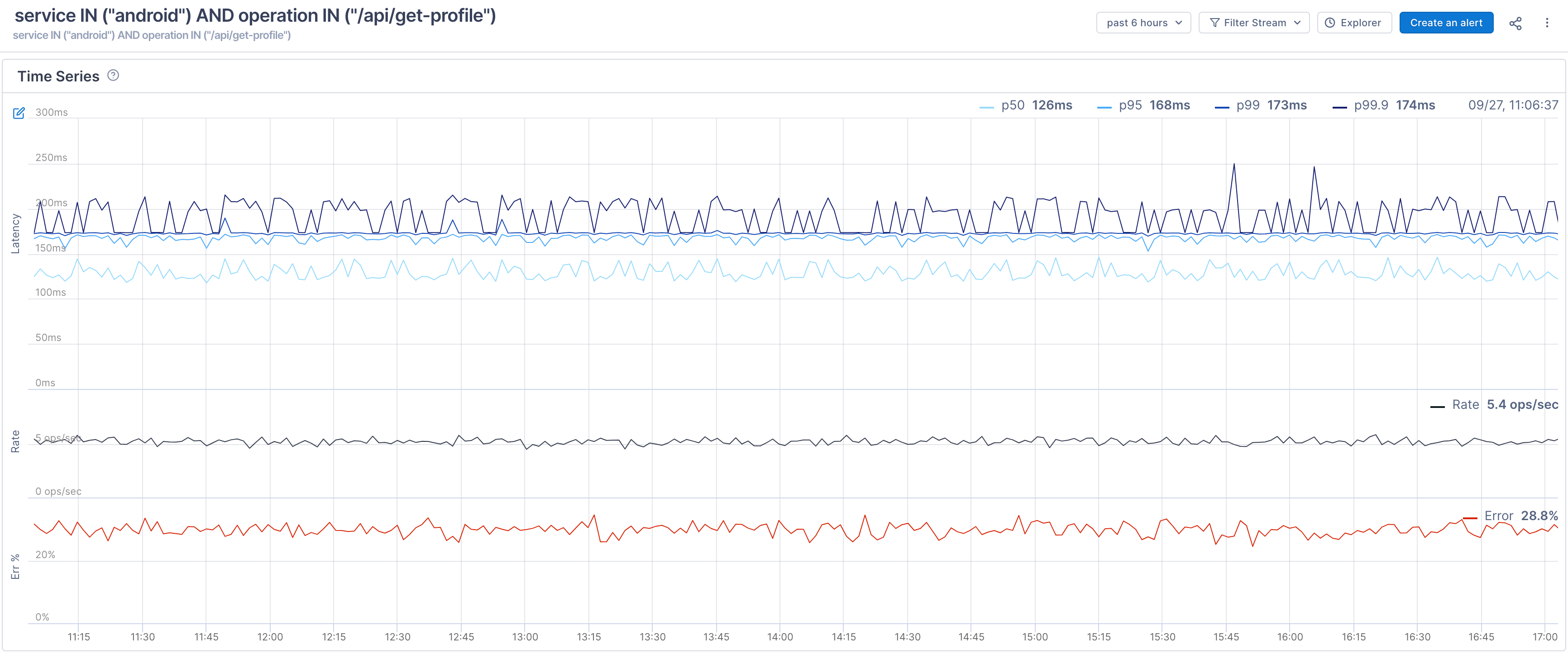
The first time series shows latency over a period of time. At the top, you can see the average duration of spans in the p50, p90, p99, and p99.9 buckets. The second series shows the operation rate over time, and the bottom series shows the error percentage rate over time.
When you hover over the latency series, you can view individual spans as dots in a scatterplot. This makes it very easy to see the actual distribution of latency and immediately notice outliers. Dots in red are spans with errors. You can click on any of the dots to open the full trace in Trace view. 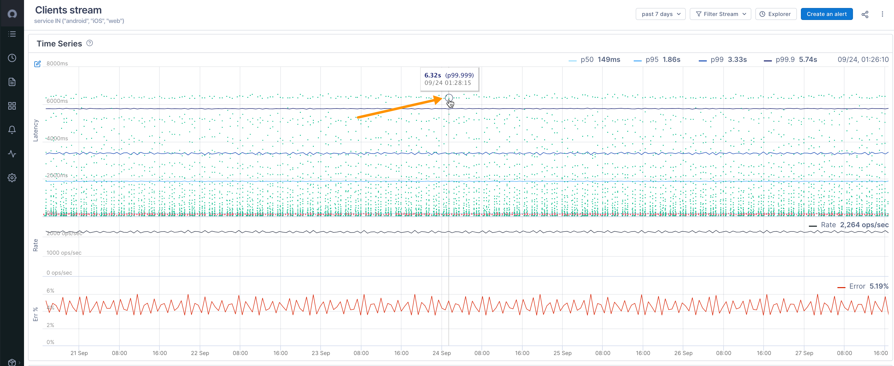
Below the time series is the Historical Spans table that displays the spans used to create the stream (it uses the same functionality as the Trace Analysis table in the Explorer view). You can click a span to view the full trace in Trace View. Spans with errors are shown in red. 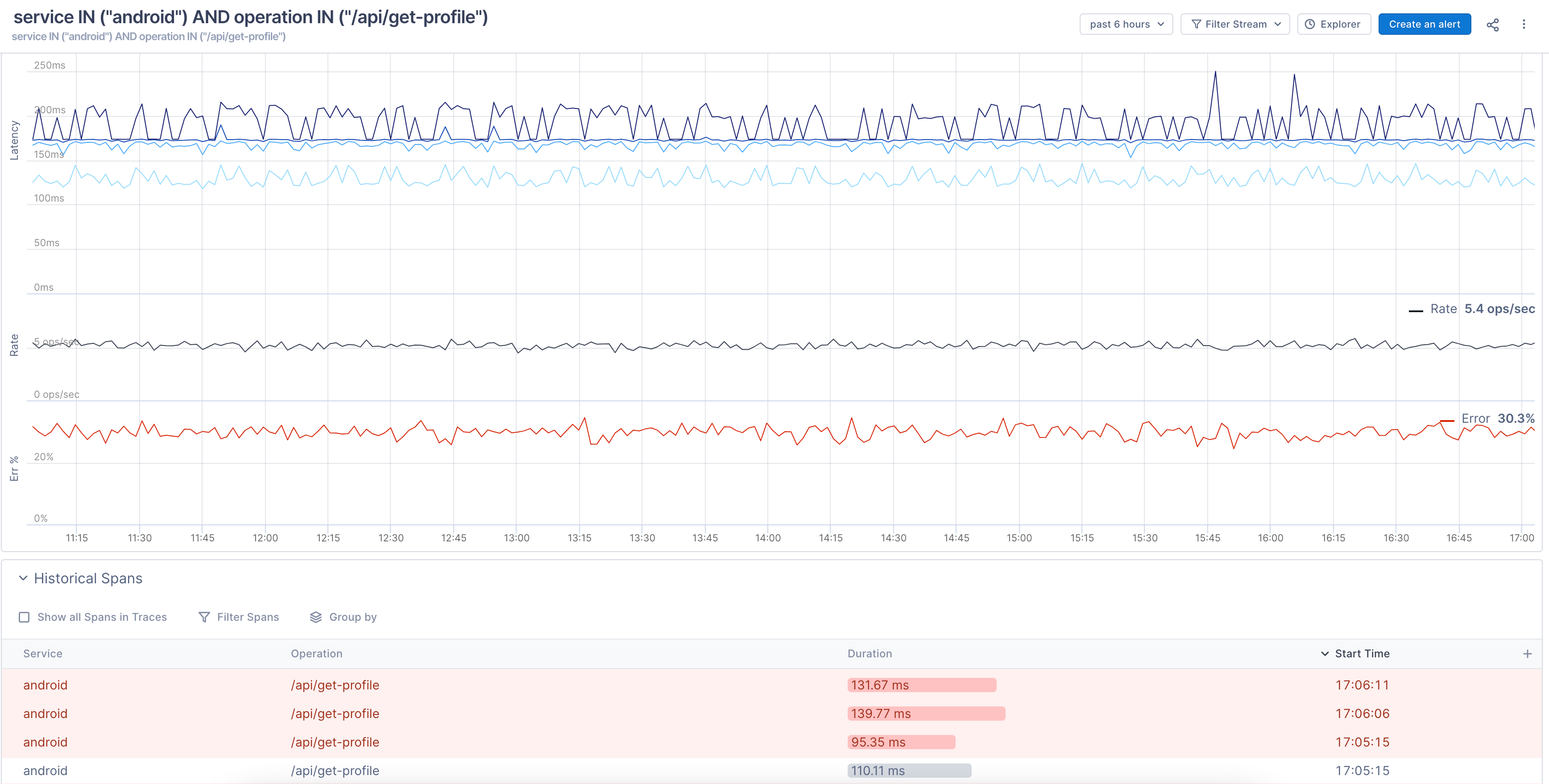
To help with issue mitigation, spans in the Historical Spans table may contain more exemplars of errors or latency and so may not reflect true percentage rates.
Cloud Observability starts collecting data for Streams once you create them, so when you create a Stream and view it in a tri-chart, it will initially be blank.
Filter data on a Stream
By default, the tri-chart displays all data for a Stream from the last 24 hours. You can change that time period. You can also filter the data by errors, percentiles, and duration.
Filtering a Stream also filters the data in the Historical Spans table.
Filter by time
Use the time period dropdown to choose a different period or enter a custom time period. Click Pick Time Range to enter a custom time period from a calendar. The time series and the Historical Spans table redraw to show spans just from that time period. 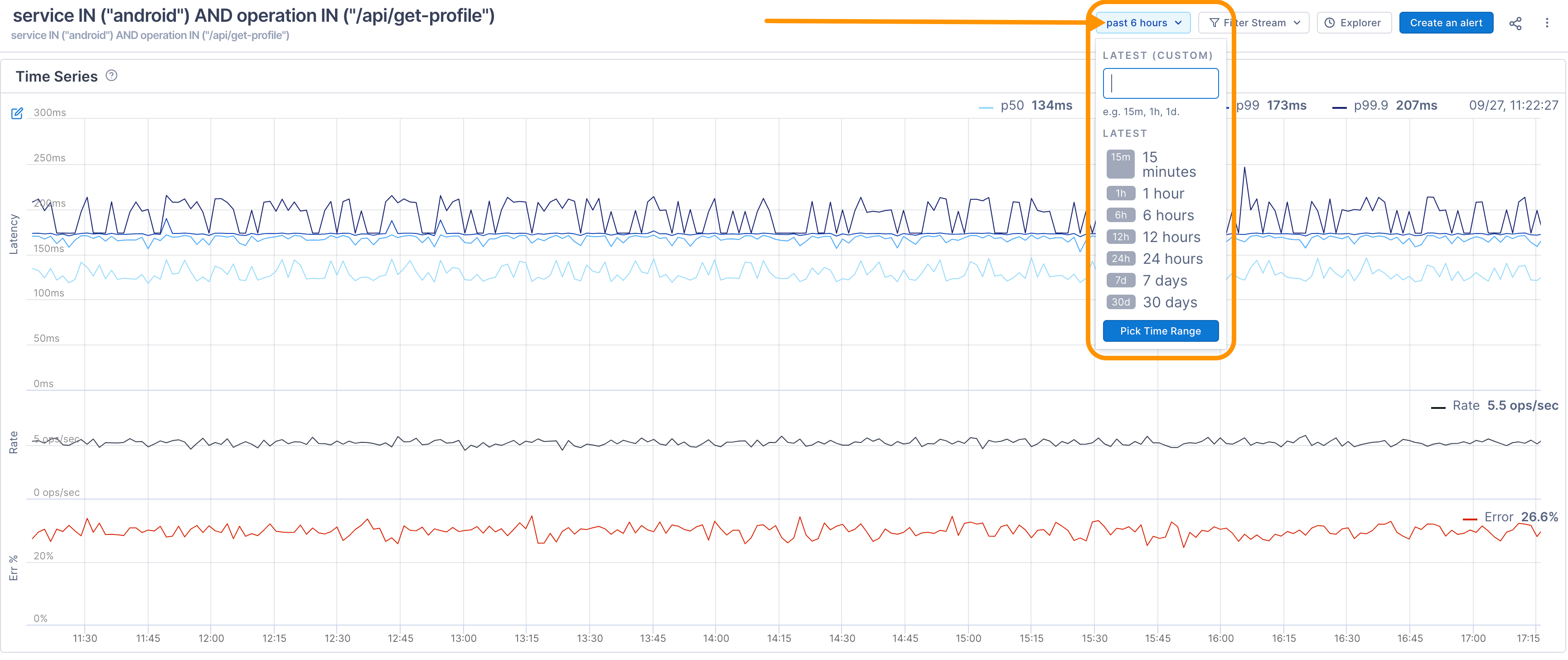
Changing the time window may affect the alignment of the data points and show different results.
Filter by Errors
To view spans with errors, use the Filter dropdown and choose Errors. The tri-chart redraws to display only data for spans with errors and the Historical Spans table shows the spans with errors. 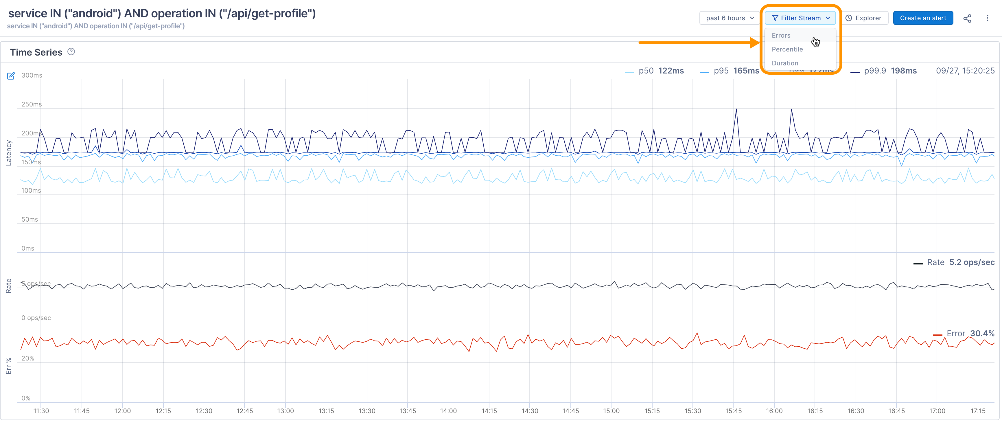
The scatterplot of spans does not display when filtering by errors.
Filter by latency percentile
By default, the tri-chart displays lines for the p50, p90, p95, and p99 latency percentiles. You can filter the data to display a specific percentile and above. Use the Filter dropdown and choose Percentile. Enter a value and the tri-chart refreshes the graph and table to show just that percentile and above. You can change the value by clicking it to reopen the dialog.
For example, this data is filtered to show p99.5 and above. 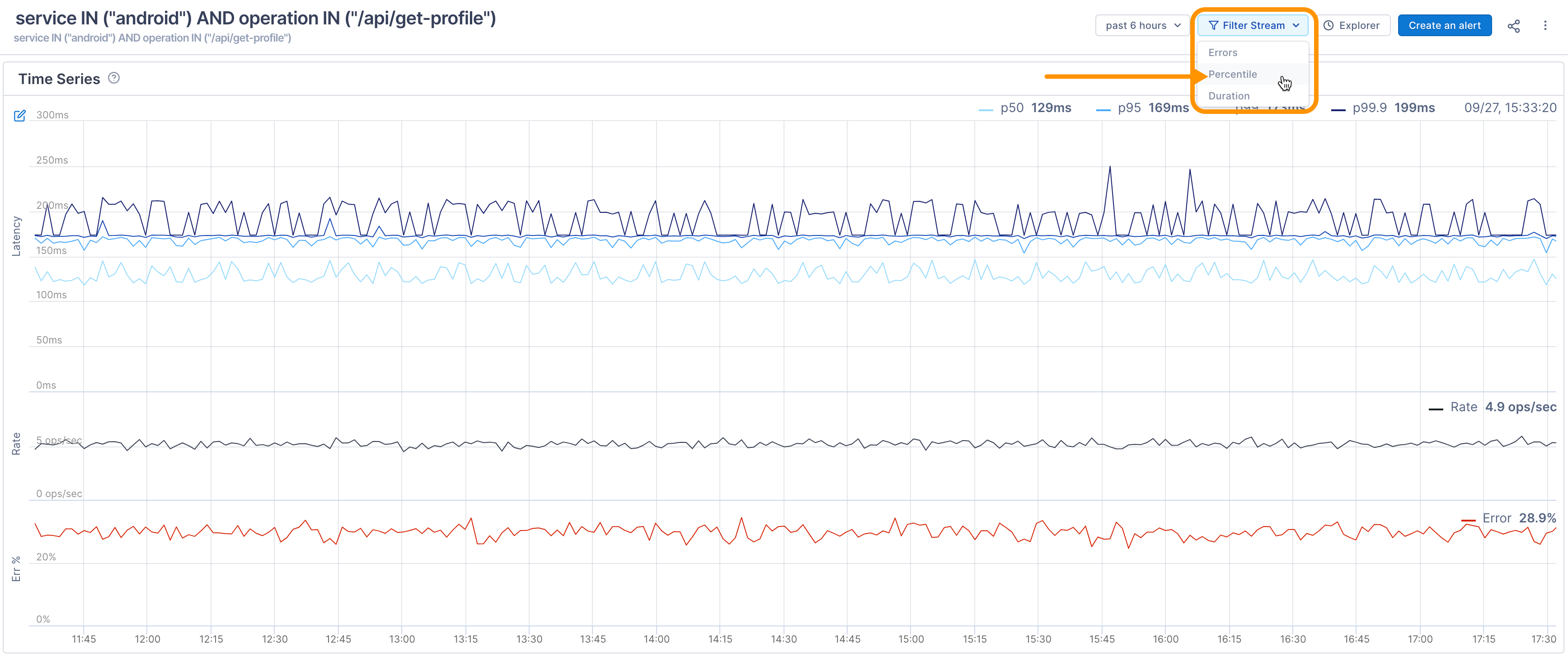
Filter by duration
By default, the tri-chart shows all spans, regardless of duration. Use the Filter dropdown, choose Duration, and enter a time period to see where that duration lies in the time series. The tri-chart refreshes the graph to show where that duration lies, and the scatterplot only shows spans at or above that duration. The table shows spans lasting approximately that duration. You can change the value by clicking it to reopen the dialog. 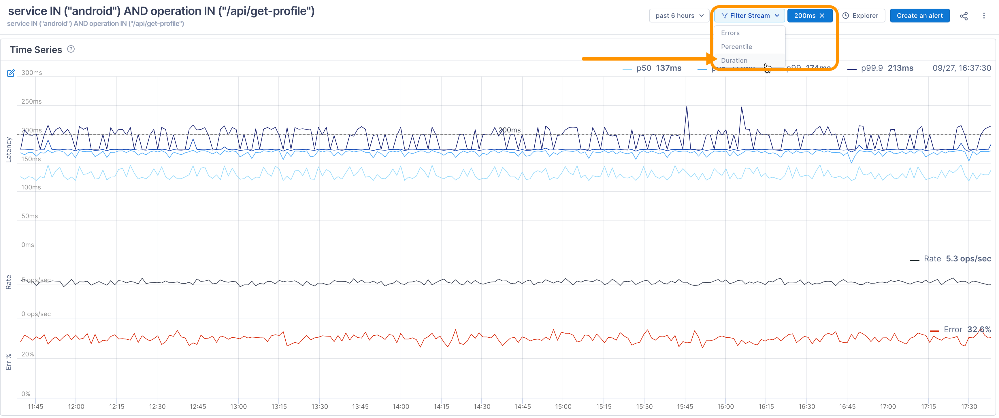
Analyze span data
The Historical Spans table shows information from a sample of spans returned by the Stream’s query. By default, the table shows the service, the operation reporting the span, the span’s duration, and the start time. You can add other columns as needed.
When you click on a span, you’re taken to the Trace view where you can see the span in the context of the full trace. 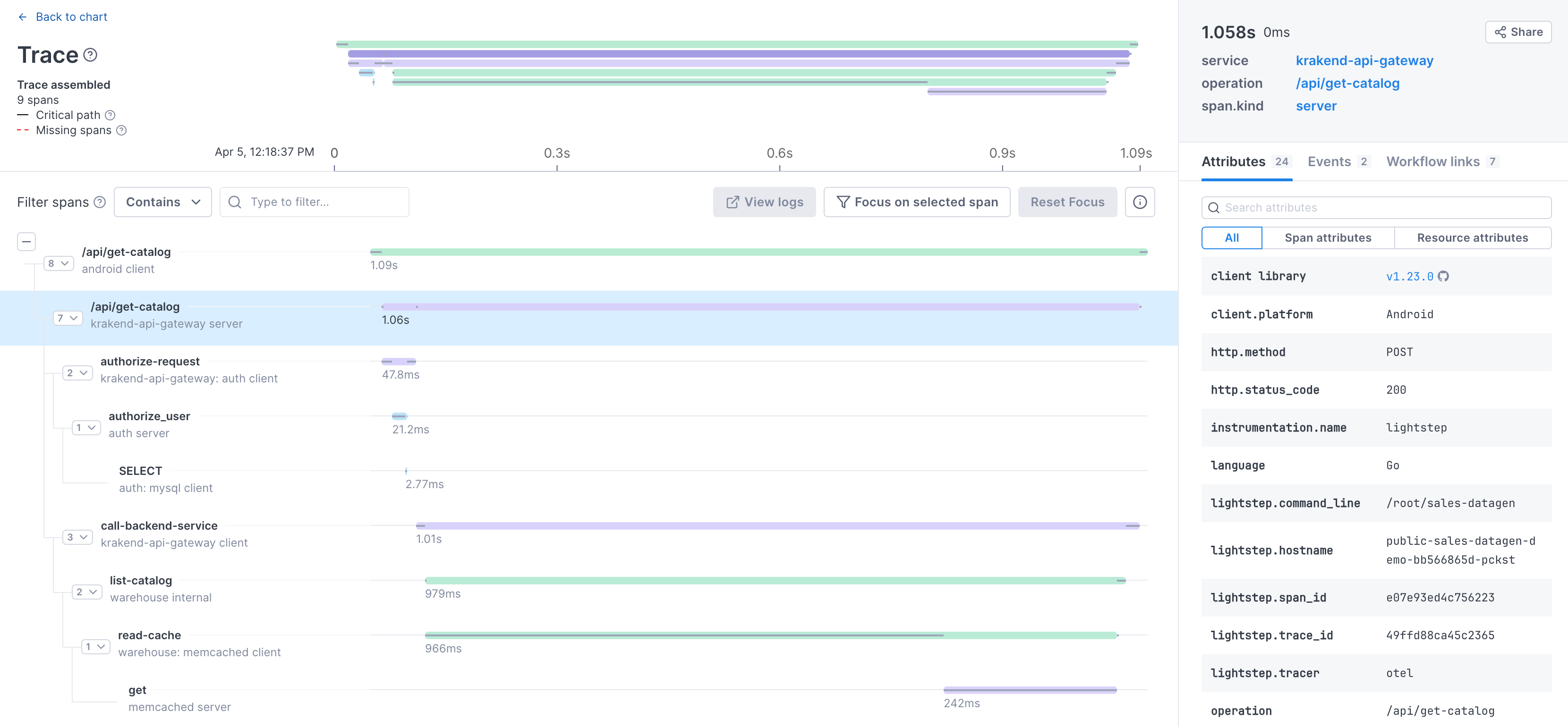
Add all spans from the trace to the table
By default, the table only shows spans that match your Stream’s query. But often, you’ll want to see spans that participated in the same traces as the spans returned by your query. For example, if you’re trying to reach a hypothesis, you may want a more broad view of what is going on in a trace, without having to open a bunch of traces yourself.
To see all spans that took part in a trace with your query results, select Show all Spans in Traces. 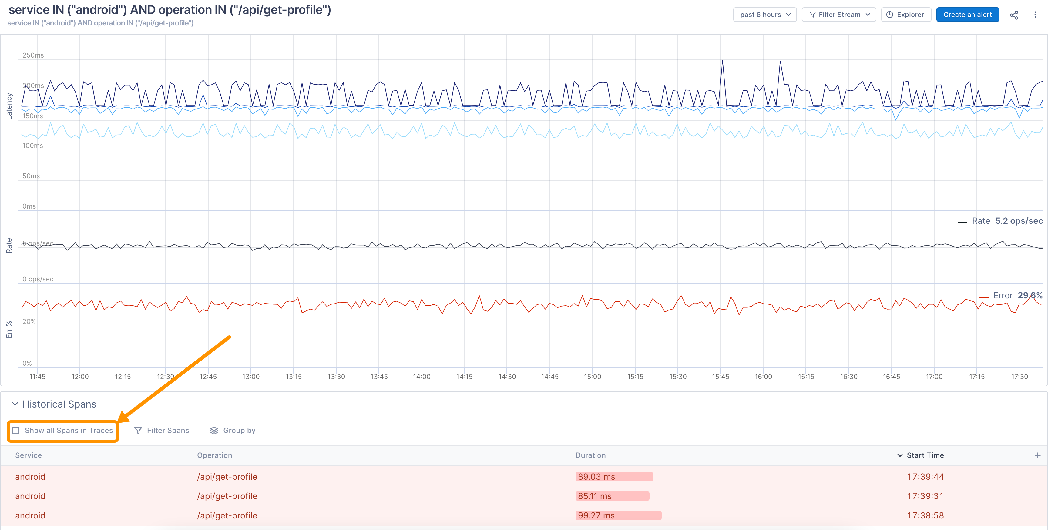
Add more columns to the table
You can add columns that show the span’s attribute data to the right of the table by clicking the + icon. As you start typing, Lightstep finds attributes matching your search. 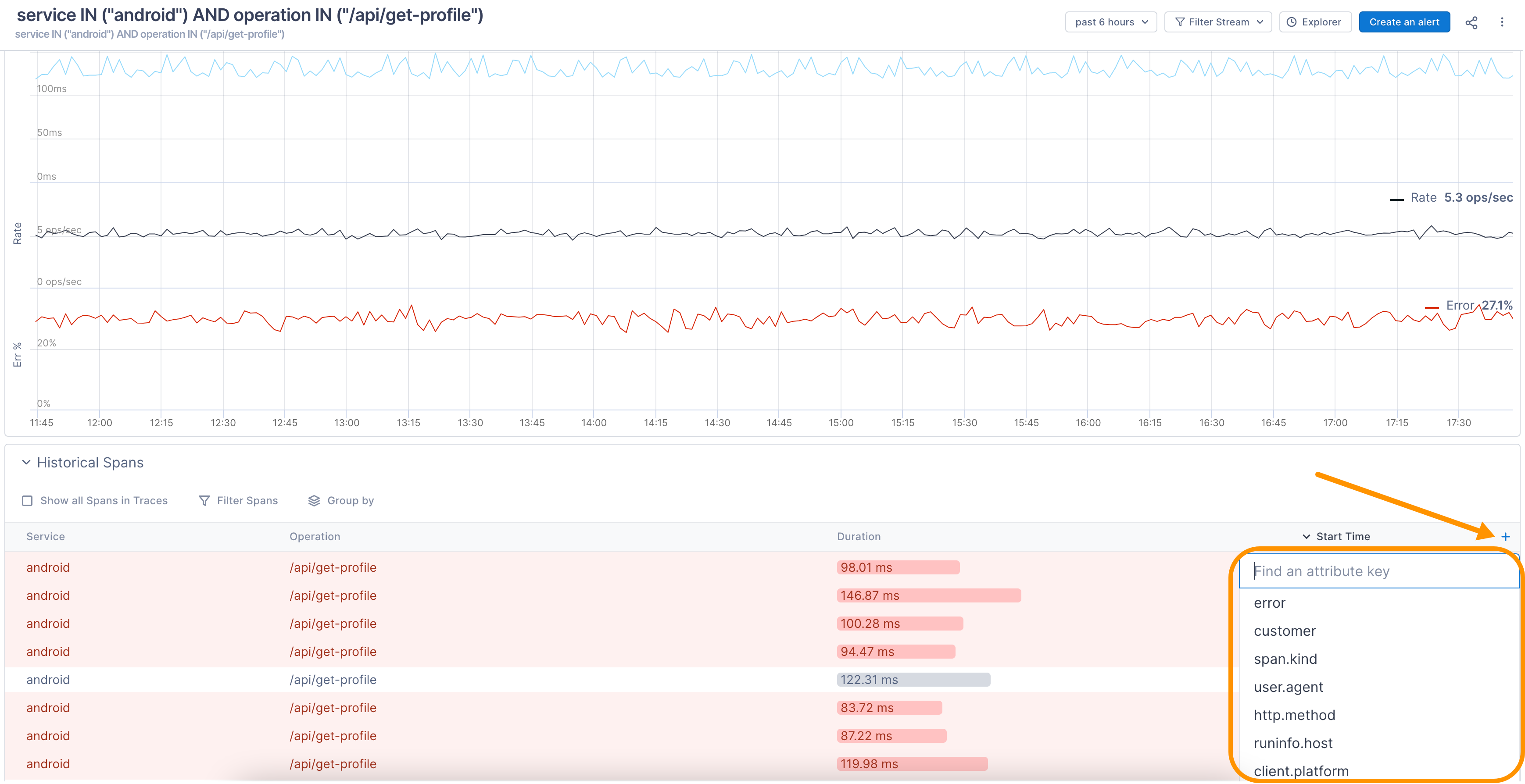
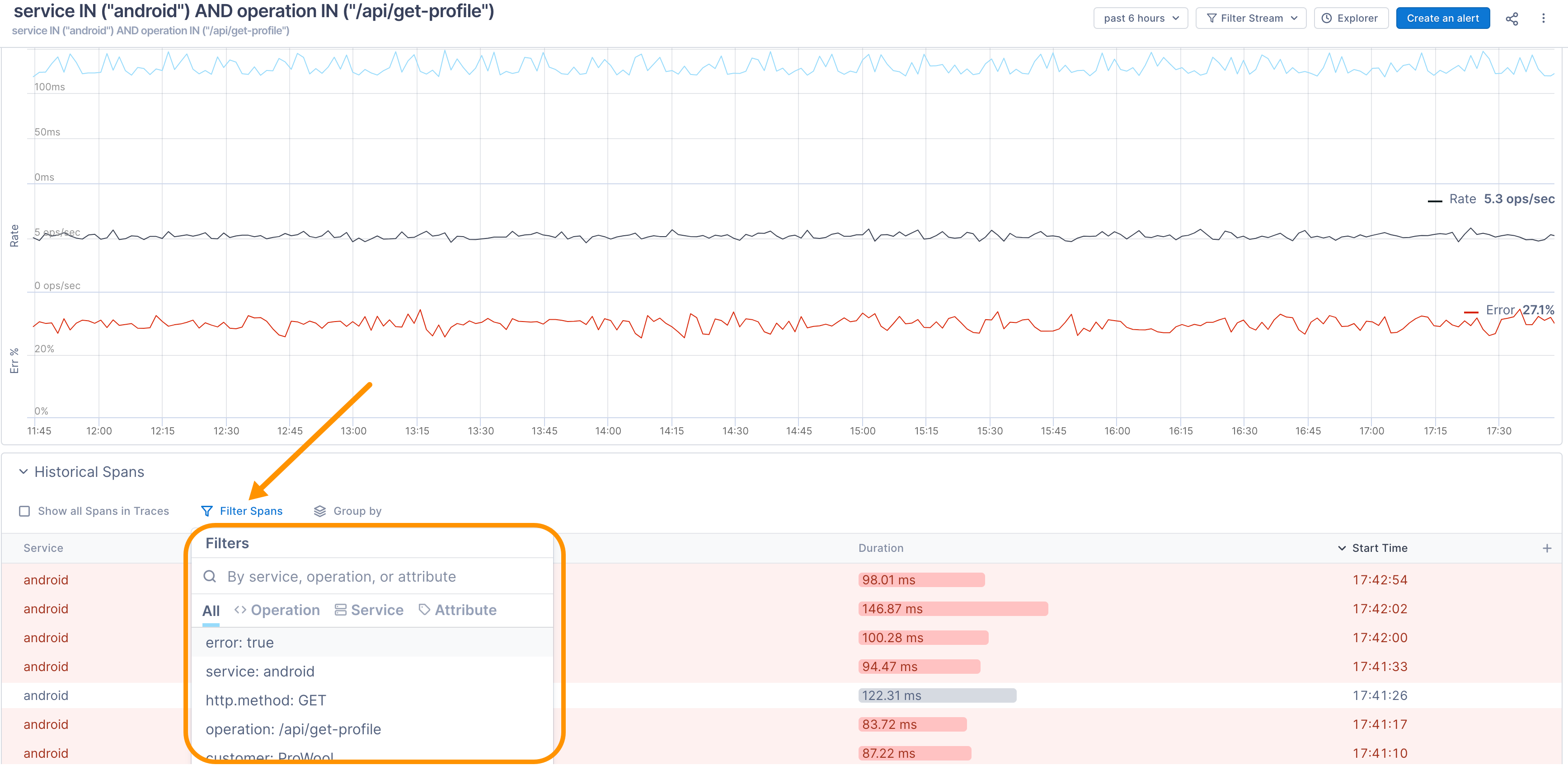
Filter data
You can filter the data in the Historical Spans table by Service, Operation, or Attribute.
Filtering the table does not affect the data shown in the time series charts.
Group results
You can group your results to see interesting aggregate data about your spans. You can group by service, operation, or attribute. 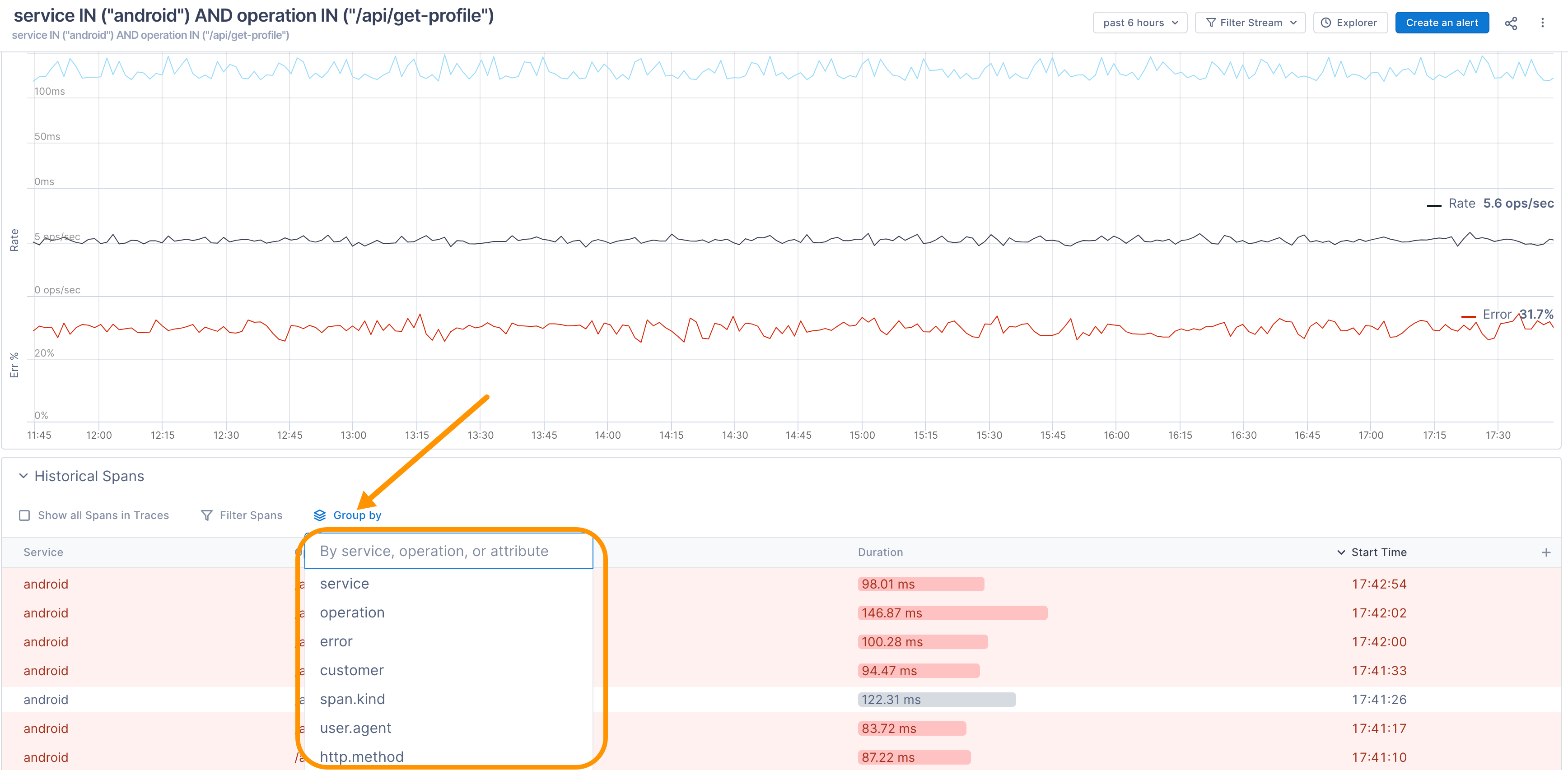
When you group your results, the table shows each value on the spans for the attribute, as well as average latency, error % and span count. 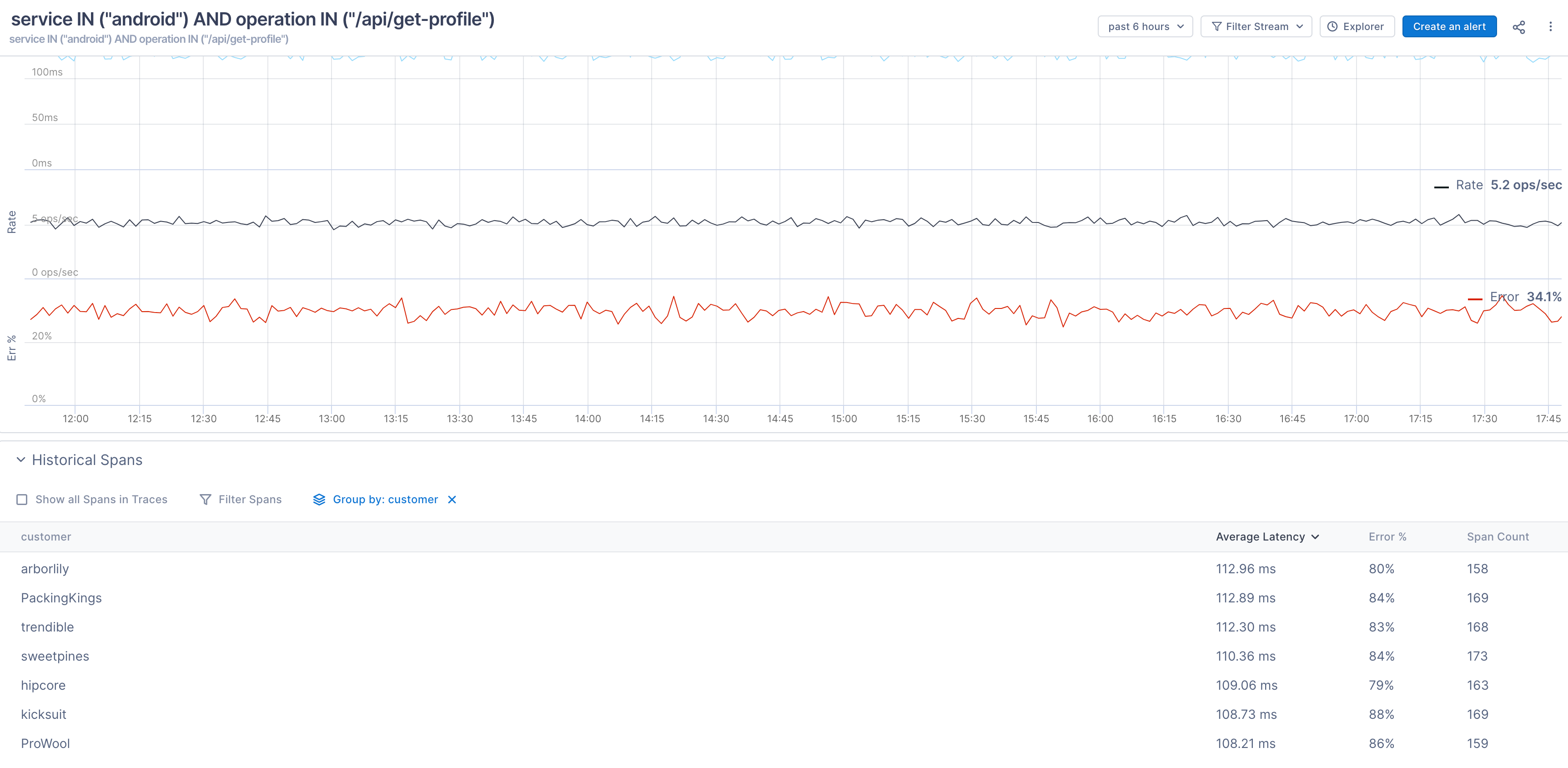
To help with issue mitigation, spans in the Historical Spans table may contain more exemplars of errors and so may not reflect the true percentage of error rates.
Click on a group to see the spans belonging to that group. 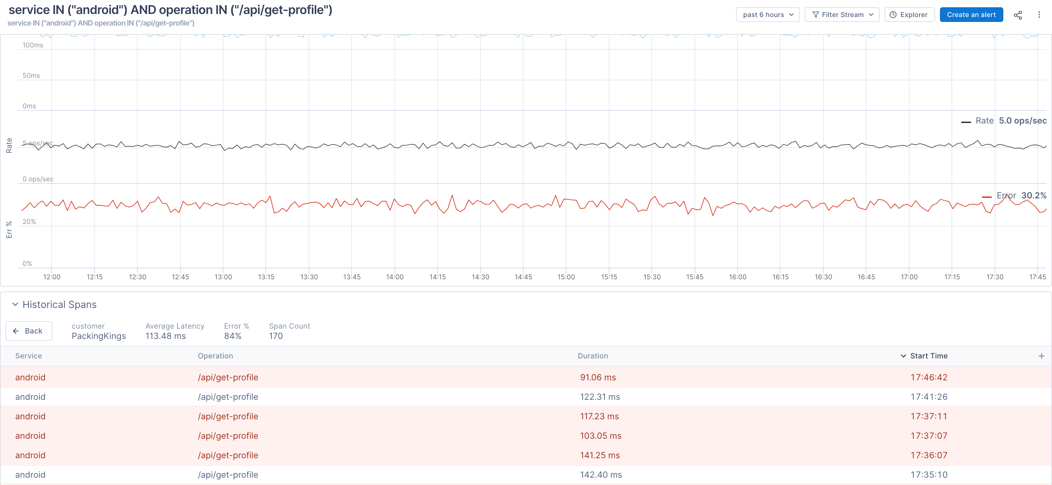
Share a Stream
The URL for a Stream is stable and shareable; perfect for alert messages, slack messages, and bot auto-responses. You can share a shortened URL for the Stream by clicking the Share button. 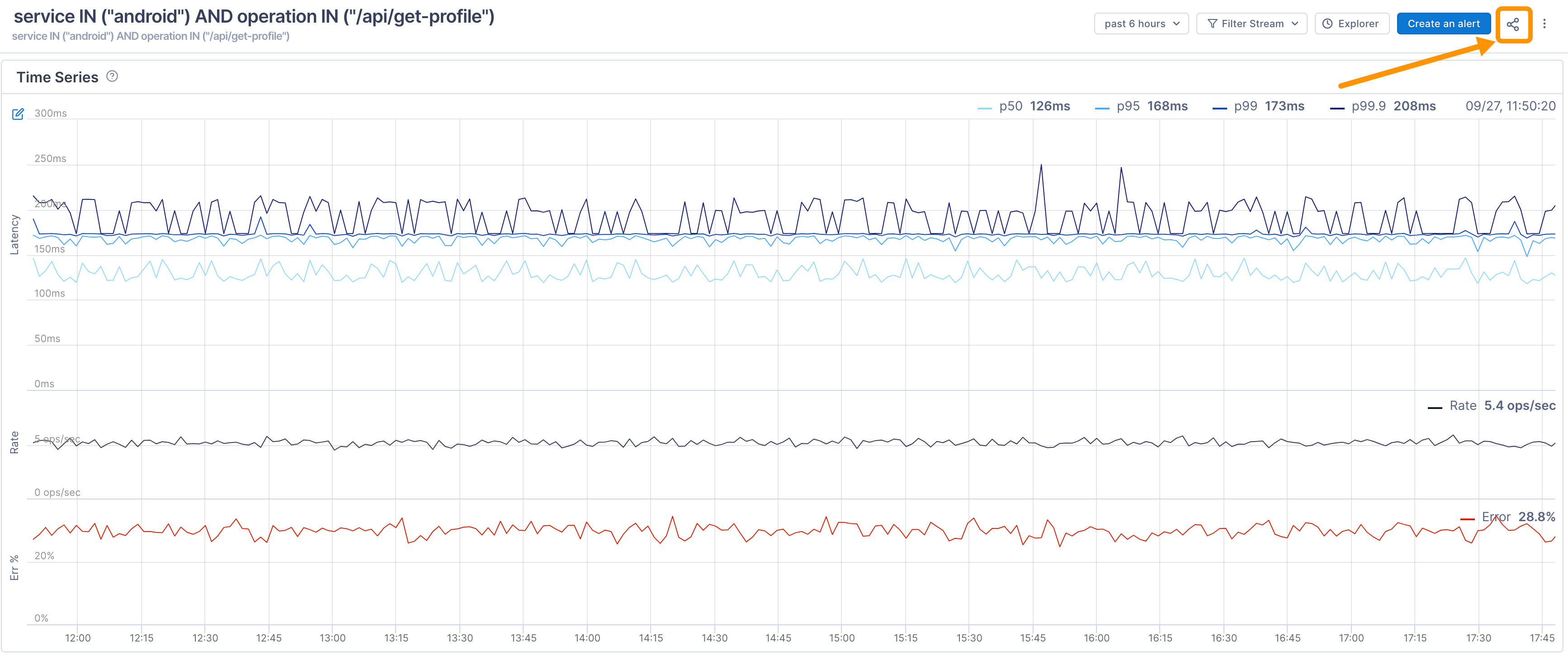
When you integrate Lightstep with Slack, you can share a preview of the Stream in any channel of your workspace. Paste the URL from the the Share button into a Slack channel. Other Slack members can see the tri-chart and Lightstep users can click View Stream to jump right to the tri-chart. 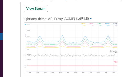
Add a Stream query to a notebook
You can add a Stream’s query to a notebook for when, during an investigation, you want to be able to run ad hoc queries, take notes, and save your analysis for use in postmortems or runbooks. Notebooks allow you to view metric and trace data from different places in Cloud Observability together, in one place.
To add to a notebook, click Investigate > Add to notebook and search to choose an existing notebook or create a new notebook. 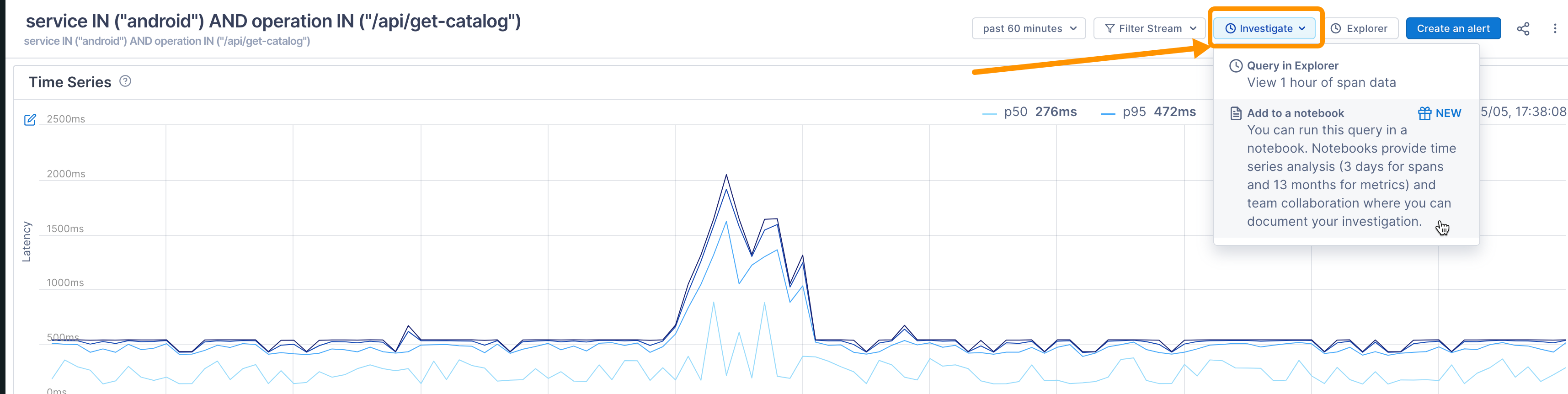
When you add to a notebook, a chart is created using the same query. You can see the latency for multiple percentiles and view exemplar traces. 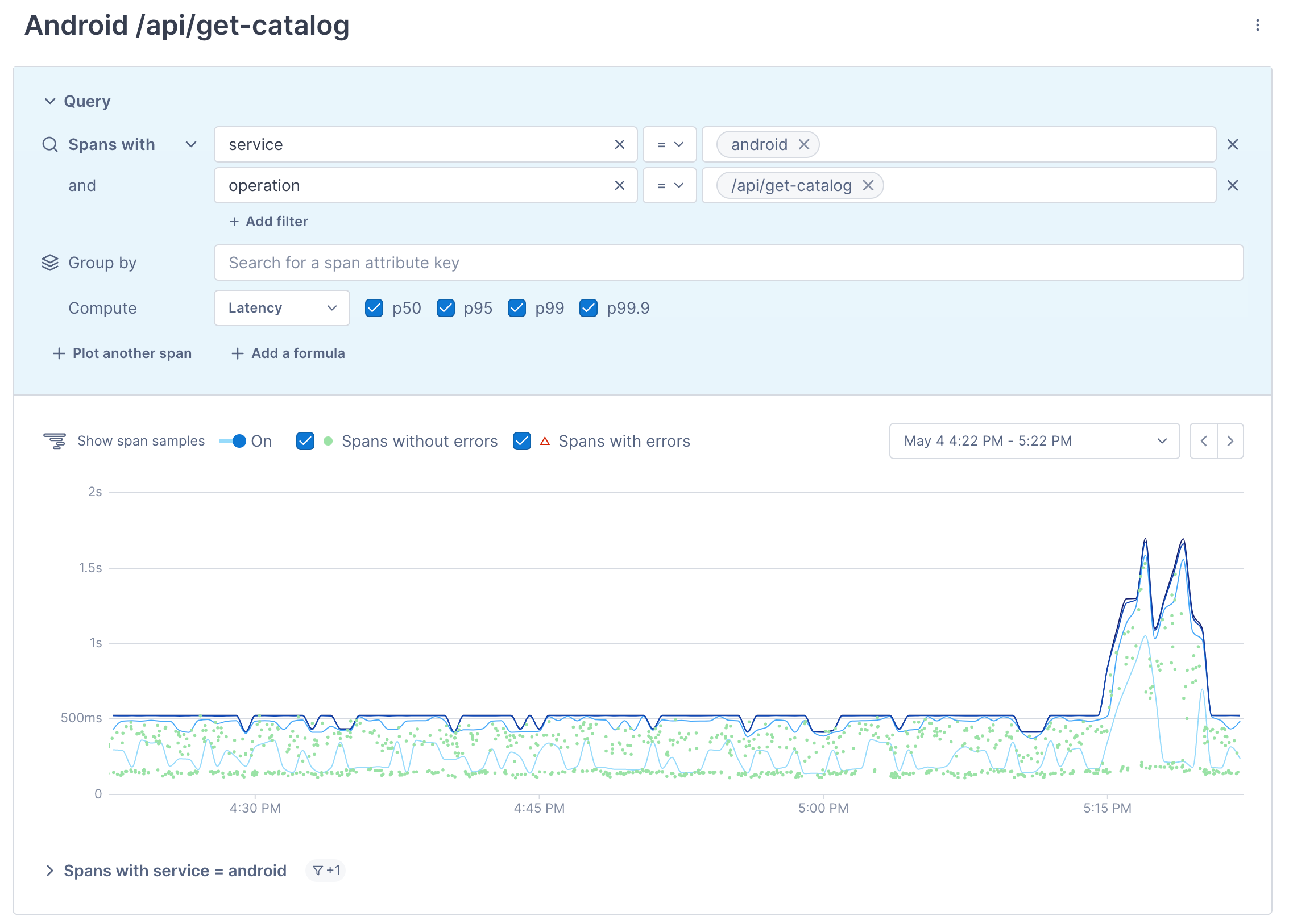
Run a Stream’s query in Explorer
If you want to view a Stream’s span data in Explorer, you can run the query right from the Stream list view. Click the hamburger icon for the Stream and choose Go to Explorer. 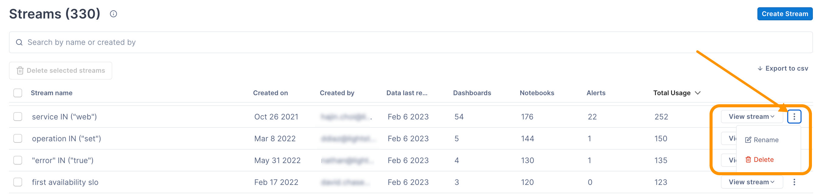
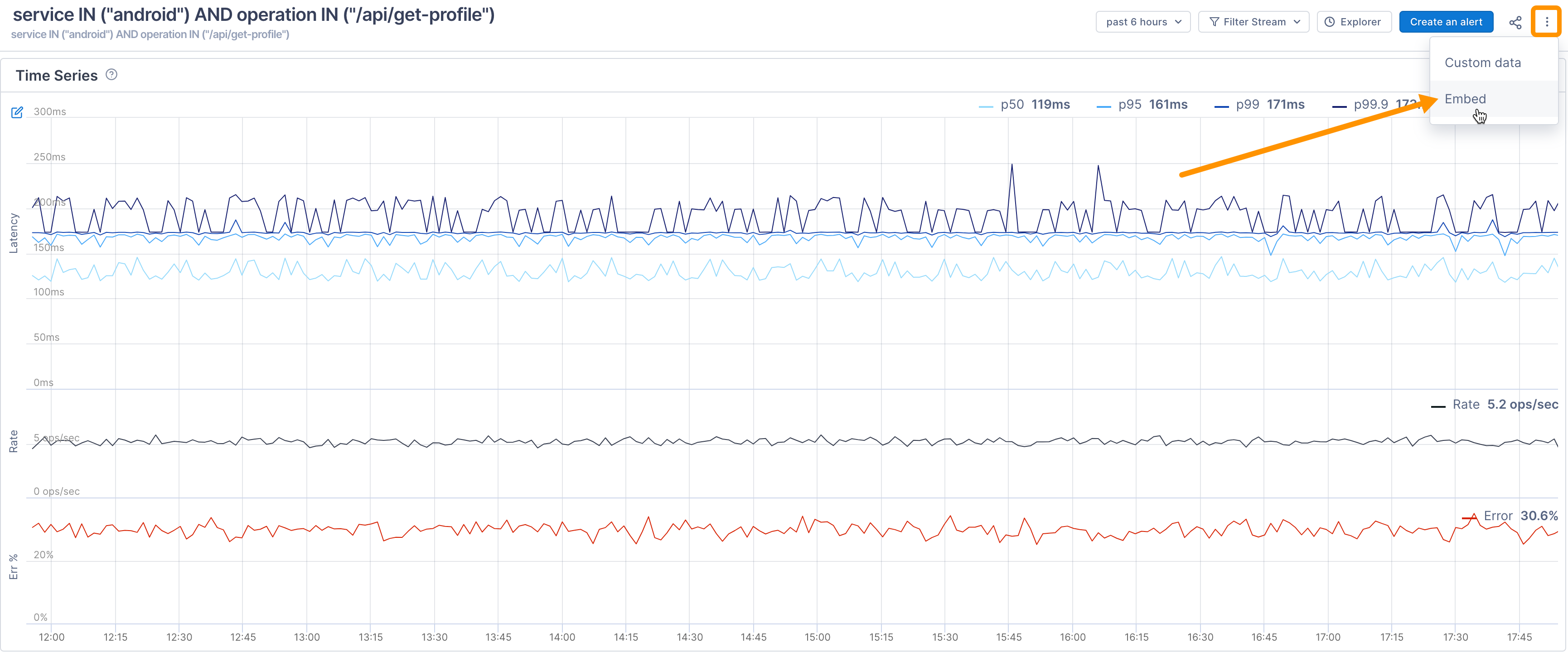
Embed a Stream in third-party apps
You can embed a Stream into any app that supports adding an <iframe> object. By default, the Stream uses the light theme currently displayed in Lightstep, but you can embed a dark-themed version instead.
Use our Grafana plugin to view Streams in Grafana. Once in Grafana, clicking on a Cloud Observability panel takes you back to Cloud Observability where you can view sample traces.
To embed a Stream:
-
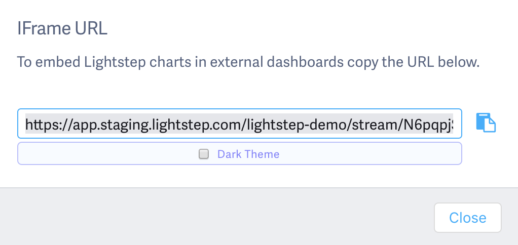
Open the IFrame URL dialog to copy the code for the Stream. You can find the code to embed the Stream in two places:
From the Stream, at the top, click the Hamburger icon then Embed.
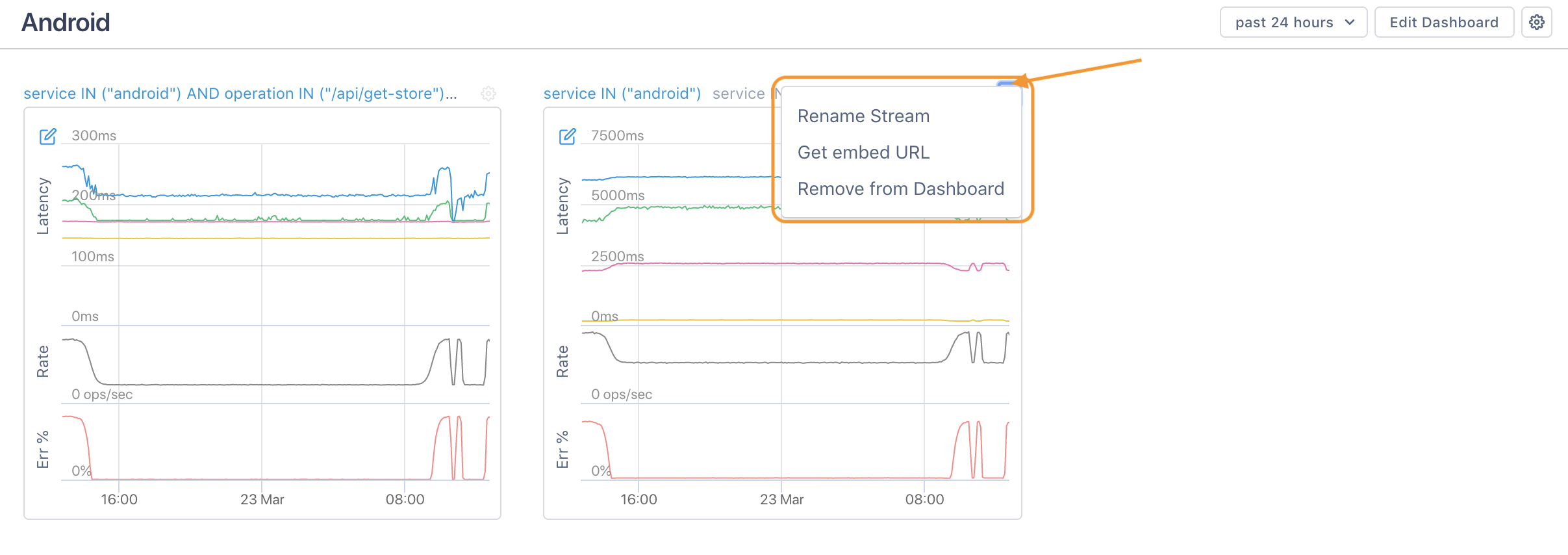
From a dashboard, click the gear icon for the Stream and choose Get embed URL.
-
If you want to use a dark version of the Stream, click Dark Theme in the dialog.
-
Copy the code and paste into the third-party app as needed. For example in Datadog, you can drag an IFrame widget onto a ScreenBoard and paste in the code from Cloud Observability.
See also
Understand data retention in Cloud Observability
Updated Dec 5, 2022